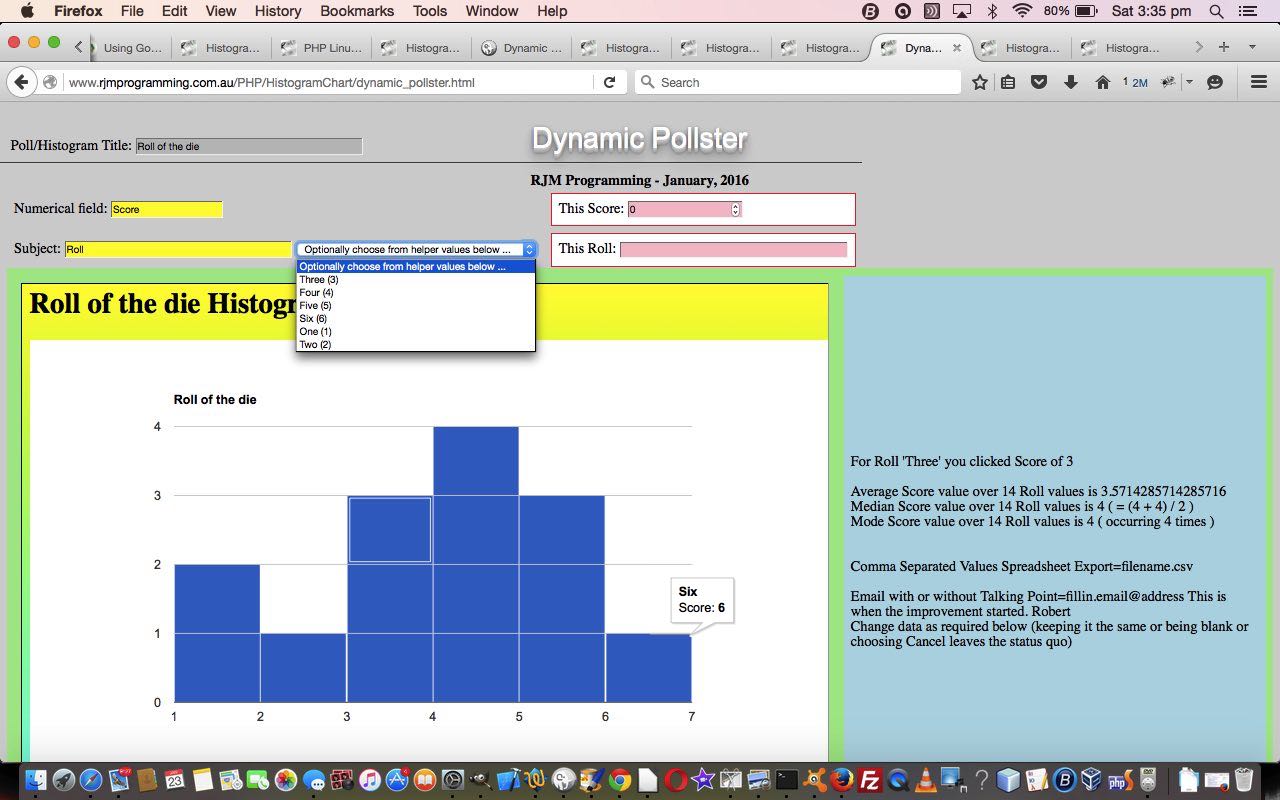
Yesterday it was the the turn of Google Chart Histogram Charts to get them working for their Select event, which is like a mobile touch event and non-mobile click event on the Google Chart of interest (which we started on with Google Chart Histogram Chart Select Event Primer Tutorial as shown below), and today we test out that functionality with a real world idea which we like to think of as involving a “Moving Histogram”, and which we call “Dynamic Pollster”. This “Moving Histogram”, to us, and maybe to others, involves our web application making use of the Google Chart Histogram Chart, in an HTML iframe element, is like a polling station or experiment reading recorder, that asks the user to enter raw “finding” data, and dynamically piece together a “Moving Histogram” for that data, updated after every raw “finding” data set is entered. So the resultant iframe’s Histogram “moves” and is dynamic, similar to how the algorithm for “Moving Average” “moves” and is dynamic. By the way, we use a “Moving Average” algorithm when piecing together the “Select” event derivable …
- Average (or mean) value ( via “Moving Average” where
MovingAverage = ((PreviousMovingAverage x (-1 + NumberDataPoints)) + ThisValue) / (NumberDataPoints)) - Median (or middle) value
- Mode (or most numerously occurring) value
… and so we come to some of the practicalities of data sets that could get big … use an HTML form with method=POST to allow for the larger data sets.
Software wise our HTML “Dynamic Pollster” code and amended Google Chart Histogram Chart (Select event) (in PHP) integration involved …
- dynamic_pollster.html (and a live run link) … and the HTML iframe contents are worked by …
- histogram_chart.php changes (to improve the select event (mobile touch) functionality regarding POSTed data and emails and csv file creation) and live run link, or the live run button related to today’s tutorial picture’s HTML iframe contents is
- csv.php changes (regarding csv file creation changes)
Link to Google Chart Tools “spiritual home” … via Google.
Link to Google Chart Histogram Charts information … via Google.
Link to our previous PHP/Javascript/HTML Google Chart Histogram Tutorial.
This extra ‘select’ event functionality of the Google Chart Histogram Chart web application (in the HTML iframe), available via the suffix “&onclick=y” applied to the Google Chart Histogram Chart title, flows on directly to the iPad iOS App we created and talked about, last, with Xcode Swift iOS Application End Game Primer Tutorial.
Previous relevant Google Chart Histogram Chart Select Event Primer Tutorial is shown below.
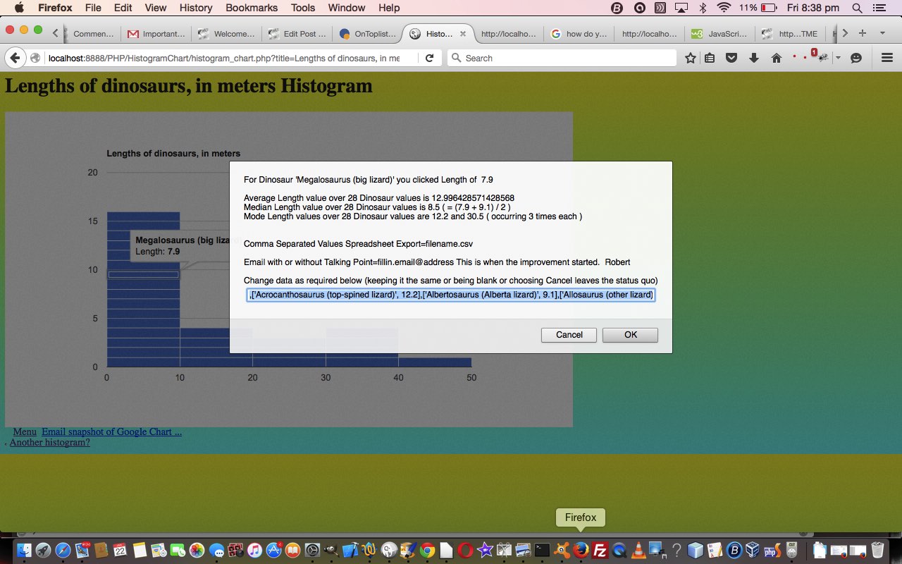
Today it’s the turn of Google Chart Histogram Charts to get them working for their Select event, which is like a mobile touch event and non-mobile click event on the Google Chart of interest.
We believe in packing this Select event with business logic, and we think, for a Histogram Chart scenario it would be good to calculate the …
- Average (or mean) value
- Median (or middle) value
- Mode (or most numerously occurring) value
… for the Histogram data set. We do Dinosaur lengths today with the tutorial picture, but am sure you could well imagine a Real Estate Histogram of auction house or unit sale prices in a certain area (where the industry here in Australia is often interested in Median values).
Software wise our new Google Chart Histogram Chart (Select event) integration involved …
- histogram_chart.php changes (to cater for select event (mobile touch) functionality) and live run link
Link to Google Chart Tools “spiritual home” … via Google.
Link to Google Chart Histogram Charts information … via Google.
Link to our previous PHP/Javascript/HTML Google Chart Histogram Tutorial.
This extra ‘select’ event functionality, available via the suffix “&onclick=y” applied to the Google Chart Histogram Chart title, flows on directly to the iPad iOS App we created and talked about, last, with Xcode Swift iOS Application End Game Primer Tutorial.
So please try creating your own emailable Google Chart live run for …
A curiosity that came up while calculating the Median value of an even number of numbers got explained here … thanks.
If this was interesting you may be interested in this too.
If this was interesting you may be interested in this too.


3 Responses to Google Chart Moving Histogram Chart Select Event Poll Tutorial