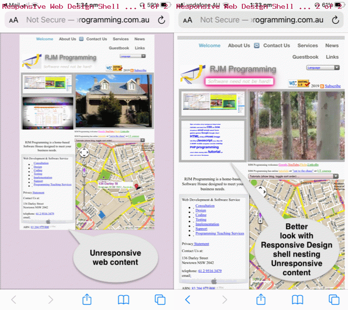
Today we wanted to tip our toes into the vast subject of “responsive web design” …
Responsive web design (RWD) is an approach to web design that makes web pages render well on a variety of devices and window or screen sizes from minimum to maximum display size. Recent work also considers the viewer proximity as part of the viewing context as an extension for RWD.[1] Content, design and performance are necessary across all devices to ensure usability and satisfaction.[2][3][4][5]
… coming at it from the idea “Can a responsive shell webpage host a non-responsive iframe?”
In turn this got us to the excellent ideas of this webpage which we’ll try out for a while …
- honing in on our “Landing Page and friends” set of unresponsively designed webpages …
- honing in on iPhone sized devices (ie. not iPads nor laptops) …
- host web browser address bar calls of “Landing Page and friends” set of unresponsively designed webpages within a caller.html responsively web designed shell supervisory webpage and start using some of that …
Unresponsive Landing Page Responsive Shell around Unresponsive Landing Page … as food for (your) thought …
   function bodonl() {

     var wasih=document.body.innerHTML;

     var huhd=document.getElementById('Container').getBoundingClientRect();

     var pb=0;

     if (eval('' + huhd.height) > eval('' + huhd.width)) {

     isportrait=true;

     pb=eval(eval('' + huhd.width) / eval('' + huhd.height) * 100.0);

     nowih='<div id="Container" style="padding-right:' + pb + '%; position:relative; display:block; height: 100vh;"><iframe' + wasih.split('<iframe')[1].split('</div>')[0].replace('" frameborder', fname + '" style="position:absolute; top:0; left: 0;" frameborder') + '</div>';

     //if (navigator.userAgent.match(/Android|BlackBerry|iPhone|iPod|Opera Mini|IEMobile/i)) {

     //document.getElementById('myvis').setAttribute('initial-scale','0.5');

     //}

     } else {

     isportrait=false;

     pb=eval(eval('' + huhd.height) / eval('' + huhd.width) * 100.0);

     nowih='<div id="Container" style="padding-bottom:' + pb + '%; position:relative; display:block; width: 100%;"><iframe' + wasih.split('<iframe')[1].split('</div>')[0].replace('" frameborder', fname + '" style="position:absolute; top:0; left: 0;" frameborder') + '</div>';

     }

     document.body.innerHTML=nowih;

   }
If this was interesting you may be interested in this too.


