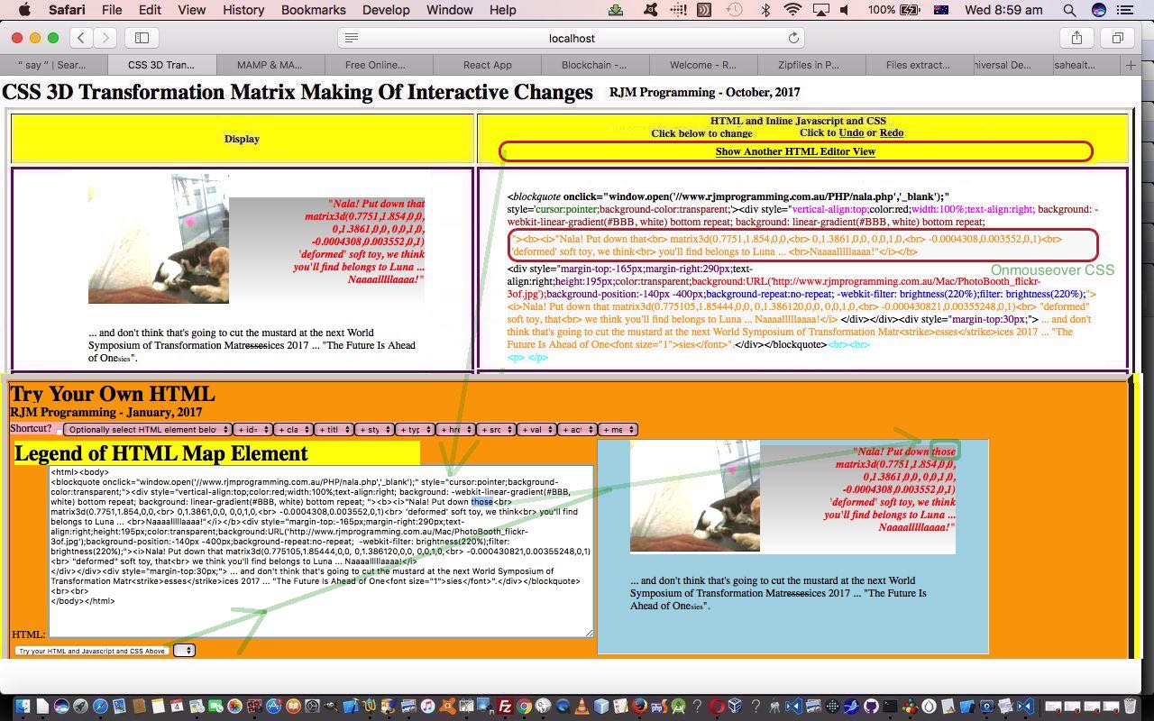
Do you remember our HTML textarea (like CMSs use) based Do It Yourself HTML Editor Integration Tutorial HTML Editor series of blog postings? Yes, yesterday’s CSS 3D Transformation Matrix Making Of Interactive Tutorial intimated we might integrate these two (that and today’s), and today we do. We think they work well together, and together this way, are good candidates to bear out the message of HTML Textarea and Div Talents Primer Tutorial that both have their “talents” as per the table …
But their strengths and weaknesses go like this, at least to us, in the limited HTML text view of things …
Text Functionality Issue HTML Element Type Strength Weakness (where a “Yes” is like … “Oh No!”) Display Monocolour Text Textarea Yes Div Yes Display Editable Text Textarea Yes Div Yes Display Multicolour Text Textarea Yes Div Yes
… the extension of that lesson above, today, being that there are other stand-in HTML elements like the HTML div element with these discussions. Today’s example is the HTML td (table cell) element, that can, like the HTML div element, allow multicoloured and highlighted text, whereas the HTML textarea editing “talents” extend to that way an HTML textarea element, “under the hood” allows the use of the caret characters (“<” and “>”) in its very makeup, while with those highlighting HTML div and td type elements that look of “<” and “>” is achieved, as a display, by mapping these characters to the HTML entities “<” and “>” respectively.
And so far we’ve integrated the Do It Yourself HTML Editor Integration Tutorial HTML Editor into this “CSS 3D Transformation Matrix Making Of Interactive” web application via an HTML iframe element hosting of it …
function anotherview() {   // the parent HTML a link onclient event logic

   var hprefix='<html><body>', hsuffix='</body></html>';

   var ih=document.getElementById('isdisplay').innerHTML;

   wis='' + eval(eval(window.getComputedStyle(document.getElementById('isdisplay'), null).getPropertyValue("width").replace('px','')) - 0) + 'px'; // parent table cell (td) width

   his='' + eval(eval(window.getComputedStyle(document.getElementById('isdisplay'), null).getPropertyValue("height").replace('px','')) - 0) + 'px'; // parent table cell (td) height

   document.getElementById('anotherapproach').style.display='block';

   if (ih.toLowerCase().indexOf('<html') != -1 && ih.toLowerCase().indexOf('<body') != -1) {

     hprefix='';

   } else if (ih.toLowerCase().indexOf('<body') != -1) {

     hprefix=ih.substring(0,ih.toLowerCase().indexOf('<body'));

     ih=ih.substring(ih.toLowerCase().indexOf('<body'));

   }

   if (ih.toLowerCase().indexOf('</html>') != -1 && ih.toLowerCase().indexOf('</body>') != -1) {

     hsuffix='';

   } else if (ih.toLowerCase().indexOf('</body>') != -1) {

     hsuffix='</html>';

   }

   if (document.URL.indexOf('localhost:8888') == -1) {

   document.getElementById('anotherapproach').src="//www.rjmprogramming.com.au/HTMLCSS/do_away_with_the_boring_bits.html?htmlcontent=" + encodeURIComponent(hprefix + ih + hsuffix) + "&urlprefix=";

   } else {

   document.getElementById('anotherapproach').src="http://localhost:8888/do_away_with_the_boring_bits.html?htmlcontent=" + encodeURIComponent(hprefix + ih + hsuffix) + "&urlprefix=";

   }

   location.hash='#anotherapproach';

}


function checki(iois) {  // using Client Pre-emptive Iframe techniques to adjust iframe's iframe's width and height via parent table cell (td) width and height as calculated above

  if (iois != null) {

    var aconto = (iois.contentWindow || iois.contentDocument);

    if (aconto != null) {

     if (aconto.document) { aconto = aconto.document; }

     if (aconto.body != null) {

       if (wis != '') aconto.getElementById('ihtmlcontent').style.width=wis;

       if (his != '') aconto.getElementById('ihtmlcontent').style.height=his;

     }

    }

  }

}
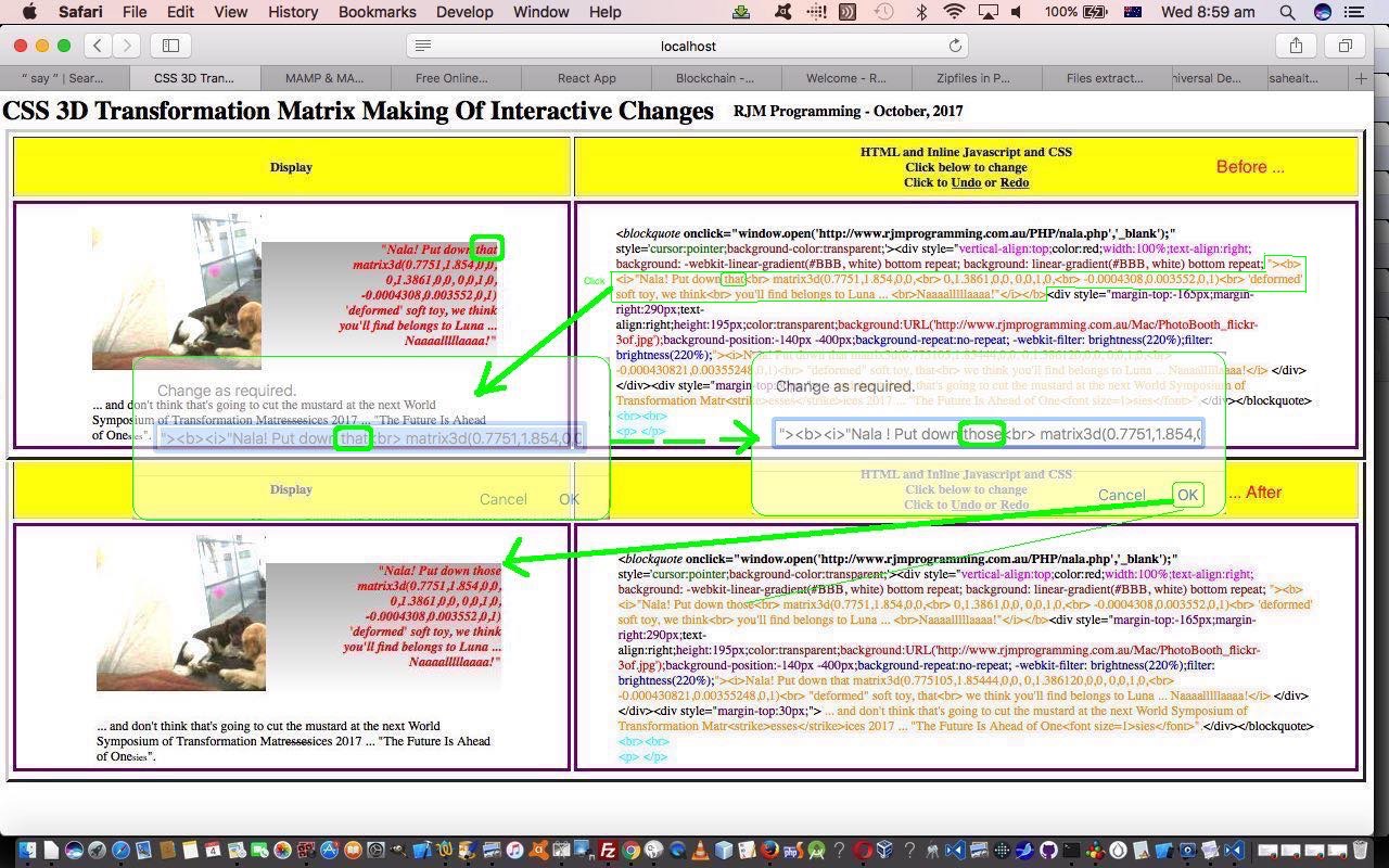
… so that the HTML and Javascript and CSS has become downloadable making_of.htm which changed this way to allow this live run link to work. You will notice that the “one-way” code functions above change a lot to make it the “two-way” integration it is now, and rather than confuse you here, will let you see the changes for yourself. “Two-way” means that once you involve the other HTML (textarea) Editor and change you make to the HTML here will go the full circle back to our “CSS 3D Transformation Matrix Making Of Interactive” editor for that other mode of changing it, and around and around it can go from there.
The other new CSS you will see in code above (and for which this useful link inspired us, thanks) is about some onhover or onmouseover non-mobile platform functionality we’ve introduced to that parent table cell (td) element’s contents, which get internally broken into clickable HTML span elements with some attention grabbing …
<style>

#sanother:hover, span:hover {

        border: 3px solid red; //dashed #3a7999;

        display: block;

	background: rgba(0,0,0,0);

	padding: 4px 4px 4px 4px;

	border-radius: 15px;

	box-shadow: inset 0 0 0 2px #3a7999;

}

</style>
… that is also applied to the new HTML a link that gets the user to the integrated Do It Yourself HTML Editor Integration Tutorial HTML (textarea) Editor.
Along the way, this project change, during unit testing, showed to us a weakness with the HTTP Cookie management system we set up, first, with Job Search Grid Game Cookie Tutorial‘s Javascript cookie_get.js specifically if removal of HTTP Cookies logic, where we found out it can be important to specify, in our case, for a cookie called “bugalugs” …
document.cookie = "bugalugs=;path=/;expires=0";
… the “scope” (ie. path) to your HTTP Cookie, and which you can see from our changed code.
Previous relevant CSS 3D Transformation Matrix Making Of Interactive Tutorial is shown below.
The recent CSS 3D Transformation Matrix Making Of Tutorial got us to thinking more about linking …
- what you see on a webpage … to …
- what you see as raw HTML (even inline Javascript and CSS) … which, to all intents and purposes is what you “arrange” when you work in CMS (Content Management Systems) …
… which, surely, is the core of “content editing”. The dual purpose is to create a generic tool to teach some HTML via inline CSS, primarily, but also a bit with inline Javascript, so that you can break up a slightly complex scenario into HTML bits and pieces that make it display the way it does, and you (wake up!) the user can change the HTML to see what happens on the display and go … wake up! … ooh! aah! … and perhaps realize it’s a lovely day to get out and about!
We’ve tried this HTML editing before with Do It Yourself HTML Editor Integration Tutorial and which we may think about integrating with, but today’s idea is a change in tack where the “stream of HTML consciousness” can be broken up more, and think that most of us get more understanding when something textual can be linked with something graphical, as in a real HTML output display, a step like WordPress (or many other CMS product) (HTML) textarea element editor’s Visual tab giving you a WYSIWYG (what you see is what you get) view of what the HTML tab shows you (as the duck swimming for all its worth) workings underneath. But as tempting as that WordPress Visual tab is, especially if you are scared of HTML, just editing in that Visual tab can have its pitfalls, which you can read a bit about here. And so, rather than trying to scare you out of CMS, heaven forbid, we’d rather direct you to improve your HTML … yay!
In this line of thinking, when you talk CMS you should read HTML Textarea and Div Talents Primer Tutorial as related material.
You can try this “pilot” live run that has the generic event logic but, so far, “un-“generic content primer, that if to you looks familiar, is because it came from the blog posting thread we last left off with at CSS 3D Transformation Matrix Making Of Tutorial as shown below. And the HTML and Javascript and CSS basis to that “live run” is via the source code making_of.html for your perusal. It works by you being able to click on snippets of HTML that go and change a WYSIWYG display to the left of it … left chosen because … wake up!
You can also see this play out at WordPress 4.1.1’s CSS 3D Transformation Matrix Making Of Interactive Tutorial.
Previous relevant CSS 3D Transformation Matrix Making Of Tutorial is shown below.
It was “line ball” as to whether the “making of” our CSS 3D Transformation Matrix Primer Tutorial some time back was harder than the programming involved in its “cut to the chase” web application’s code. This, we find, embarrassing, though we find CSS styling a lot harder than Javascript DOM as far as the client side of web applications “production” goes.
The thing about that tutorial’s …
“Nala! Put down that
matrix3d(0.7751,1.854,0,0,
0,1.3861,0,0, 0,0,1,0,
-0.0004308,0.003552,0,1)
‘deformed’ soft toy, we think
you’ll find belongs to Luna …
Naaaalllllaaaa!”Nala! Put down that matrix3d(0.775105,1.85444,0,0, 0,1.386120,0,0, 0,0,1,0,
-0.000430821,0.00355248,0,1)
“deformed” soft toy, that
we think you’ll find belongs to Luna … Naaaalllllaaaa!… and don’t think that’s going to cut the mustard at the next World Symposium of Transformation Matressesices 2017 … “The Future Is Ahead of Onesies“.
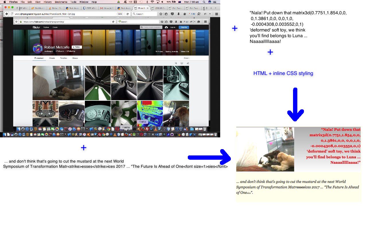
… “making of” picture (we are going to refer to as “production” in blurb below) is that it took a long while to get it looking this way, as basically the blockquote element we wanted it to end up as, so that a little of a blockquote‘s shadowing could be hinted at with this work. But let’s show you its HTML (with inline CSS) innards and explain more …
<blockquote onclick=”window.open(‘http://www.rjmprogramming.com.au/PHP/nala.php’,’_blank’);” style=’cursor:pointer;background-color:transparent;‘><div style=”vertical-align:top;color:red;width:100%;text-align:right; background: -webkit-linear-gradient(#BBB, white) bottom repeat; background: linear-gradient(#BBB, white) bottom repeat; “><b><i>”Nala! Put down that<br> matrix3d(0.7751,1.854,0,0,<br> 0,1.3861,0,0, 0,0,1,0,<br> -0.0004308,0.003552,0,1)<br> ‘deformed’ soft toy, we think<br> you’ll find belongs to Luna … <br>Naaaalllllaaaa!”</i></b><div style=”margin-top:-165px;margin-right:290px;text-align:right;height:195px;color:transparent;background:URL(‘http://www.rjmprogramming.com.au/Mac/PhotoBooth_flickr.jpg’);background-position:-140px -400px;background-repeat:no-repeat; -webkit-filter: brightness(220%);filter: brightness(220%);“><i>Nala! Put down that matrix3d(0.775105,1.85444,0,0, 0,1.386120,0,0, 0,0,1,0,<br> -0.000430821,0.00355248,0,1)<br> “deformed” soft toy, that<br> we think you’ll find belongs to Luna … Naaaalllllaaaa!</i>
</div></div><div style=”margin-top:30px;“> … and don’t think that’s going to cut the mustard at the next World Symposium of Transformation Matr<strike>esses</strike>ices 2017 … “The Future Is Ahead of One<font size=1>sies</font>”.</div></blockquote><br><br>
<p> </p>
- The photograph is shown as a background image to an HTML div element
- Background and colour is based on a linear gradient overriding other background transparencies
- The ideal positioning (and cropping) of the background image may be a “suck it and see” operation
- A brightness filter is used to add more light to the “production”‘s background photograph
- Add a “link” feel to the “production” by using the normal “link” cursor
- The “production”‘s wording
- Top and right div element vertical and horizontal alignment is crucial to make sense of the positioning
- Spacing
- When clicking on any part of the “production” you get played a Nala video
Looking back, the insistence on the use of blockquote may have added to the complexity, and the need for two div elements to become involved.
Here are some links, we give thanks for, related to this …
- CSS3 overflow-y property
- overflow-y Google search
- Using CSS, can you apply a gradient mask to fade to the background over text? – Stack Overflow
- background image mask out bits on the right – Google search
- matrix3d() – CSS | MDN
- webkit-brightness – Google search
- Offset a background image from the right using CSS – Stack Overflow
- background-offset – Google search
- “background image mask out bits on the right” – Google search
- CSS Clipping and Masking: Examples and Observations – Vanseo Design
- CSS Clipping and Masking — Show and Hide Parts of Images and Elements
- css – “Inline” border of a div – Stack Overflow
- outline-right – Google search
- css – “Inline” border of a div – Stack Overflow
- border inline – Google search
Previous relevant CSS 3D Transformation Matrix Primer Tutorial is shown below.
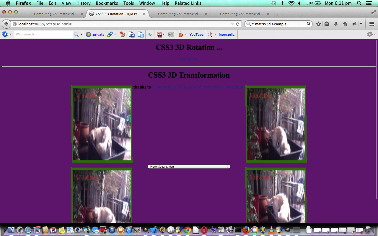
The tutorial CSS3 3D Rotation and Transformation Primer Tutorial discussed CSS styling regarding element transformations, and referred to the wonderful content of Computing CSS matrix3d transforms | Franklin Ta, involving matrix mathematics to transform HTML elements and the matrix3d() CSS function … great stuff, thanks. Also, coming at this topic of transformations from another angle, the previous ImageMagick and Three Ps Charcoal Implode Quality Tutorial touches on this aspect of transformations, in its case “affine” transformations, whereby an actual image element is transformed and presented in a downloadable way.
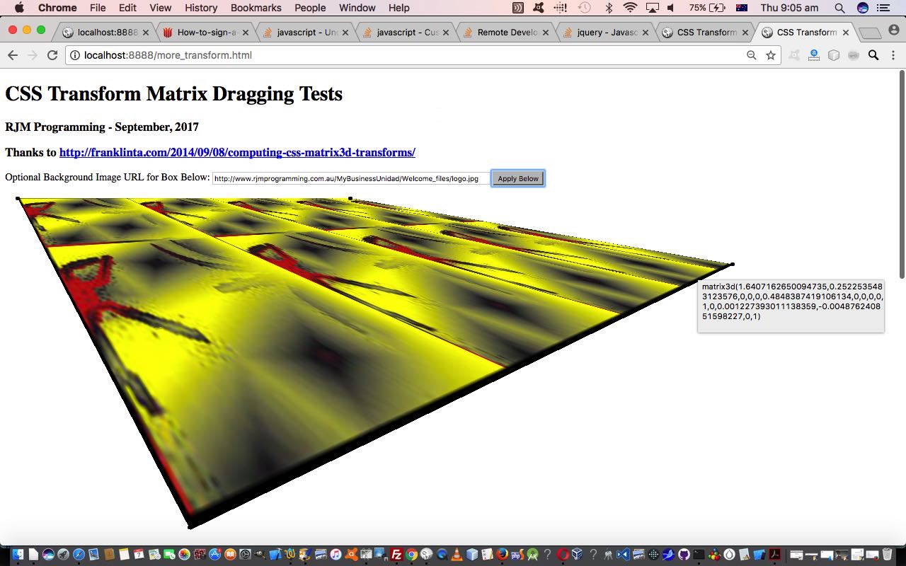
Today we recreate that work with the CSS matrix3d() function of Frank Ta to turn this into a web application where you can drag the edges of an HTML div element to derive the underlying CSS matrix3d() function parameter set would be used to recreate this HTML div display, perhaps elsewhere. We also allow for the user to enter in an image URL that if they click a button will apply that image as the background image to the HTML div element, as you can see play out with today’s tutorial picture. The jQuery Javascript here helps the day enormously, though Frank used the CoffeeScript (compiled into Javascript) within the CodePen “Front End Developer Playground and Code Editor” environment … worth taking a skeg … when doing a cuter looking web application at that aforesaid mentioned link.
Is the power of the modern device going to mean these types of transformations will “power” our online world, rather than trying to make the original media “fit the bill”, always? We’d say, probably, but we’d also say …
“Nala! Put down that
matrix3d(0.7751,1.854,0,0,
0,1.3861,0,0, 0,0,1,0,
-0.0004308,0.003552,0,1)
‘deformed’ soft toy, we think
you’ll find belongs to Luna …
Naaaalllllaaaa!”Nala! Put down that matrix3d(0.775105,1.85444,0,0, 0,1.386120,0,0, 0,0,1,0,
-0.000430821,0.00355248,0,1)
“deformed” soft toy, that
we think you’ll find belongs to Luna … Naaaalllllaaaa!… and don’t think that’s going to cut the mustard at the next World Symposium of Transformation Matressesices 2017 … “The Future Is Ahead of Onesies“.
Why don’t you try this HTML and Javascript (mostly jQuery) and CSS web application more_transform.html‘s live run to see what we mean? It can be weird, and wonderful!
Previous relevant CSS3 3D Rotation and Transformation Primer Tutorial is shown below.
Cascading Style Sheets (CSS) is a style sheet language used for describing the presentation semantics (the look and formatting) of a document written in a markup language. Its most common application is to style web pages written in HTML and XHTML, but the language can also be applied to any kind of XML document, including plain XML, SVG and XUL.
Tutorial …
Cascading Style Sheet methodology is a good technique in order to separate document content from document presentation. For the same content, two different CSS approaches can produce vastly different browser outputs.
With today’s tutorial we concentrate on CSS within HTML and specifically the CSS3 3D Rotation and Transformation functionality you can read about CSS3 3D Transforms at w3schools.
With the transformations section there are 16 elements in a 4×4 matrix to define, and so there is a fair degree of mathematical geometry that would be good to know here. This mathematics is explained well at Computing CSS matrix3d transforms | Franklin Ta … thanks a lot.
You can download source code and rename to rotate3d.html or you can use the live run to wake up all those ants on the footpath that have been thinking their life is just grand and dandy.
Thanks to Wikipedia for the quote above.
If this was interesting you may be interested in this too.
If this was interesting you may be interested in this too.
If this was interesting you may be interested in this too.
If this was interesting you may be interested in this too.
If this was interesting you may be interested in this too.

