Our CSS3 lesson today combines …
- yesterday’s CSS3 Object Fit Primer Tutorial CSS3 object-fit property … combined with …
- CSS3 resizing functionality
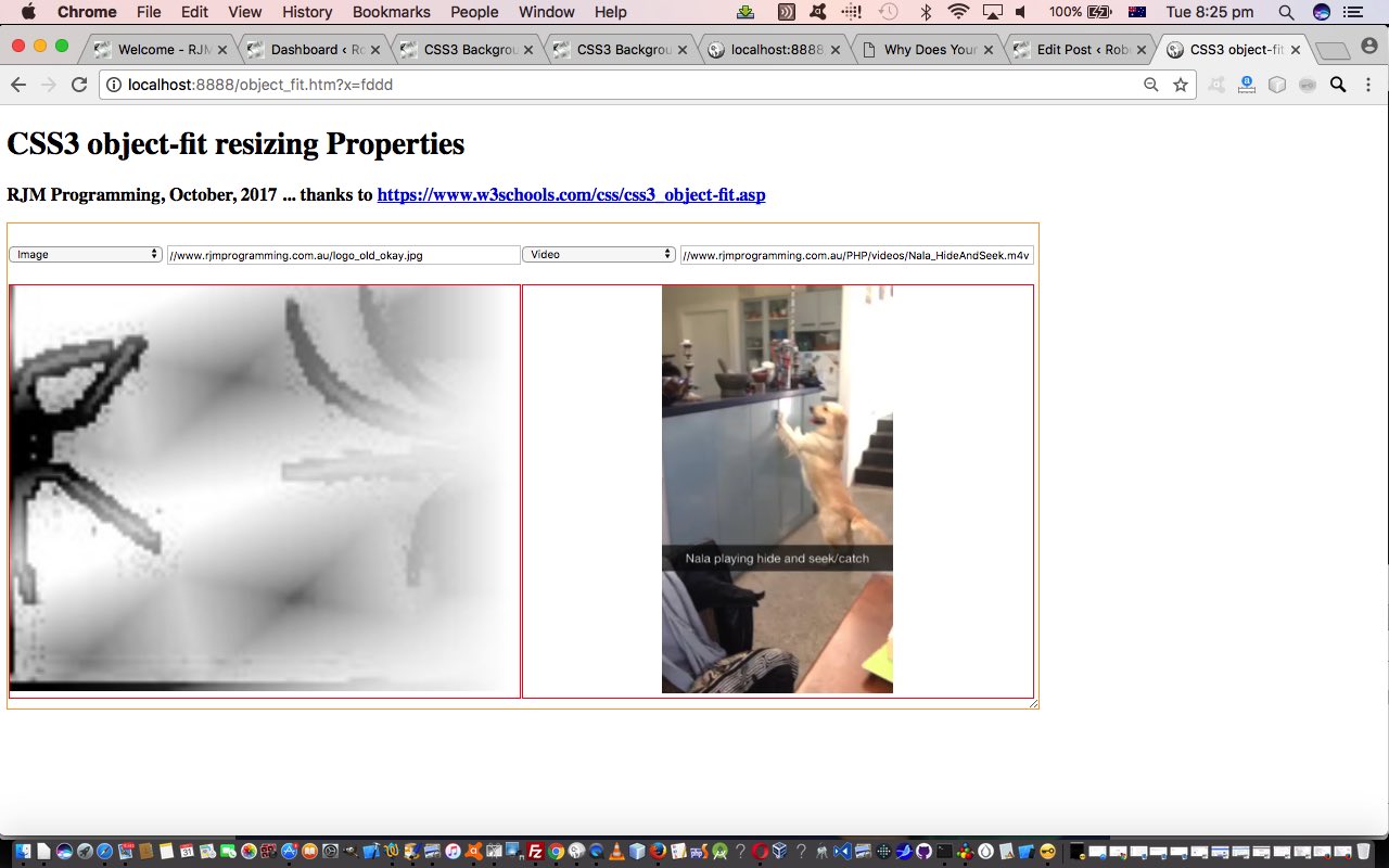
When you think of the modern GUIs you no doubt think dynamism and flexibility. But what if we take away the ability to resize windows or parts thereof? That GUI system would become very dull indeed. We have a Javascript onresize event that works off when the “window” is resized, but what if CSS3 allows for an HTML element to be resized with one of those element “looks” like at the bottom right of a textarea element? It sounds great, doesn’t it?! It’s just that that aforesaid mentioned Javascript onresize event can not be relied upon, though you’ll see it in our object_fit.htm code today, because we are of the optimistic type, factoring in a solution for the future. We get around the restriction by setting off a setTimeout (timer) Javasacript function constantly monitoring our HTML div element’s width and height properties.
Alas, again, this resizing does not work everywhere, as you might have guessed from a “draggy” kind of thought, but we think it’s a cute idea, and so we encased yesterday’s HTML table “work” into a “parent” HTML div element we’ll apply the following CSS3 to …
<style>

.fill { object-fit: fill; }

.contain { object-fit: contain; }

.cover { object-fit: cover; }

.scale-down { object-fit: scale-down; }

.none { object-fit: none; }


div {

    border: 1px solid orange;

    resize: both;

    overflow: auto;

}

</style>
… and you get the effect as per today’s live run for which the following changed codings apply.
Previous relevant CSS3 Object Fit Primer Tutorial is shown below.
The recent CSS3 Background Size Contain and Cover Primer Tutorial was an epiphany for us regarding two very useful …
-
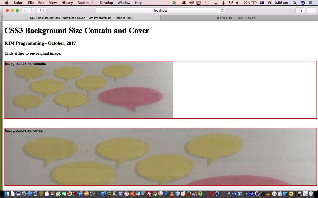
The contain keyword scales the background image to be as large as possible (but both its width and its height must fit inside the content area). As such, depending on the proportions of the background image and the background positioning area, there may be some areas of the background which are not covered by the background image.
-
The cover keyword scales the background image so that the content area is completely covered by the background image (both its width and height are equal to or exceed the content area). As such, some parts of the background image may not be visible in the background positioning area.
… concepts regarding web application background images and specifically the associated Background Size property. But what if we extend that thinking to …
… relationships to some HTML element tags that nest them (today into some HTML table td (cell) elements whose dimensions are calculated via the ever popular window.getComputedStyle Javascript functionality), in CSS3 “talk”, the new(ish) object-fit property applicable to those two HTML element types above.
It’s not just cover and contain property values at play with the object-fit property, it’s …
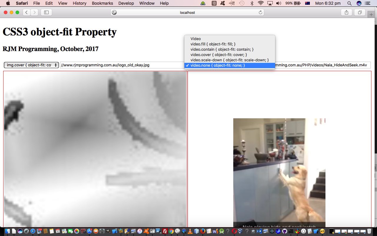
fill – This is default. The replaced content is sized to fill the element’s content box. If necessary, the object will be stretched or squished to fit
contain – The replaced content is scaled to maintain its aspect ratio while fitting within the element’s content box
cover – The replaced content is sized to maintain its aspect ratio while filling the element’s entire content box. The object will be clipped to fit
none – The replaced content is not resized
scale-down – The content is sized as if none or contain were specified (would result in a smaller concrete object size)
In this line of thinking we’ve mocked up a proof of concept web application for you to play around with these ideas yourself at today’s HTML and CSS and Javascript object_fit.html‘s live run.
Previous relevant CSS3 Background Size Contain and Cover Primer Tutorial is shown below.
We’ve got a fairly simple but fairly useful lesson today with respect to a CSS styling improvement introduced with CSS3, the Background Size property that allows you to specify the size of background images.
How often have you mismatched (the size of) a background image to the contents it is backgrounded against, and involved the background-repeat property, much to your chagrin, perhaps?
You can try this simple illustration of two useful background-size values, namely …
-
The contain keyword scales the background image to be as large as possible (but both its width and its height must fit inside the content area). As such, depending on the proportions of the background image and the background positioning area, there may be some areas of the background which are not covered by the background image.
-
The cover keyword scales the background image so that the content area is completely covered by the background image (both its width and height are equal to or exceed the content area). As such, some parts of the background image may not be visible in the background positioning area.
… at today’s live run link with its underlying serverside HTML and CSS code you could call bs_contain_cover.html as you wish.
If this was interesting you may be interested in this too.
If this was interesting you may be interested in this too.
If this was interesting you may be interested in this too.


