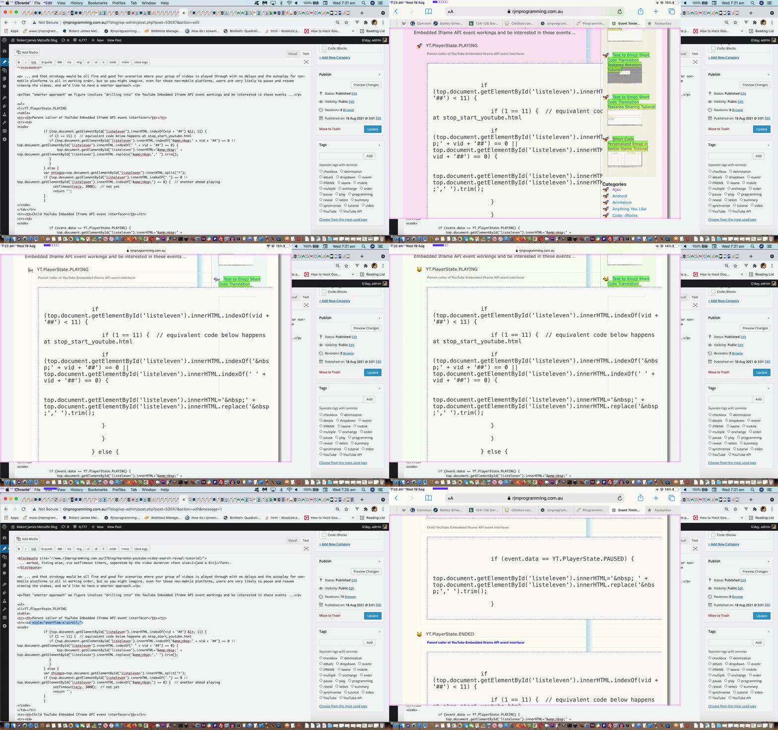
Yesterday’s Karaoke YouTube Video Search Event Timing Tutorial blog posting’s presentation (ie. its “look”), at least earlier on today had some of its priorities out of skew. It was a blog post trying to get the reader to examine “the code” of that YouTube Embedded Iframe API event scenario. In other words “the code” (in HTML code tags) was the “main game”. But up the top of the blog post, earlier on today, those topmost code element’s content could be cut off to the right depending on the width of your device (ie. laptops were wide enough, but tablets and phones were not).
Can we fix it with Javascript? Perhaps, but that is cracking a small nut with a giant hammer. Can we fix it with CSS? Yes, and what is the conservative, least controversial approach, and what concepts come into play?
- it’s a (CSS) overflow issue, and because it is “an out to the right” issue we are talking overflow-x issue … and …
- overflow issues are normally come upon, successfully, in CSS, when you apply the styling to the nester element of some nested element whose content is overflowing the dimensions (in this case “width”) of the nester element …
- honing in on the particular styling selector of interest in that the particular issue has occurred in a table cell (td) nesting a code element … so let’s try to CSS style just in that specific way (ie. the conservative approach) …
- we thank this link for the heads up on CSS selectors for nesting (ie. Descendant Selector) syntax … a bit like falling off a log really …
CSS …
<style>

  td code { overflow-x: visible; }

</style>'
… or inline within HTML …
<table><tr><td style="overflow-x: visible;"><code> blah blah blah</code></td></tr></table>
- and practically what we did was …
- temporarily changed the topmost blog posting’s code element HTML to try that second idea above …
- tested the “look” of the blog posting and saw it being better while ones below were still annoying … check … so … undid that, then …
- changed the WordPress TwentyTen themed blog’s header.php (where the <style> … </style> CSS sits and add in that first idea above …
- tested the “look” of the blog posting and saw that all code elements were better (being more readable out to the right (that’s the “-x” in “overflow-x”))
Voila! A fairer go for the code!
If this was interesting you may be interested in this too.


