Regarding our Landing Page series of HTML/Javascript/CSS webpages here at RJM Programming, we’re streamlining our device width (Responsive Web Design) considerations of …
- Mobile Friendly Meta Viewport Tag Zoom Tutorial by now going with …
Was .. Now is …
<meta id=”myviewport” name=”viewport” content=”width=device-width, initial-scale=1, minimum-scale=0.25, maximum-scale=8, user-scalable=yes” />
<meta name="viewport" content="width=device-width, initial-scale=1.0">
- Google PageSpeed and Firebug Mobile Friendly Primer Tutorial by now going with …
Was ..
function widthfix() {  //

 if (navigator.userAgent.match(/Android|BlackBerry|iPhone|iPod|Opera Mini|IEMobile/i)) { // it is a mobile device

   document.getElementById('body_content').style.width='100%';

   document.getElementById('nav_layer').style.width='100%';

   document.getElementById('widget0').style.width='100%';

 }
Now is …
function widthfix() {  //

 if (1 == 7 && navigator.userAgent.match(/Android|BlackBerry|iPhone|iPod|Opera Mini|IEMobile/i)) { // it is a mobile device

   document.getElementById('body_content').style.width='100%';

   document.getElementById('nav_layer').style.width='100%';

   document.getElementById('widget0').style.width='100%';

 }
Why?
- viewport advice of W3School’s Responsive Web Design – The Viewport useful link, thanks … to keep it simple …
<meta name="viewport" content="width=device-width, initial-scale=1.0">
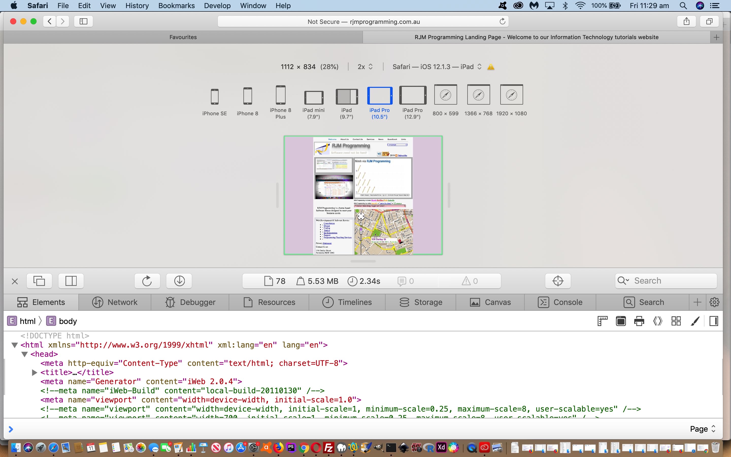
- we were able to use Safari (web browser) Develop Menu “Responsive Design Mode” functionality (as per Safari Develop Menu Responsive Design Primer Tutorial) to see for ourselves the improvement where our previous width based Javascript logic amendments had been interfering with the meta viewport suggestions better in keeping with Responsive Design thoughts
Food for thought, we hope, for those chipping away at responsive design amalgamations!
If this was interesting you may be interested in this too.


