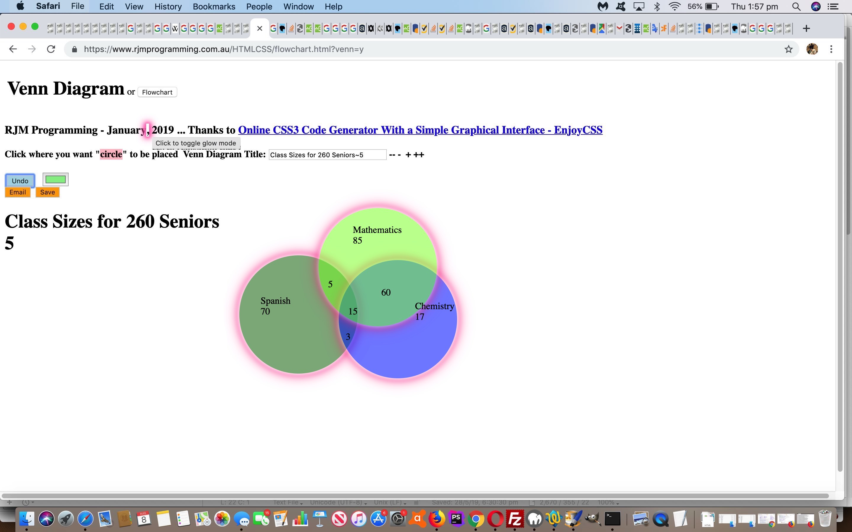
Here at RJM Programming, we are coming to realize that (W3School’s glowing text inspired) “glow” ideas can be that “extra dimension” to styling thoughts for so many of our web application efforts. Read more from yesterday’s Horizontal Rule and Div Glowing Lines and Vertices Tutorial as the background to this, but today’s “glow” focus turns to …
- Flowcharts and Venn Diagrams … read background to this at Venn Diagrams Onclick Tutorial link … with their …
- div elements … nothing new here, but today, there are special cases we need to cater for, those being the case of …
- div style=”border-radius:50%;” … and reading the super helpful link, thanks, we realized that box-shadow can (these days, for lots of platforms and browsers) simulate what border can do regarding “rounding its corners” (ie. the CSS border-radius property), got us to …
<style>

.cglow {

  box-shadow-bottom-right-radius: 50%; // thanks to https://stackoverflow.com/questions/2714765/using-border-radius-and-box-shadow-together-css

  box-shadow-bottom-left-radius: 50%;

  box-shadow-top-right-radius: 50%;

  box-shadow-top-left-radius: 50%;

  -webkit-animation: cglow 1s ease-in-out infinite alternate;

  -moz-animation: cglow 1s ease-in-out infinite alternate;

  animation: cglow 1s ease-in-out infinite alternate;

  -webkit-border-radius: 50%;

  border-radius: 50%;

}


@-webkit-keyframes cglow {

  from {

    box-shadow: 0 0 3px #fff, 0 0 5px #fff, 0 0 37px #e60073, 0 0 9px #e60073, 0 0 11px #e60073, 0 0 13px #e60073, 0 0 15px #e60073;

  box-shadow-bottom-right-radius: 50%; // thanks to https://stackoverflow.com/questions/2714765/using-border-radius-and-box-shadow-together-css

  box-shadow-bottom-left-radius: 50%;

  box-shadow-top-right-radius: 50%;

  box-shadow-top-left-radius: 50%;

  }


  to {

    box-shadow: 0 0 24px #fff, 0 0 6px #ff4da6, 0 0 8px #ff4da6, 0 0 10px #ff4da6, 0 0 12px #ff4da6, 0 0 14px #ff4da6, 0 0 16px #ff4da6;

  box-shadow-bottom-right-radius: 50%; // thanks to https://stackoverflow.com/questions/2714765/using-border-radius-and-box-shadow-together-css

  box-shadow-bottom-left-radius: 50%;

  box-shadow-top-right-radius: 50%;

  box-shadow-top-left-radius: 50%;

  }

}

</style>
… that combines with CSS …
<style>

.circle {

  -webkit-box-sizing: content-box;

  -moz-box-sizing: content-box;

  box-sizing: content-box;

  text-align: center;

  width: 200px;

  height: 200px;

  border: none;

  -webkit-border-radius: 50%;

  border-radius: 50%;

  font: normal 100%/normal Arial, Helvetica, sans-serif;

  color: rgba(0,0,0,1);

  -o-text-overflow: clip;

  text-overflow: clip;

  background: pink; //#1abc9c;

  opacity:0.5;

}

</style>
… to help the Javascript be able to dynamically create “Glow Circles” for Venn Diagrams
“Dynamically”, in this case, is, for most intents and purposes, is like the user controllable mechanisms of yesterday’s Horizontal Rule and Div Glowing Lines and Vertices Tutorial which we’ll leave you to read way below, and show you the new version of “function glowit()” just below, as per …
  function glowit() {

    if (doglow) {

      ciss=' class=glow';

      xciss=' class=cglow';

      document.getElementById('dstyle').innerHTML='<style> .circle {  -webkit-animation: cglow 1s ease-in-out infinite alternate;  -moz-animation: cglow 1s ease-in-out infinite alternate; animation: cglow 1s ease-in-out infinite alternate;   } .oval, .rectangle, .glow { -webkit-animation: glow 1s ease-in-out infinite alternate;  -moz-animation: glow 1s ease-in-out infinite alternate; animation: glow 1s ease-in-out infinite alternate;  } </style>';

    } else {

      ciss='';

      xciss='';

      document.getElementById('dstyle').innerHTML='';

    }

  }
Feel free to try the changed HTML and CSS and Javascript flowchart.html‘s live run link to try out the new “glow” possibilities. And just remember …
Glow with
the flow!
Previous relevant Horizontal Rule and Div Glowing Lines and Vertices Tutorial is shown below.
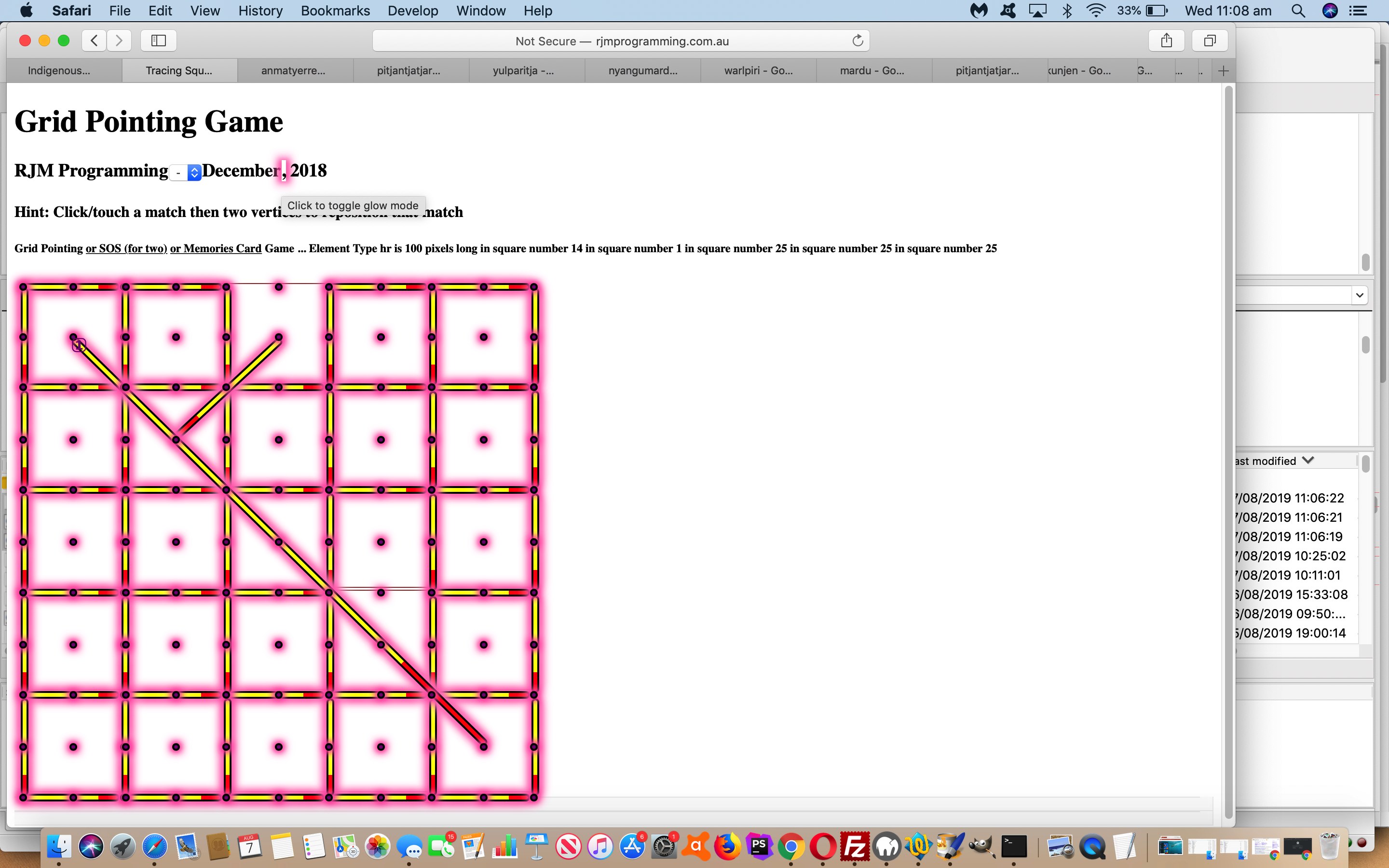
There is another graphical idea we’d like to add some (W3School’s glowing text inspired) “glow” to, like in the spirit of yesterday’s Image Map with Overlay SVG Glowing Polygon Tutorial, but this time, we want it as a user controllable quality, as we realize sometimes people don’t want “glow” in their faces (… but then there’s …)
That (user controllable CSS via Javascript DOM into HTML div) concept involves …
- hr (horizontal rule)
- div (that are CSS transformed) … picking up where we left off with the web application sections of the HTML Square Horizontal Rule Image Map Notice Board Tutorial web application … combined with …
- static CSS animation keyframe arrangements involving box-shadow …
/* Thanks to https://www.w3schools.com/howto/tryit.asp?filename=tryhow_css_glowing_text */


@-webkit-keyframes glow {

  from {

    box-shadow: 0 0 3px #fff, 0 0 5px #fff, 0 0 37px #e60073, 0 0 9px #e60073, 0 0 11px #e60073, 0 0 13px #e60073, 0 0 15px #e60073;

  }


  to {

    box-shadow: 0 0 24px #fff, 0 0 6px #ff4da6, 0 0 8px #ff4da6, 0 0 10px #ff4da6, 0 0 12px #ff4da6, 0 0 14px #ff4da6, 0 0 16px #ff4da6;

  }

}
… that with the “glow” work up to now has been combined with static CSS “call that keyframes animation” … but not today … where we add one more static HTML div at the end of the <body></body> section of the webpage as per …
<div id=dstyle></div>

</body>
… with our HTML and Javascript means by which “glow control” goes back to the user (optionally) via … - dynamic CSS (because CSS is incredibly useful as a dynamically added “tool” statically before document.body onload within the <head></head> section or dynamically via Javascript DOM into the <body></body> section of the webpage …
- within <head></head> webpage section we introduce a new global variable …
var doglow=true; // default to "glow mode is yes" after 5 seconds showing non-glow mode implications
- added to static text “,” of an H3 header element to change this way in HTML …
<h3 id=myh3>RJM Programming - December<a class="glow" onclick="doglow=!doglow; if (!doglow) { this.className='xglow'; } else { this.className='glow'; } glowit(); " style="cursor:pointer;text-decoration:none;" title="Click to toggle glow mode">,</a> 2018<span id=debug></span></h3>
- … which starts as “glowing” to attract the user’s attention to it, though the user has 5 seconds of time not to see this “glow” applied to the application the user is accessing via document.body onload HTML …
<body onload=' draw_hrs(); '>
- … that Javascript function “draw_hrs()” changing at its top to add in that 5 second delay (after document.body onload) logic …
function draw_hrs() {

  setTimeout(glowit, 5000);

  // Rest of "draw_hrs" document.body onload logic follows ...

  // ...

  // End of rest of "draw_hrs" document.body onload logic

}
- … calling that Javascript function “glowit()” which has the dual purpose of being what’s called when the user takes control to click/touch the “,” to toggle “glow mode” for the application section at hand …
  function glowit() {

    if (doglow) {

      document.getElementById('dstyle').innerHTML='<style> hr, .glow, div.vertical { -webkit-animation: glow 1s ease-in-out infinite alternate;  -moz-animation: glow 1s ease-in-out infinite alternate; animation: glow 1s ease-in-out infinite alternate;  } </style>';

    } else {

      document.getElementById('dstyle').innerHTML='';

    }

  }
- within <head></head> webpage section we introduce a new global variable …
The changed square_hr_tracing.htm can glow for you too.
Previous relevant Image Map with Overlay SVG Glowing Polygon Tutorial is shown below.
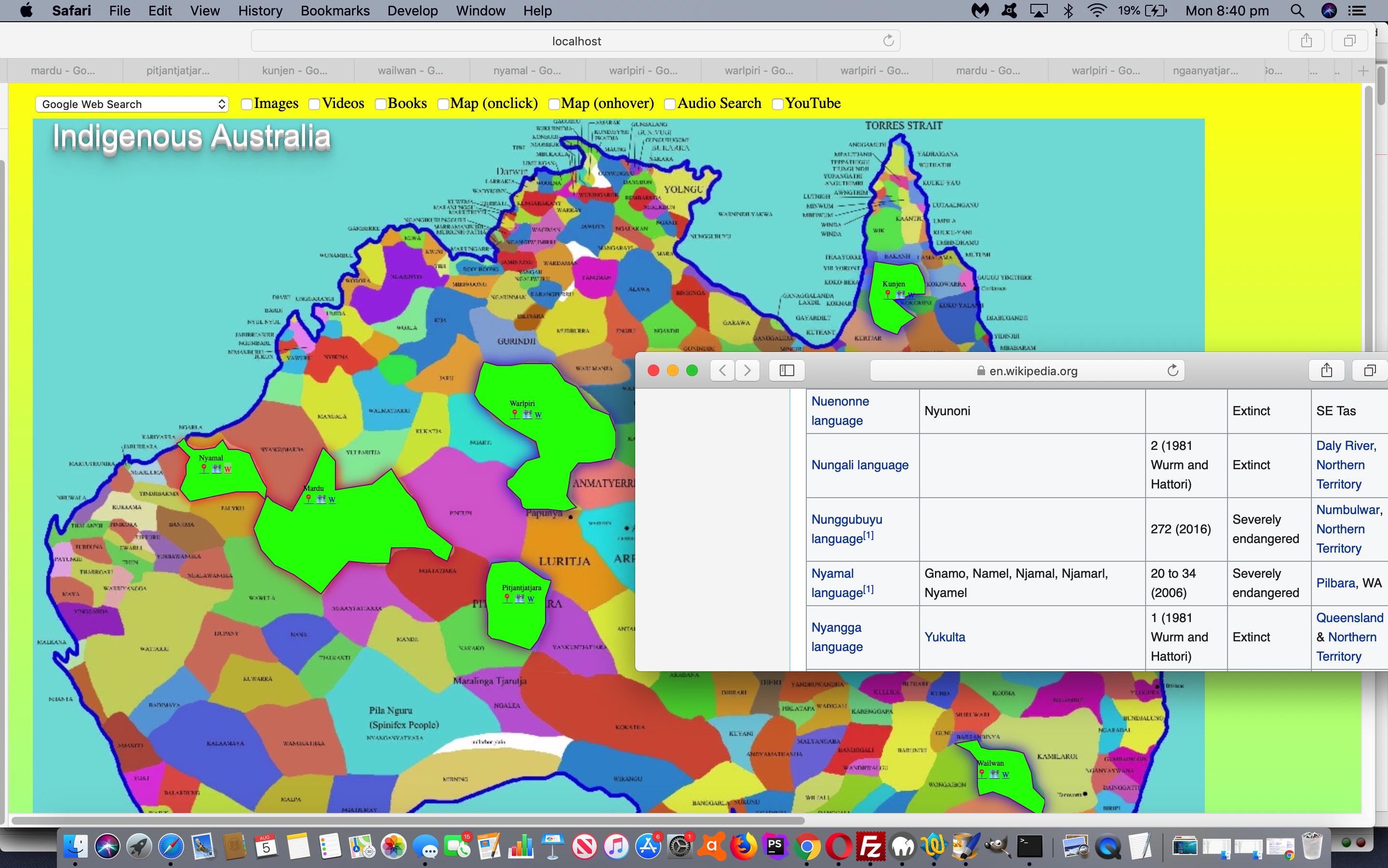
In the “glowing” CSS styling work we’ve been talking about recently, as with yesterday’s Multiple Choice Quiz with Glowing Box Tutorial “Glowing Box”, today we have for you …
- HTML image map element … with …
- area shape=”poly” (polygon) elements (that represent approximate coverage for Australian Indigenous Language areas in Australia) … overlaid by …
- SVG polygon elements (that come into play when an area element is clicked/touched … all old news you can read from Australian Indigenous Language SVG Overlay Tutorial … but new today we add …
- “Glowing Polygon” animated drop shadow (and thanks to this great link for help here) for that SVG polygon as per the new CSS styling …
<style>


/* Thanks to https://www.w3schools.com/howto/tryit.asp?filename=tryhow_css_glowing_text */


svg {

  font-size: 16px;

  color: #fff;

  text-align: center;

  -webkit-animation: glow 1s ease-in-out infinite alternate;

  -moz-animation: glow 1s ease-in-out infinite alternate;

  animation: glow 1s ease-in-out infinite alternate;

  color: black;

  -webkit-filter: drop-shadow(0 0 5px red);

  filter: drop-shadow(0 0 5px red);

}


@-webkit-keyframes glow {

    0% { -webkit-filter: drop-shadow(0 0 5px red); filter: drop-shadow(0 0 5px red); }

    100% { -webkit-filter: drop-shadow(0 0 8px blue); filter: drop-shadow(0 0 8px blue); }

}

</style>
… an effect quite eye-catching as you click/touch in a language region to find out more.
Perhaps you want to use this changed HTML and Javascript and CSS aboriginal_language_regions.html image map live run link to see how this plays out in actuality, or to explore a little into the oldest continuous culture on this planet?
Previous relevant Multiple Choice Quiz with Glowing Box Tutorial is shown below.
We’re going from “Glowing Text” ideas below, with HTML5 Mark Tag with Glowing Text Tutorial, to “Glowing Box” ideas, starting today, that we apply in the context of a Multiple Choice Quiz.
As far as online quizzes go, don’t know if you agree, but we think our best chance to remember our learning is, particularly regarding incorrect (quiz) answers, to either …
- trap the user with a correct answer with a Javascript popup (eg. alert) window, awaiting the press of a button … and/or …
- really “in your face” highlighting of the correct answer (particularly in the case of a multiple choice scenario) with attention grabbing (CSS) styling
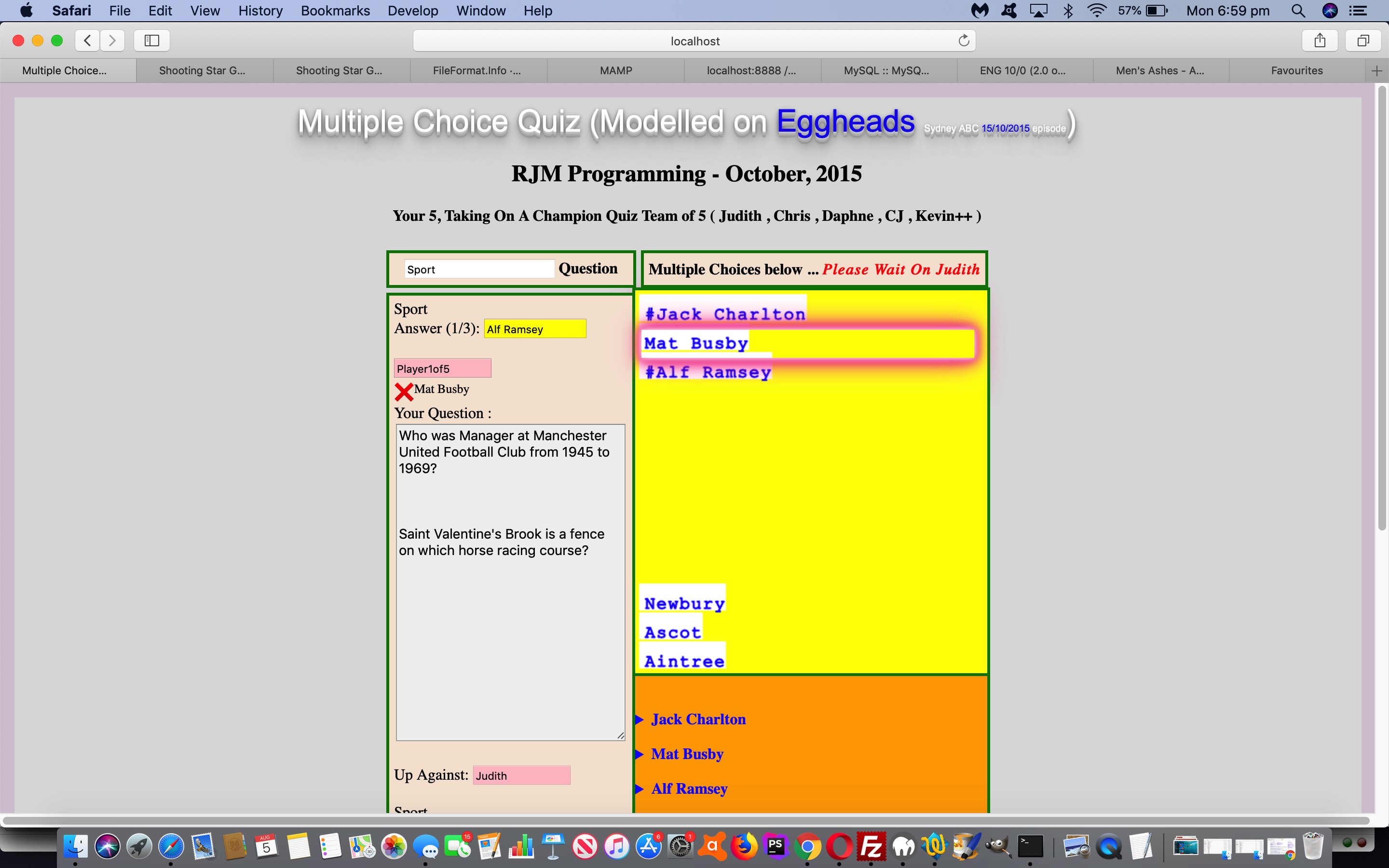
… and so, for the latter, we queue the new “Glowing Box” (CSS) styling, which (to us) is the same as the (brilliant CSS W3schools glowing text idea) “Glowing Text” styling except where you had “text-shadow” in the keyframes section (for “Glowing Text”) we use “box-shadow” in that same keyframes section (for “Glowing Box”). We add this onto our previous efforts with HTML/Javascript Multiple Choice Quiz Reveal Tutorial.
With the changed multiple_choice_quiz.html live run link, you can try out the new CSS “Glowing Box”, as per …
<style>


/* Thanks to https://www.w3schools.com/howto/tryit.asp?filename=tryhow_css_glowing_text */


.glow {

  font-size: 16px;

  color: #fff;

  text-align: center;

  -webkit-animation: glow 1s ease-in-out infinite alternate;

  -moz-animation: glow 1s ease-in-out infinite alternate;

  animation: glow 1s ease-in-out infinite alternate;

  color: black;

}


@-webkit-keyframes glow {

  from {

    box-shadow: 0 0 3px #fff, 0 0 5px #fff, 0 0 37px #e60073, 0 0 9px #e60073, 0 0 11px #e60073, 0 0 13px #e60073, 0 0 15px #e60073;

  }


  to {

    box-shadow: 0 0 24px #fff, 0 0 6px #ff4da6, 0 0 8px #ff4da6, 0 0 10px #ff4da6, 0 0 12px #ff4da6, 0 0 14px #ff4da6, 0 0 16px #ff4da6;

  }

}

</style>
… overlaying correct Multiple Choice (set) answers with a very compelling (div “box” 3D looking) display.
Previous relevant HTML5 Mark Tag with Glowing Text Tutorial is shown below.
To get the background to our attention seeking “mark” tag “glowing text” application please read …
- HTML5 Mark Tag Div Contenteditable Tutorial … along with …
- Glowing Text Validation Primer Tutorial‘s thread of blog postings below inspired by the CSS brilliance of W3School’s glowing text idea
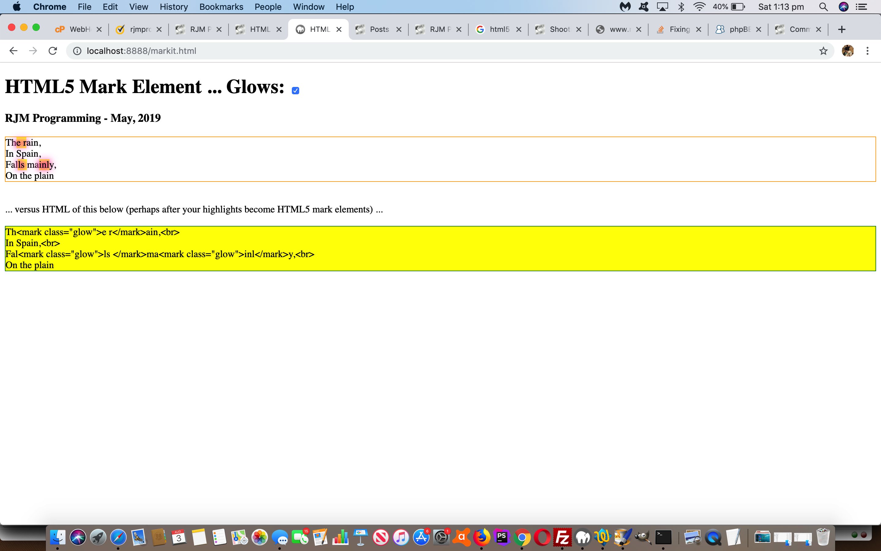
… today’s use quite apt for this “mark” tag’s text highlighting talent. It’s default highlighting is a strong yellow background colour, but you can apply this “glowing text” CSS class to achieve a more “in your face result”, which you can try (the changed markit.html‘s) live run link … or below …
… yourself, to see what the effect is of “mark highlighting” and “glowing text”.
Previous relevant Glowing Text Validation Primer Tutorial is shown below.
Yesterday’s application of the use of CSS brilliance of W3School’s glowing text idea with Shooting Star Game Primer Tutorial was just one idea regarding the use of glowing text. What about using it with form validation?
Yes, that’s “a goer” … see, even the pamplettes are nodding. The reason, of course, is that glowing text is a mechanism whereby you can grab the attention of even the most blasé of online users. And especially if the field you are “form validating” is mission critical, this could be a good ploy.
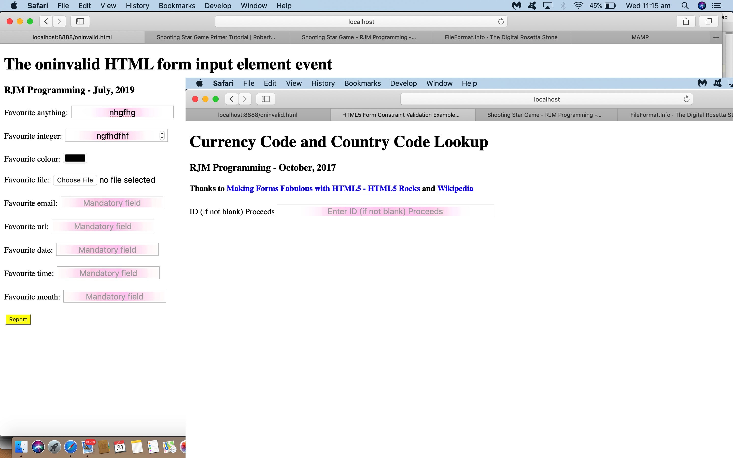
See how we apply this (by making mistakes filling in the forms) with …
- the changed html5_form_constraint_validation.html‘s live run as featured on HTML5 Form API Validation Revisit Tutorial
- the changed oninvalid.html live run as featured on HTML Oninvalid Event Form Validation Primer Tutorial
Previous relevant Shooting Star Game Primer Tutorial is shown below.
We’ve got one of those pretty simple “click ’em up” games for you today, inspired by the CSS brilliance of W3School’s glowing text idea, thanks.
That set us to thinking of Emojis we could apply (in front of the great background ideas derived from this advice) and looked up Emojipedia (is good for looking up Emoji names or concepts in words) and onto FileFormat Information (is great for HTML Entity determinations for your less complex Emojis) and even Iemoji (is great for HTML Entity determinations for Emojis of all complexities) to determine some components to our game, those being …
- 🌟 … star
- ☄️ … comet
- 🌕 … moon
… which, in turn, led to thoughts regarding a game …
- for one player
- that rewards fast reflexes … and …
- scores via onclick event logic on each component
- according to levels of difficulty … and …
- lessens the score for “blazing away” clicks (or touches) … for that, if a player score is (made up of) score/goes then “goes” is incremented by any document.body onclick event during the game
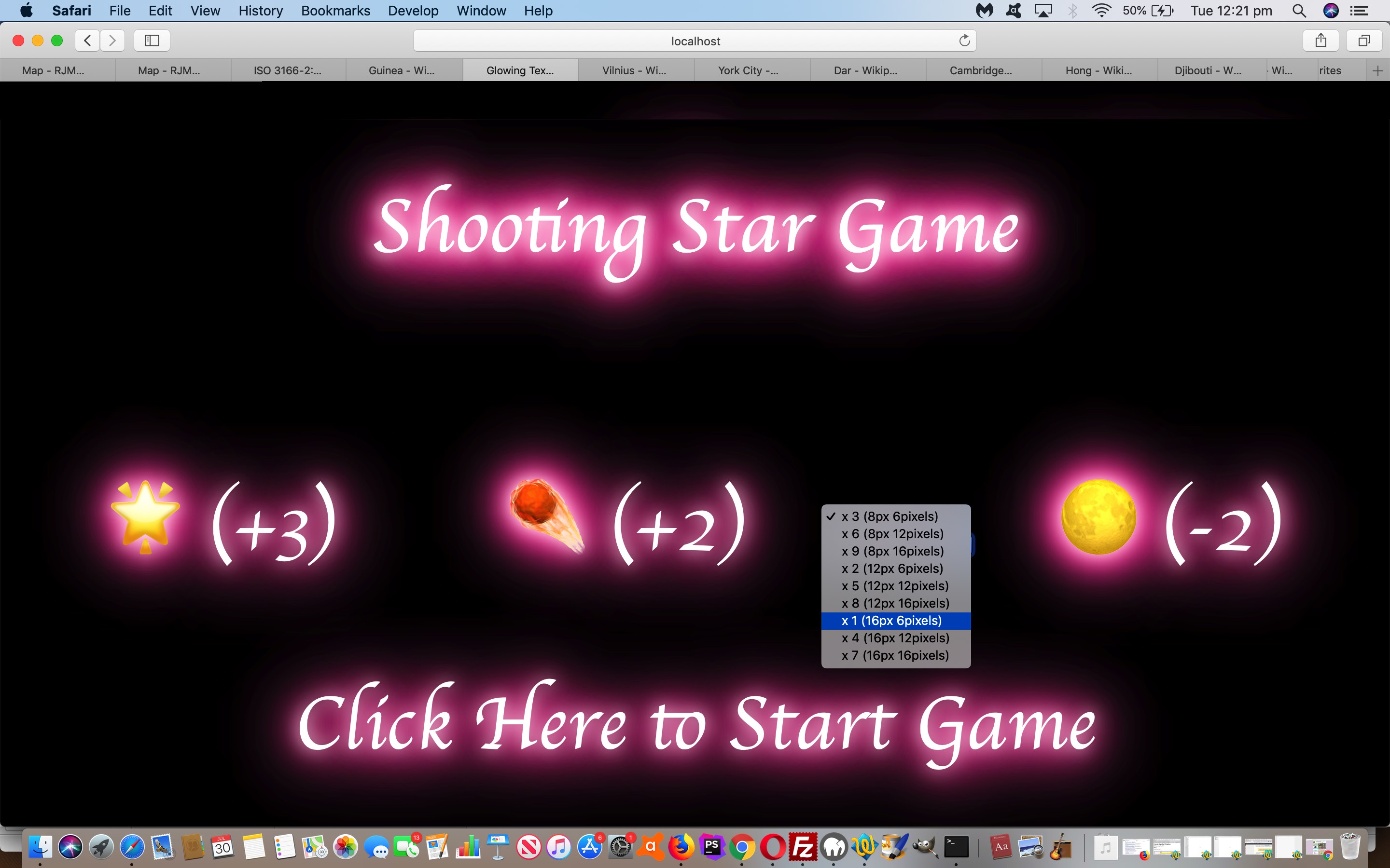
Levels of difficulty … pour quoi? Well, we can change the …
- Emoji font-size … and/or …
- Movement potential of emoji (in pixels) in any “setTimeout(movecomponents, 100);” 1/10th of a second call cycle
Have a go of today’s shooting_star_game.html game if you like, to see this in action.
If this was interesting you may be interested in this too.
If this was interesting you may be interested in this too.
If this was interesting you may be interested in this too.
If this was interesting you may be interested in this too.
If this was interesting you may be interested in this too.
If this was interesting you may be interested in this too.
If this was interesting you may be interested in this too.
