
HTML/Javascript Monthly Temperature Comparisons Tutorial
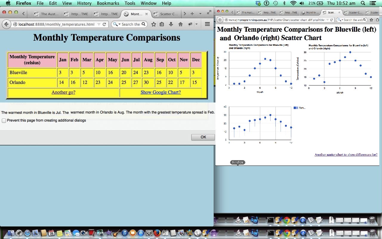
Here is a tutorial showing some client-side basics in HTML and Javascript that helps with a tabular display of Monthly Temperature Comparisons. The inspiration for this came from a Yahoo Answers question here, so thanks a lot.
Link to some downloadable HTML programming code … rename to monthly_temperatures.html
Guess most of the work for such a tutorial is the way to organise the look of the display of the table as it dynamically gets populated and the functional thought of linking it to a Google Chart Scatter Chart Difference scenario, for some optional visual appeal, as was also done in HTML/Javascript Visual Change Drop Punt Game Tutorial.
If this was interesting you may be interested in this too.



I like the single-row radio-play approach for keeping the controls compact while still making each selection clear. When I’m checking a calculation alongside a tutorial, I use StepStat to see the intermediate steps; how do you handle the layout when the playlist gets much longer?