The job of making web pages mobile friendly can be approached from a few different angles, and is a job that definitely benefits from having a good set of tools and “tool combinations”.
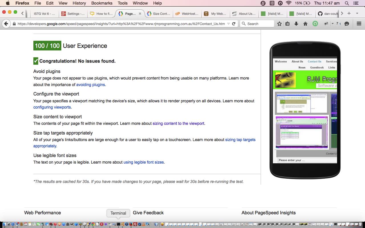
Say “tool combinations” because have found the Google PageSpeed Insight tool at this webpage, combined with Firefox and its Firebug add-on, a really powerful combination.
The Google PageSpeed Insight tools not only measure a webpage’s speed but can also give a report on the Mobile (or Desktop, for that matter) friendliness of that webpage, giving a score out of 100.
This also serves as an independent view of your webpage, without you falling into the trap of being too optimistic … though a bit of optimism can be a good thing … doh!
So that’s the plan, and today we put this plan to use on this domain’s “landing page” and its cohorts, which are all written in HTML/Javascript/CSS, and which use an iWeb (by Apple) theme, so am thinking some of the observations may be directly useful for some webmasters out there, perhaps?! We talked about iWeb with iWeb Primer Tutorial.
At first we tried a CSS and “meta tag viewport”, only, approach to the improvements, but it ended up being better to use Javascript as a solution mechanism. So we created some “onload” event code for each of these webpages as below …
function widthfix() {  //

 if (navigator.userAgent.match(/Android|BlackBerry|iPhone|iPod|Opera Mini|IEMobile/i)) { // it is a mobile device

   document.getElementById('body_content').style.width='100%';

   document.getElementById('nav_layer').style.width='100%';

   document.getElementById('widget0').style.width='100%';

 }

}
Please feel free to visit the www.rjmprogramming.com.au landing page, and its six friends, preferably on a mobile phone, to hopefully try the improved user experience for yourself.
Stop Press
The ideas above got a tweak in October, 2019 which you can read about on Responsive Design Viewport Width Considerations Tutorial from 12th October, 2019.
If this was interesting you may be interested in this too.


