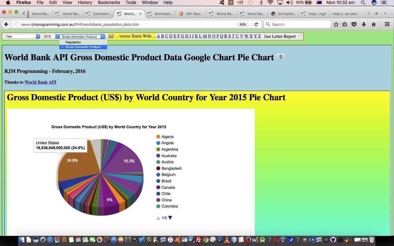
We’ve changed onion types today in our quest for the ultimate “onion of the 4th dimension” concept this project, that being our … oops, the goalposts have shifted … web application project “Worldbank API World Country Population Report Project” where we extend the “scope” of the “indicators” we can report on to those we presented yesterday with Worldbank API World Country Population Period Tutorial, those being the original …
- Population … and today we add to that, the World Bank “indicator” …
- Gross Domestic Product
… and here you may have sneaked a peek below to see that …
- nothing codewise has been added to in terms of “pieces of code” … we thank the excellence of (the organization of the) Worldbank API for this, as the form of the GDP data is not enough different to that of the Population data to warrant us thinking that we needed to change anything other than versions … and …
- nothing codewise has been renamed in terms of “pieces of code” … and that is us … we’re not embarrassed that a “guinea pig” for an idea gets extended into a bigger picture … so long as “Worldbank” is there in the name somewhere
This “guinea pig” method of extending a project has its advantages and disadvantages as most methods of doing things (inherently) have (their own) advantages and disadvantages. The “guinea pig” approach may suffer if things become complex later when you try to fit in another “extended” concept that is a bit of a “square hole” being forced into our “round socket” … (😄💖🔴). Conversely, if things stay simple enough, why not use methods like …
- plugging in a programmatic “variable” where once there was a “hardcoding” … and …
- plugging in (the equivalent of) an HTML select element “dropdown” where once there was a titular piece of text
… to keep on pushing out the “onion” types … we know you’re out there … come an’ show us the cut of your jib!
Yet again, both “parent” HTML and “child” PHP changed today for the new extended “indicator” reporting (adding GDP to pre-existing Population indicator(s)), so that …
- “parent” supervisory web application has HTML (and Javascript and CSS) you could call worldbank_population_data.htm changed in this way
- “child” supervised you could call worldbank_population_data.php changed in this way
And yet again, we would welcome you trying this web application for yourself to try out this new “layer” of functionality “positioning”.
Previous relevant Worldbank API World Country Population Period Tutorial is shown below.
Yesterday’s Worldbank API World Country Population Trend Tutorial started us on the topic of “trends” with data and our Google Chart Pie Chart Differences representation of Worldbank API derived data took the form of the first of …
- snapshot (of two different snapshotted times) … but today we turn our attention to …
- period of time (of several regular snapshotted times)
… and for the purposes of this latter “chart” reporting we like, around here, still talking in terms of Google Charts, in order of our opinion “regarding quality of reporting purpose” with regard to this Worldbank API Population data reporting …
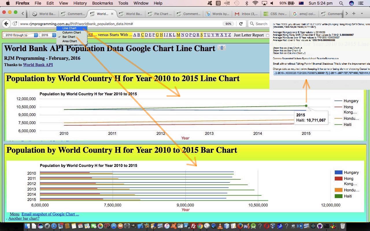
- Line Chart
- Column Chart
- Bar Chart
- Area Chart
… all Google Chart “types” looking for the same basic form of data, the hint, in the first place, why we associate these all together with that new period of time reporting options we’ve integrated into the web application at the “parent” HTML supervisor level by, for every new option from yesterday of the form [year] compared to in that top lefthand HTML select element “dropdown”, we also add in an associated [year] through to “dropdown” option which, if selected, will present the user with the opportunity to select the type of Google Chart they’d like to see from the list of four chart types as described above.
Again, both “parent” HTML and “child” PHP changed today for that period of time concept of reporting, so that …
- “parent” supervisory web application has HTML (and Javascript and CSS) you could call worldbank_population_data.htm changed in this way
- “child” supervised you could call worldbank_population_data.php changed in this way
And again, we would welcome you trying this web application for yourself, to get this into perspective regarding perhaps, your own opinions about the pros and cons, strengths and weaknesses of the various very useful Google Chart ideas we appreciate for those reporting tasks, helping support the adage “every picture is worth a thousand words”.
Previous relevant Worldbank API World Country Population Trend Tutorial is shown below.
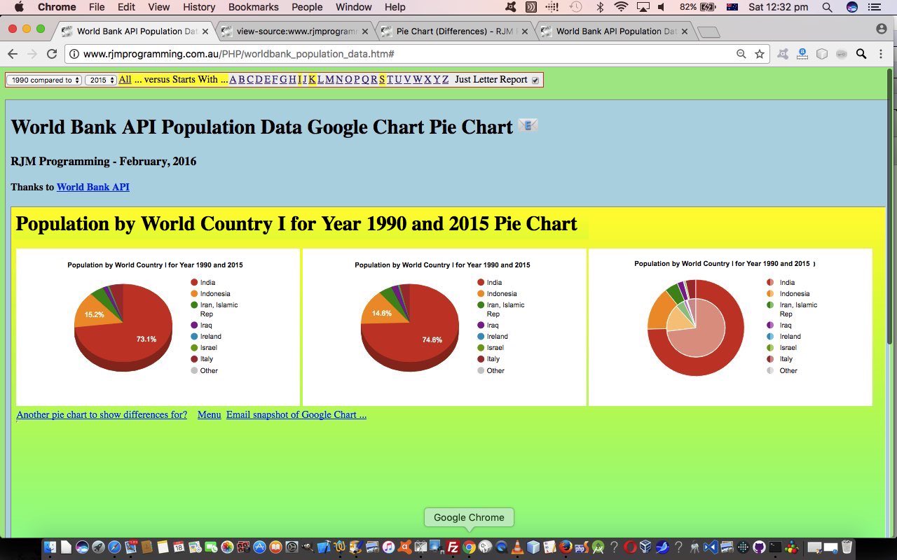
The “onion of the 4th dimension” way to go (after yesterday’s Worldbank API World Country Population Report Tutorial as shown below) for our latest web application project “Worldbank API World Country Population” we like is to now start thinking of a means to show “trends” in population. With this in mind there is a ready made Google Chart Pie Chart Differences to help here. With the Google Chart Pie Chart Differences we’ll supply two different years worth of data, and the cleverness of this Google Chart product is called into play to show three Pie Charts, namely …
- original year’s Pie Chart Worldbank API data
- “compared to” year‘s Pie Chart data
- a Google Chart Pie Chart Differences “trend” Pie Chart showing an “inner ring” Pie Chart within an “outer ring” Pie Chart where you can get a sense of “trends” that are taking place
… that is manifested in the “parent” HTML code by changing the previous hardcoded “Year” word with an HTML select element “dropdown” element to define that optional second “compared to” year of interest.
The other new functionality today is a “share” via Email emoji (HTML a link “button”) that latches on to the user’s Email client program via Middle Word Share Tutorial‘s approach, namely …
mailto:[emailAddress]?subject=[Subject]&body=[URLtoLinkTo] type of href property (on that link). As you can imagine, it is possible to piece together a Javascript encodeURIComponent() version of [URLtoLinkTo] value via the current webpage’s document.URL
… the curious variation being that we don’t think of the “parent” HTML’s document.URL here (in blurb above), but, rather, it is more useful to consider the “child” HTML iframe element PHP’s document.URL both as an easier to code concept, and the simplifier of “length of data” GET vs POST HTML form element originated data issues. You see, if your data getting to the Pie Chart is over a certain length, it will be POSTed and you would lose the opportunity to Email this (in that mailto: email client program way), because you rely on real GET method URLs for this approach. At the “view” of the middle “child” PHP, though, it gets its calls, always, in a GET URL way, so it is, counterintuitively, the best (and simplest) place to intervene and code for this Email “share” functionality.
Both “parent” HTML and “child” PHP changed today, so that …
- “parent” supervisory web application has HTML (and Javascript and CSS) you could call worldbank_population_data.html changed in this way
- “child” supervised you could call worldbank_population_data.php changed in this way
We would welcome you trying this web application for yourself, to get this into perspective.
Previous relevant Worldbank API World Country Population Report Tutorial is shown below.
In yesterday’s Worldbank API World Country Population Primer Tutorial, as shown below, we noted …
the data is presented in some way shape or form with the Pie Chart, but for all the advantages of lots of information in the one place, it does suffer a bit with clutter
… and today we show some practical strategies to be more clear (less cluttered) with the data, should the user, optionally, be interested, here.
In practical terms, we built a supervisory HTML “parent” you could call worldbank_population_data.html (with this new live run link) on top of yesterday’s “duck with the legs moving fast” hard working “child” HTML iframe element housed PHP worldbank_population_data.php (changed this way to accomodate this move).
If you had to break up a huge chunk of Worldbank API data related to World Countries and their Population, what would you research as an idea to do this? No doubt a lot of people would agree with how we approach it, that being …
report via a "starting with" alphabetic criteria
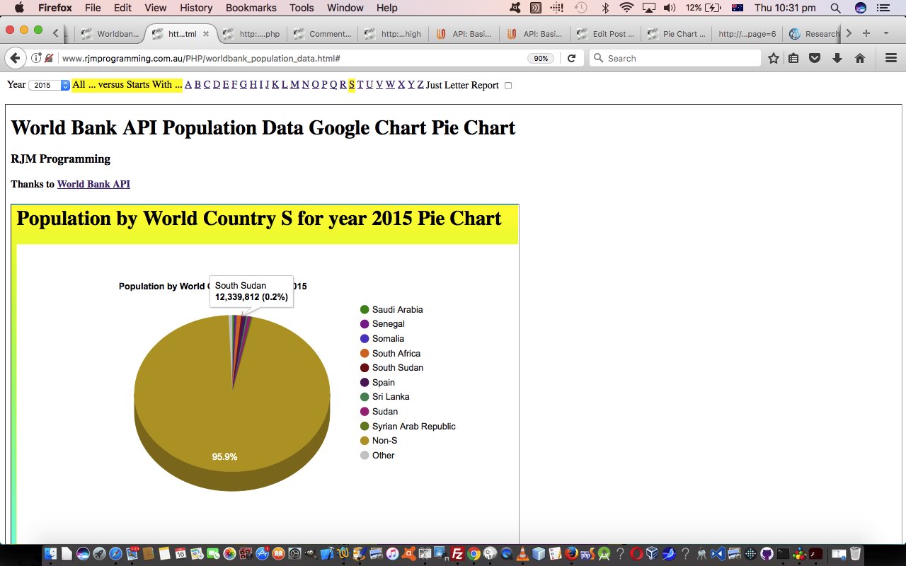
Makes sense? We hope so, and we’ll also ask for a Year of interest, with the caveat that we should offer the user the “absolute thinking” that would say if you are doing a report on …
Population by World Country A for year 2015
… for example, you should offer the user to show Pie Charts for the two scenarios below …
- World Country A Populations compared to each other … or …
- World Country A Populations compared to each other and a Non-A Population entry (which totals all non-A country populations)
We could present these functionality options in an HTML select element “dropdown”, but we think today, we’ll use a top menu of HTML a links to interface to the user of this “parent” supervisory web application we welcome you to try out for yourself.
Previous relevant Worldbank API World Country Population Primer Tutorial is shown below.
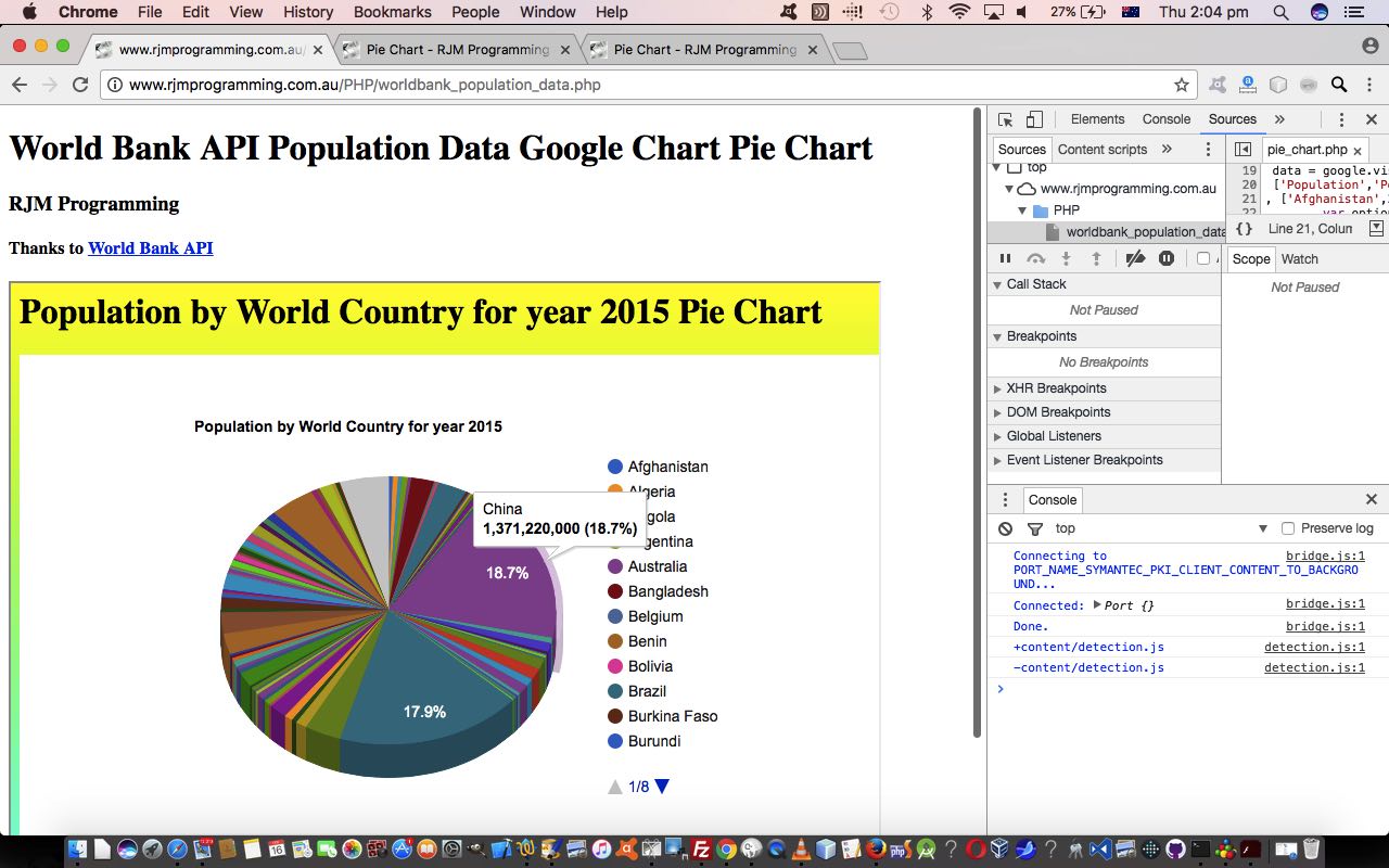
Today we’re revisiting the absolutely astonishing resource that the Worldbank API website provides. Such free public sources of data are very much appreciated in our books. Not so much in our pamphlets, but definitely in the books. Revisiting we thought, perhaps, we heard you ask … or were you passing wind? Glad you asked. Remember when we presented PHP Worldbank Growth of Merchandise Trade Tutorial, as shown below? Then, we used Google Chart Bubble Chart to present reams of information. Today, we again broach “reams” of Wordbank Population data per country to present a Google Chart Pie Chart report.
On our “first draft” of this web application project we create just the one pie chart, but we do that, along the way showing you a couple of things …
- the “reams” of data is processed on the understanding it could be sent to an HTML iframe as a URL plonked into that iframe element’s src property (as if), or if that URL is too long then that data is plugged into the HTML form and then sent (POSTed) to that same HTML iframe (whose name is the same as the form element’s target=name) via an HTML form element whose action property is set to …
//www.rjmprogramming.com.au/PHP/PieChart/pie_chart.php
- the data is presented in some way shape or form with the Pie Chart, but for all the advantages of lots of information in the one place, it does suffer a bit with clutter
… and so we try some strategies to help with those clutter issues above in blog postings to come.
In the meantime, why not try a live run of the underlying PHP (serverside) web application you could call worldbank_population_data.php featuring …
- use of PHP file_get_contents() to extract …
- JSON data is extracted and parsed to help piece together that URL to the Google Chart Pie Chart, as mentioned way above
Previous relevant PHP Worldbank Growth of Merchandise Trade Tutorial is shown below.
We’ve said it before, and (no doubt) we’ll say it again … there are great public data sources out there for you to explore.
As far as international data goes the Worldbank series of statistics is great, so, thanks.
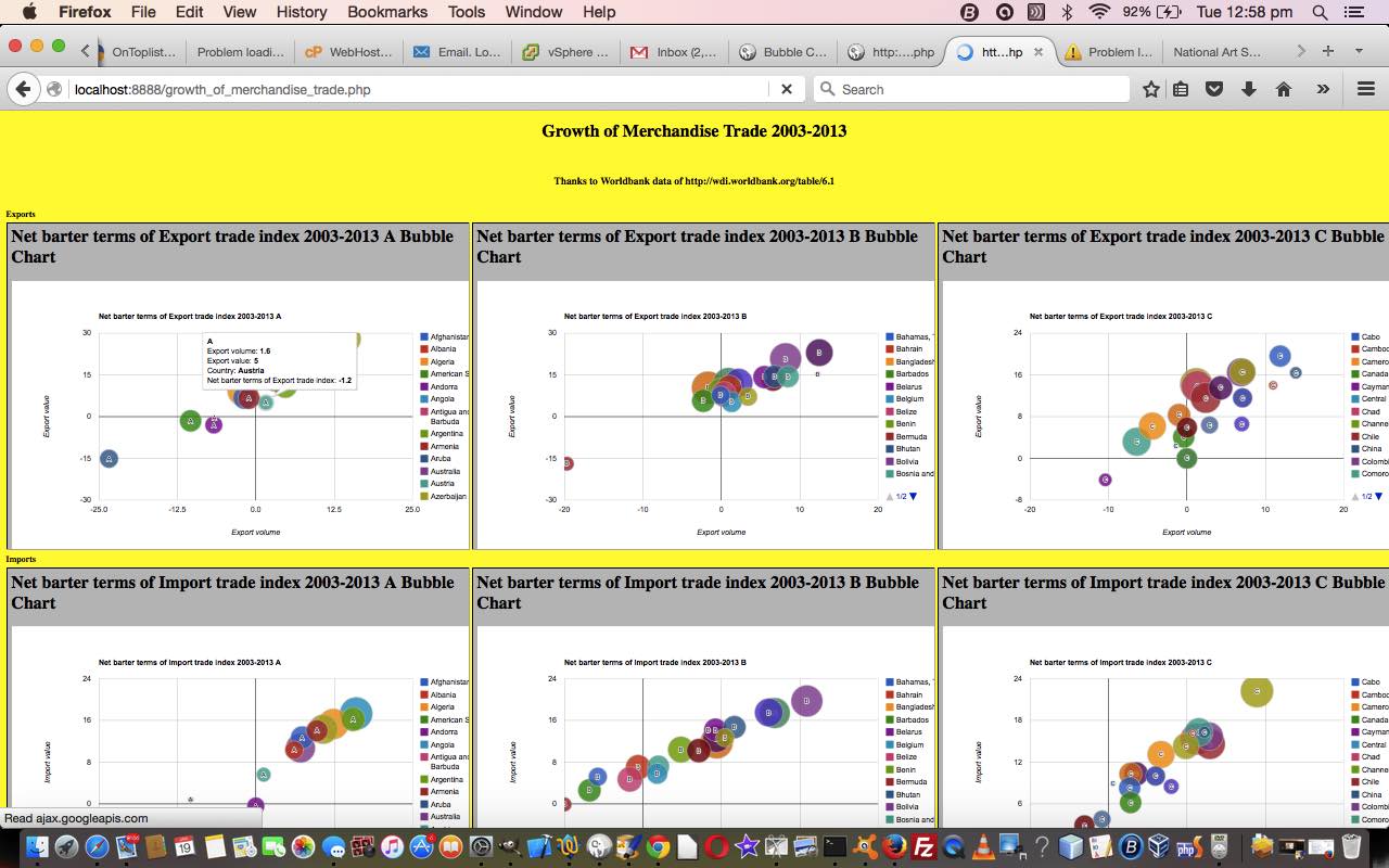
Today we combine the Worldbank data for Growth of Merchandise Trade 2003-2013 with the wonderful Google Chart Bubble Chart to create (52 = (first letters of country name) 26 x 2 (concepts: Exports and Imports)) reporting charts of interest, we hope. Again, as with any reporting subject, it is a personal thing, whether the subject matter of a report is of interest, but you could say that about so many things in life.
So, we offer some PHP source code you could call growth_of_merchandise_trade.php and a live run link as well, the full loading of which requires patience.
Stop Press
Tomorrow we go over what was needed to change PHP code above to be more mobile friendly …
- growth_of_merchandise_trade.php changes (to cater for select event (mobile touch) functionality) and live run link for yesterday’s web application
If this was interesting you may be interested in this too.
If this was interesting you may be interested in this too.
If this was interesting you may be interested in this too.
If this was interesting you may be interested in this too.
If this was interesting you may be interested in this too.
If this was interesting you may be interested in this too.

