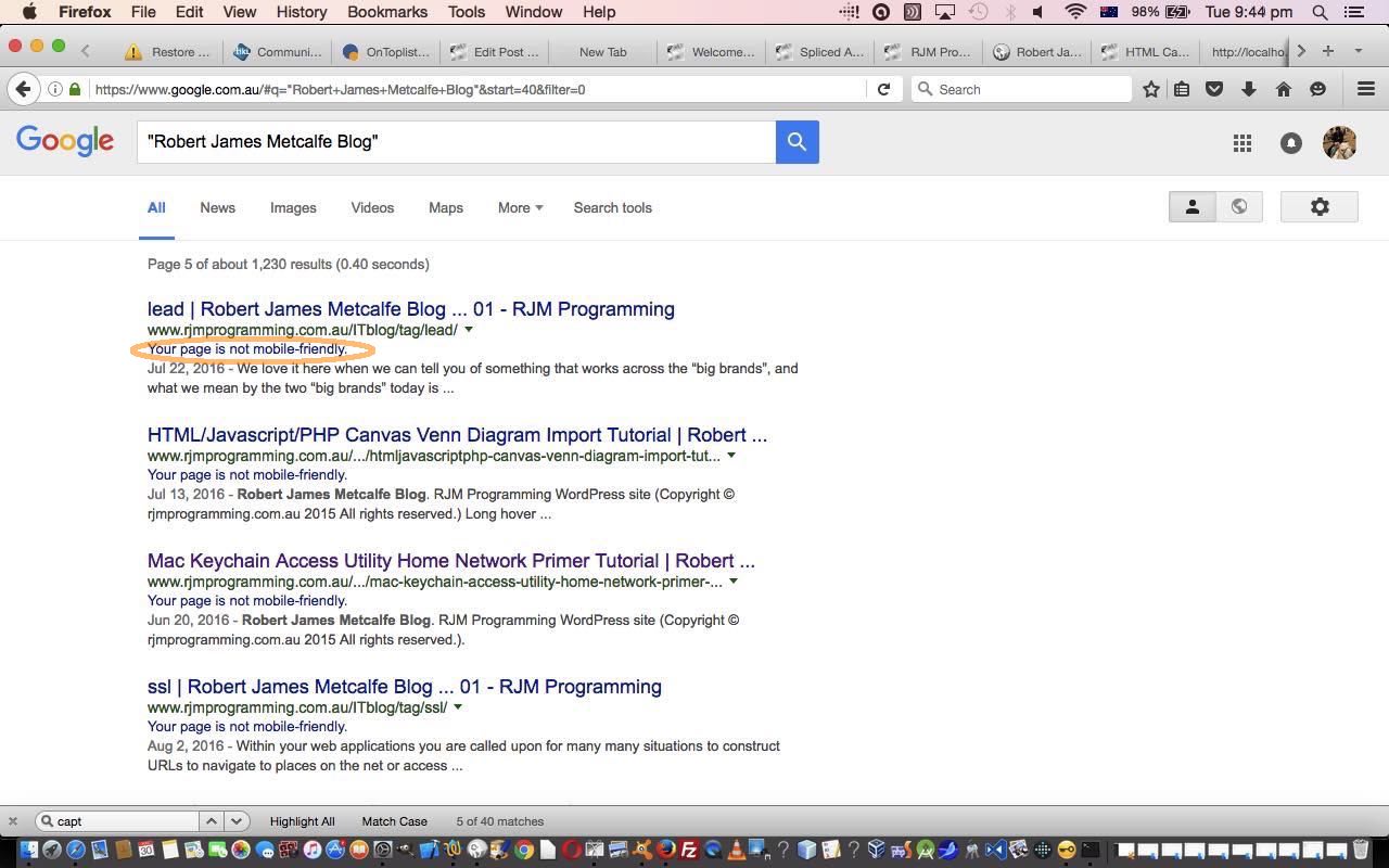
Earlier on, we talked about making the Landing Pages here at RJM Programming mobile friendly, being as this is becoming an increasingly important Search Engine Optimization issue, when we presented Google Search Engine Mobile Friendly Tester Tutorial. Today we set our sights on making our WordPress Blog here mobile friendly, being as we see the Google Search engine saying the pages were not … chortle (ahead of time), chortle … “upwardly mobile” …

A difference today, and we’ve talked about this other Google functionality before when we presented the thread of blog postings finishing with Google Page Speed Image Optimization Follow Up Tutorial, is that the combination of …
- Google “Developers” Page Speed functionality … is pointed to, and recommended by me to follow, by … “Pagespeed Insights” (and its great “Show how to fix” links) … which we needed to be goaded to use, because it initially sounded a bit irrelevant (to us at least) … but glad we did … from …
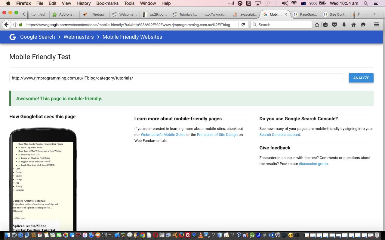
- Google “Webmasters” Mobile Friendly tester that is your entry point to all this from the Google Search engine “Your page is not mobile-friendly.” link
So that’s how we test “how are we going” with making the WordPress Blog mobile friendly. But how do we get to a point where we are in a position to be tweaking for a mobile website look that can be “tweaked” within Google’s mobile friendly test assessment as “success”.
Well, there is, amongst others, ideas such as …
- apply Responsive Design principles to your current WordPress theme, which is the TwentyTen theme around these parts … or …
- use a WordPress plugin like Any Mobile Theme Switcher by Dinesh Karki … which appears great for WordPress 3.5 and above … read here for more on that here (as a user of WordPress below 3.5 and receiving the error “Fatal error: Call to undefined function wp_get_theme()” activating the “Any Mobile Theme Switcher” plugin) … or, what we ended up going down the path of is …
- chip away at a WordPress TwentyTen theme “engine” that calls a TwentyFifteen theme “stylesheet” (which speaks “mobilish” quite well) for the smaller width mobile devices only, and adjust that TwentyFifteen theme “stylesheet”
Surprising as it may seem, the last one gets you to a useful “tweakable” scenario, we think, here, and we get to keep the TwentyTen theme customisations, and ob_start() speed consideration ideas we talked about with WordPress Blog PHP mod_deflate Speed Improvement Tutorial , though they don’t all work yet regarding some styling differences … but that’s what we mean by tweaking … and yet the Google search engine now gives these pages the tick of approval for mobile friendliness.
Where do you go to make this happen? You’ll never believe it? Go on! Guess away?! Yes, good ol’ header.php of the TwentyTen theme used to have a line of code like …
<link rel="stylesheet" type="text/css" media="all" href="<?php bloginfo( 'stylesheet_url' ); ?>" />
… that got changed to …
<link rel="stylesheet" type="text/css" media="all" href="<?php $iphone = strpos($_SERVER['HTTP_USER_AGENT'],'iPhone'); $android = strpos($_SERVER['HTTP_USER_AGENT'],'Android'); $blackberry = strpos($_SERVER['HTTP_USER_AGENT'],'BlackBerry'); $ipod = strpos($_SERVER['HTTP_USER_AGENT'],'iPod'); $ipad = strpos($_SERVER['HTTP_USER_AGENT'],'iPJUNKad'); if ($ipad || $iphone || $android || $ipod || $blackberry) { echo '//www.rjmprogramming.com.au/ITblog/wp-content/themes/twentyfifteen/style.css'; } else { bloginfo( 'stylesheet_url' ); } ?>" />
… to get us to the “green” via the Google PageSpeed recommendations (via Google Search’s “Your page is not mobile-friendly.” link to Google Mobile Friendly tester’s “Show how to fix” PageSpeed link’s …
The page content is 580 CSS pixels wide, but the viewport is only 411 CSS pixels wide.
… making me realize, in good ol’ TwentyTen theme’s header.php that …
if ($ipad || $iphone || $android || $ipod || $blackberry) { // thanks to //www.phpmysqlscript.com/2012/03/detecting-users-screen-size-and.html

      echo "\n #access .menu-header, div.menu, #colophon, #branding, #main, #wrapper { width: 580px; } \n"; // 470px; }

}
… should become …
if ($ipad || $iphone || $android || $ipod || $blackberry) { // thanks to //www.phpmysqlscript.com/2012/03/detecting-users-screen-size-and.html

      echo "\n #access .menu-header, div.menu, #colophon, #branding, #main, #wrapper { width: 411px; } \n"; // 580px // 470px; }

}
… so that …

… now to mull over the “putting”.
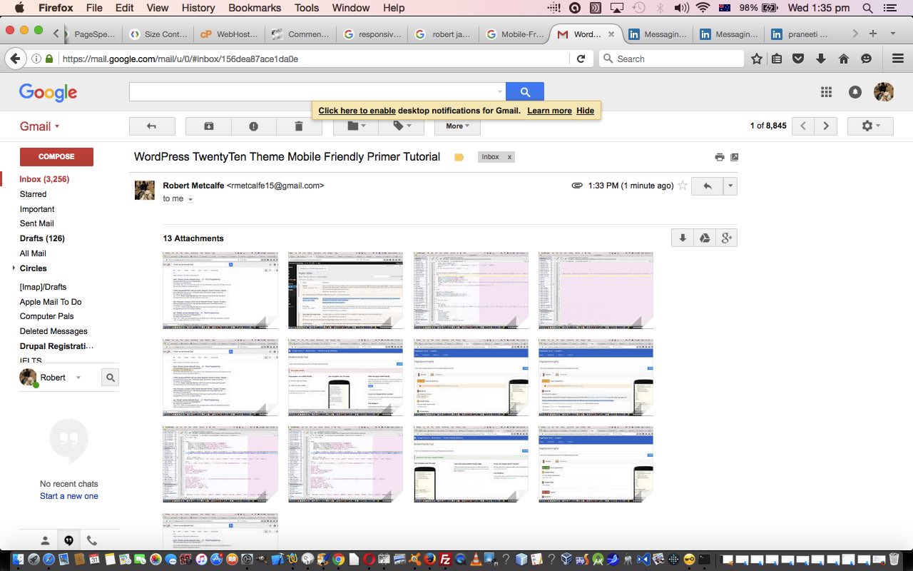
We’ll leave you with an animated GIF “stream of consciousness” presentation for you today regarding a lot of this thinking above, and hope it helps you out with ideas, yourself.
If this was interesting you may be interested in this too.


