As far as the practicalities of using the closely related Google Chart Line/Bar/Area/Column Charts goes …
- area_chart.php is PHP programming source code for this live run
- bar_chart.php is PHP programming source code for this live run
- column_chart.php is PHP programming source code for this live run
- line_chart.php is PHP programming source code for this live run
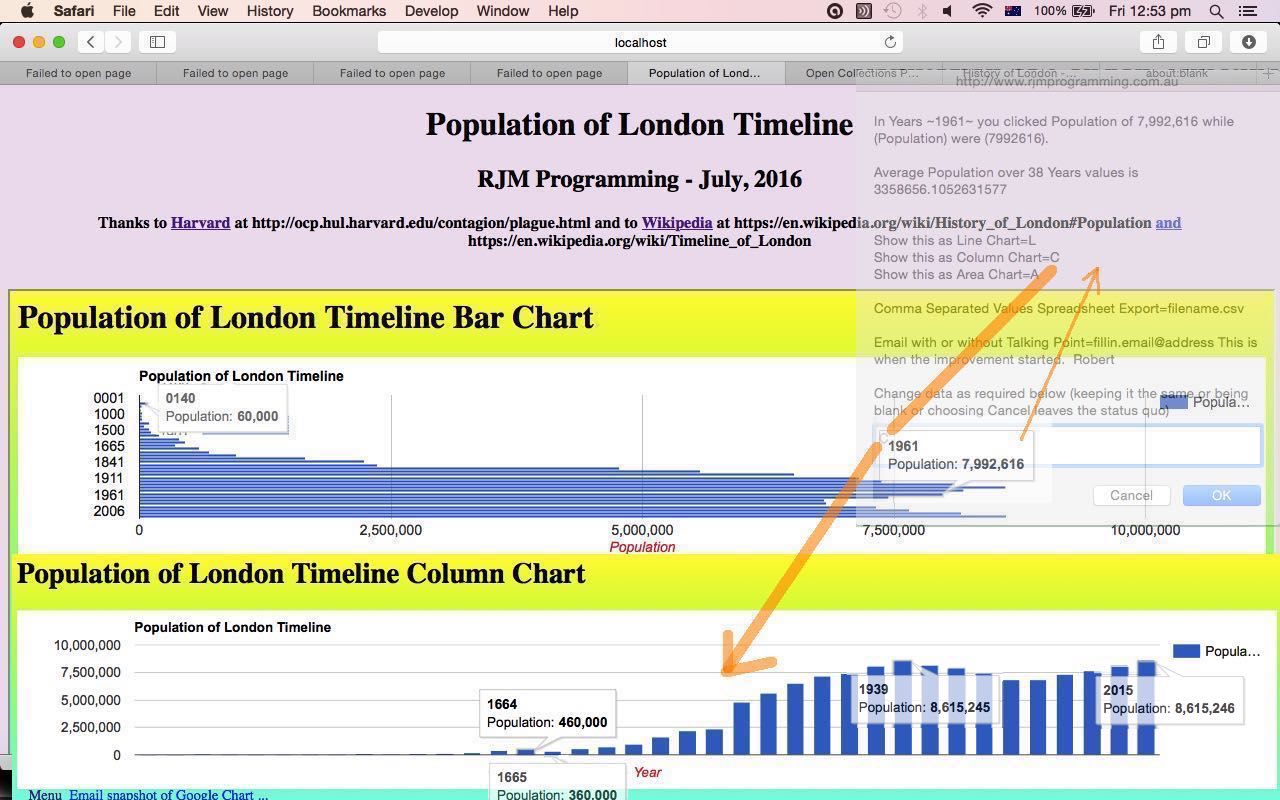
… we discovered today, that there are better representations than others in this set of four regarding the nature of the data you try to represent. I’ll explain this with regard to what we wanted to show the data for today. In the Museum of London on the trip that we’ve talked about recently with respect to mobile device usage, we found this intriguing display in the Museum of London (that we can not find the data of on the “net” … so you’ll just have to go there (and it’s somewhere in the “most recent period” section) … quick, before it moves) graphing the Population of London through history. So we’ve written a “Population of London Timeline” web application.
Now at this point you may be wondering why …
- annotatedtimeline_chart.php is the changed Annotated Timeline Chart PHP code here for non-Flash mode becoming the default behaviour, and for the ability to switch between non-Flash and Flash (legacy) modes of use … and please feel free to try a live run
… isn’t included in the list above regarding a “Population of London Timeline” web application? After all, it sounds ideal, but the fact is, when you are dealing with Year data that comes before 1900 their representation can be difficult to achieve given the Integer*4 (sorry to go all Fortran on you) (date difference in the smallest unit of time) arrangement behind the representation of dates in some computer programs. Pity really, because we would like proportion to the timeline, but then again we are not talking regular date data points, so this would have been “cramped” for the Annotated Timeline … so … my first thought, otherwise was the Column Chart … but in doing this realized that the Years disappeared with the 38 data points, and that the really small Populations in those early historical Years made them disappear and not be “clickable” … yes, we are using those Google Chart Select Event ideas you can read about a lot on this blog, and that you can get a taste for by perusing the relevant “similar feeling and concepts” Google Chart Select Event Post Readiness Tutorial as shown below, and that you can see in action if you look at our tutorial picture closely.
So what turned out to be the best of the four Google Charts to use? The Bar Chart was the best at showing the Years and the small Population data values in those early historical years. Am sure there are other scenarios where the others are the better fit.
Regarding the research today we’d like to give thanks to Harvard at //ocp.hul.harvard.edu/contagion/plague.html and to Wikipedia at https://en.wikipedia.org/wiki/History_of_London#Population and https://en.wikipedia.org/wiki/Timeline_of_London
So here is the “Population of London Timeline” web application live run and its HTML and Javascript programming source code you could call population_of_london_timeline.html
Previous relevant Google Chart Select Event Post Readiness Tutorial is shown below.
Tomorrow we have a new web application that uses the bold Google Charts (and their select events “haven” for business logic) in the list below …
- Area Chart
- Bar Chart (and Bar Chart Differences)
- Column Chart (and Column Chart Differences)
- Line Chart
- Map Chart
- Pie Chart
… charts which came in the list of ones changed when we presented the Google Chart Select Event Cache Issue Tutorial as shown below.
These Google Chart Line/Bar/Area/Column Chart changes involved …
- area_chart.php is the changed PHP programming source code as per changes for this live run
- bar_chart.php is the changed PHP programming source code as per changes for this live run
- column_chart.php is the changed PHP programming source code as per changes for this live run
- line_chart.php is the changed PHP programming source code as per changes for this live run
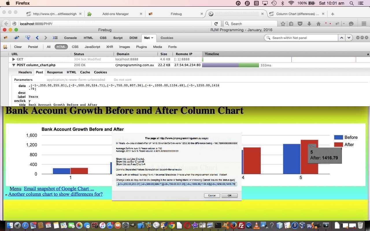
… and were done to cater for data POSTed to these charts … the live run testcase.html being a test case for us … from an HTML form. Why might we do this? We talk more tomorrow, but you might well choose to POST to these charts as a default method in preference to a GET method as a means to cater for any or all amounts of data needed to be passed in for processing. The need for such functionality improvements is often not always apparent at the start of writing a piece of code, because it is only “down the track” you realise how that code could come into play as a modular piece of code, with just a small, extra amount of effort … the effort of today. We hope to complete this picture tomorrow … and don’t forget the hares and rabbits.
Previous relevant Google Chart Select Event Cache Issue Tutorial is shown below.
We’re still trying for yet more “genericity” with our Google Graphs API, or Google Chart Tools, web and mobile applications today, building on yesterday’s Google Chart Select Event Email Integration Tutorial as shown below, with integration involving email, yesterday more for non-mobile usage and today, more for mobile platform usage, that we first tried on our recent “guinea pig” “guinea fowl” (so yesterday) “guinea baboon” functionalities (of recent times) …
- Area Chart
- Bar Chart (and Bar Chart Differences)
- Column Chart (and Column Chart Differences)
- Line Chart
- Map Chart
- Pie Chart
It probably comes as no surprise that chart data can be a great conversation starter for meetings or online discussions conducted via email, for example. They say “a picture tells a thousand words” … MMM look at that pie chart over yonder … see … three thousand words … chortle, chortle.
Do you remember yesterday? …
We use mailto links to direct the user to their default client mail supervisors to make all this happen. You will find, with PHP, that you can email without this client email via the use of the mail method.
… Well, our concentration on mailto (that works fine on non-mobile platforms) needed to be balanced with some mobile platform consideration that uses that PHP mail method, so as not to navigate too far away in our iOS app’s WebView.
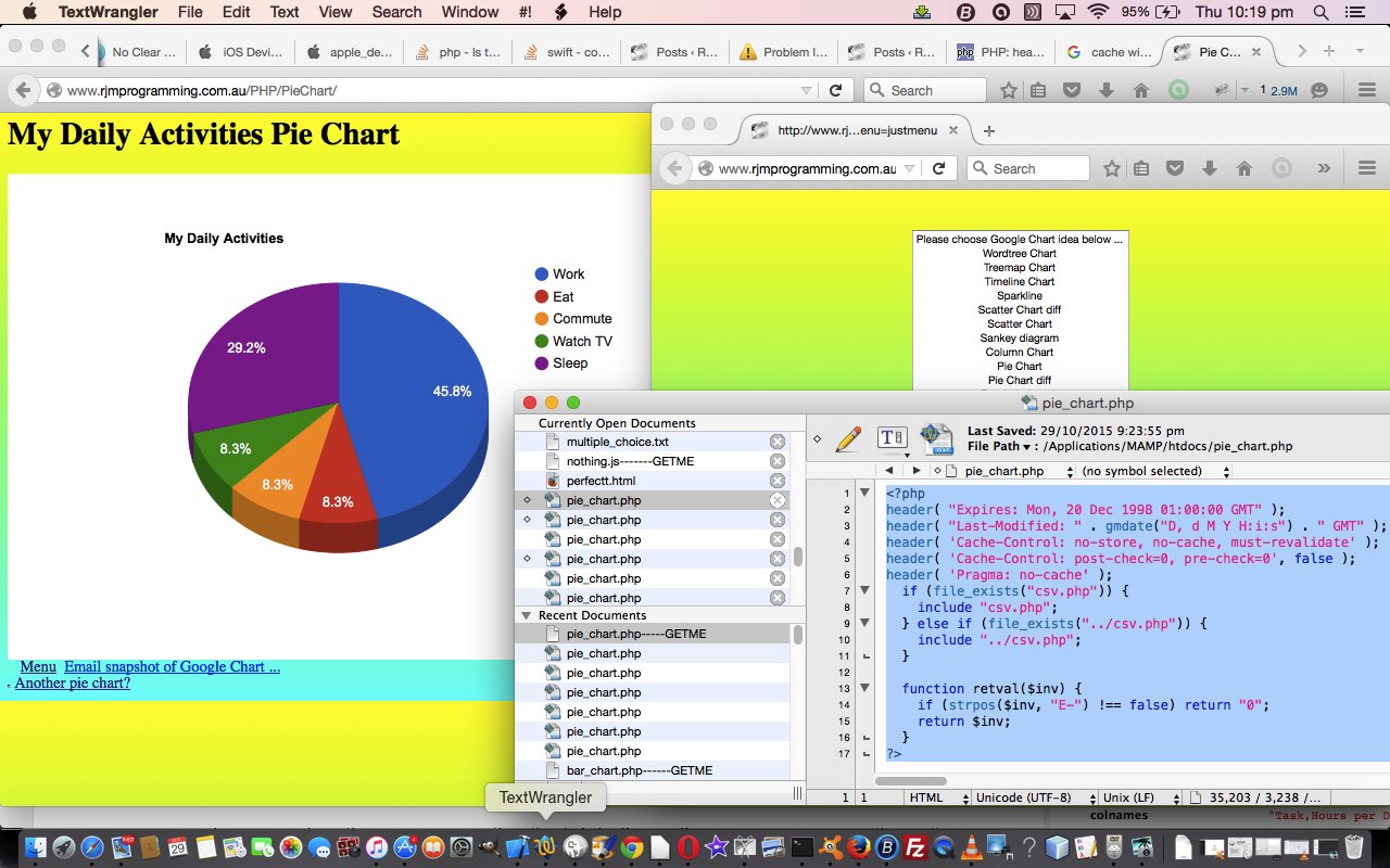
And we did some work with Google Chart Pie Charts today to add “select” event functionality, and to try to stop it using the cache, as we want the iOS app reflect changes we make to things, and be able to let the iOS app user recover from an unforseen problem exacerbated by the return to a bad caching scenario.
We found good advice about this cache issue at this useful link, so, thanks. You may read from this page that there is an HTML meta tag approach to this, but we prefer a PHP approach, and use, up the top of the PHP the code snippet …
header( "Expires: Mon, 20 Dec 1998 01:00:00 GMT" );

header( "Last-Modified: " . gmdate("D, d M Y H:i:s") . " GMT" );

header( 'Cache-Control: no-store, no-cache, must-revalidate' );

header( 'Cache-Control: post-check=0, pre-check=0', false );

header( 'Pragma: no-cache' );
… you will find up the top of the PHP pie_chart.php programming source code.
These Google Chart Pie/Line/Bar/Area/Column/Map Chart changes involved …
- area_chart.php is the changed PHP programming source code as per changes
- bar_chart.php (bar_chart_diff.php) is the changed PHP programming source code as per changes (and changes)
- column_chart.php (column_chart_diff.php) is the changed PHP programming source code as per changes (and changes)
- line_chart.php is the changed PHP programming source code as per changes
- map.php is the changed PHP programming source code as per changes
- pie_chart.php is the changed PHP programming source code as per changes
Link to Google Chart Tools “spiritual home” … via Google.
Link to Google Chart Tools Area Chart information … via Google.
Link to Google Chart Tools Bar Chart information … via Google.
Link to Google Chart Tools Column Chart information … via Google.
Link to Google Chart Tools Line Chart information … via Google.
Link to Google Chart Tools Map Chart information … via Google.
Link to Google Chart Tools Pie Chart information … via Google.
This extra functionality, available via the suffix “&onclick=y” applied to the Google Chart Area and Bar and Column and Line and Map and Pie Chart title, flows on directly to the iPad iOS App we created and talked about, last, with Xcode Swift iOS Application End Game Primer Tutorial.
So please try creating your own emailable Google Chart live runs for …
No guinea pigs (nor guinea fowl, nor guinea baboons) were harmed in the making of this blog post. Honest, hen!
If this was interesting you may be interested in this too.
If this was interesting you may be interested in this too.
If this was interesting you may be interested in this too.


