We last specifically talked about HTML and CSS and text elements when we had the CSS Embossed Text Primer Tutorial as shown below.
Today we talk about some other ideas regarding text, inspired by reading (in particular, point 9 of) 20 Useful CSS Tips For Beginners (thanks) and think a bit about the more “showy” ways of presenting HTML text data, regarding …
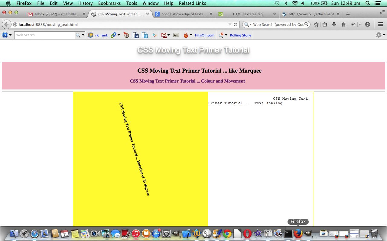
- toggling between an <h1> HTML element as a piece of text and then an image via a vastly negative HTML text-indent property
- make the text move from left to right (like a <marquee> HTML element) via the HTML text-indent property
- make the text move from right to left via the HTML text-indent property with negative values
- rotating text (helped heaps by this useful link … thanks)
- snaking text via the use of <textarea> HTML element’s Javascript DOM innerHTML and using a WYSIWYG Courier New font
… making use of CSS principles and Javascript DOM manipulations.
It can be good to apply some effects to text on occasions when it is to attract attention in the first place, but when you are deep into the explanation of something, “text distractions” may not be a good look.
Try today’s live run and/or download the HTML source code moving_text.html tutorial, and hope it helps in some way.
Previous relevant CSS Embossed Text Primer Tutorial is shown below.
Sometimes it is good to give a 3D embossed effect (with text shadowing) to some text HTML elements for the purpose of attracting the user’s attention and giving that 3D effect for vibrancy.
Today we’ve applied some CSS to do this in a number of combinations:
- With WordPress Blog title via changes to header.php as per the bold code below …
<link rel="stylesheet" type="text/css" media="all" href="<?php bloginfo( 'stylesheet_url' ); ?>" />

<style>

.mypclass { color:rgb(185,127,206); }

#mypid { color:rgb(185,127,206); }

.mypclass2 { background-color:rgb(185,127,206); color:'black'; }

.mypclass22 { background-color:rgb(185,127,206); color:'black'; }

#mypid2 {  background-color:rgb(185,127,206); color:'black';  }


#ahomeis {

    color: #ffffff;

    font: 24pt Arial;

    text-shadow: 0 1px 0 #ccc, 0 2px 0 #c9c9c9, 0 3px 0 #bbb, 0 4px 0 #b9b9b9, 0 5px 0 #aaa, 0 6px 1px rgba(0, 0, 0, 0.1), 0 0 5px rgba(0, 0, 0, 0.1), 0 1px 3px rgba(0, 0, 0, 0.3), 0 3px 5px rgba(0, 0, 0, 0.2), 0 5px 10px rgba(0, 0, 0, 0.25), 0 10px 10px rgba(0, 0, 0, 0.2), 0 20px 20px rgba(0, 0, 0, 0.15);

}


</style>

<link rel="pingback" href="<?php bloginfo( 'pingback_url' ); ?>" />
- Landing Page (and other) HTML of www.rjmprogramming.com.au …
<style>

#rjmp {

    color: #777777;

    font: 24pt Arial;

    text-shadow: 0 1px 0 #ccc, 0 2px 0 #c9c9c9, 0 3px 0 #bbb, 0 4px 0 #b9b9b9, 0 5px 0 #aaa, 0 6px 1px rgba(0, 0, 0, 0.1), 0 0 5px rgba(0, 0, 0, 0.1), 0 1px 3px rgba(0, 0, 0, 0.3), 0 3px 5px rgba(0, 0, 0, 0.2), 0 5px 10px rgba(0, 0, 0, 0.25), 0 10px 10px rgba(0, 0, 0, 0.2), 0 20px 20px rgba(0, 0, 0, 0.15);

}

</style>
- File Information Table fileinfotable.php changes can be seen via fileinfotable.php using emboss_h1.css
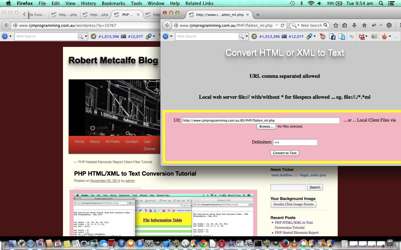
- HTML/XML to Text Conversion flatten_ml.php changes can be seen via flatten_ml.php
Hope you enjoy today’s tutorial.
If this was interesting you may be interested in this too.
If this was interesting you may be interested in this too.


