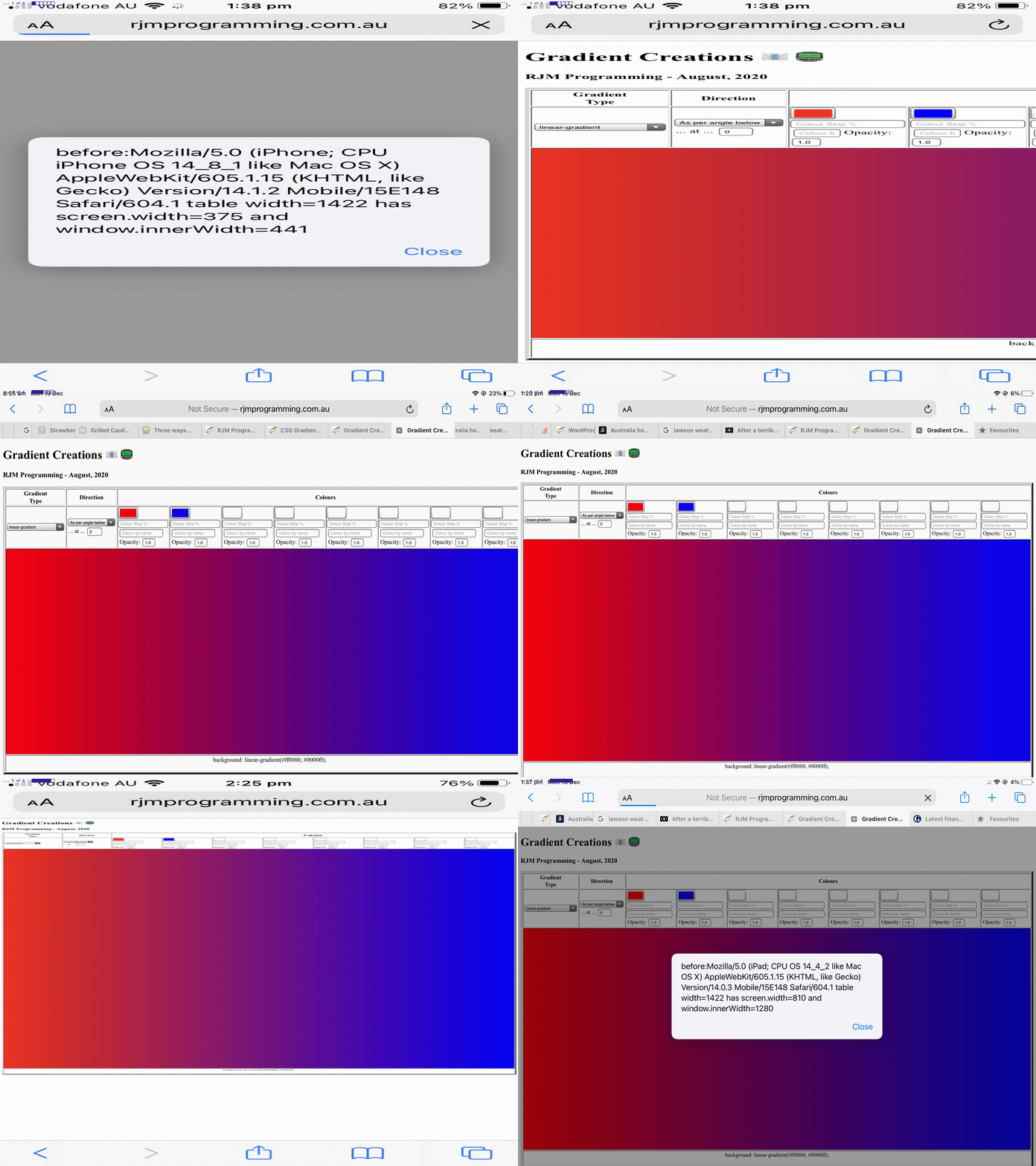
When it comes to “width” (CSS styling) considerations with webpage design on mobile platforms where you are not prepared to “de-complex-ify” (if you know what I mean) the webpage contents you can run into the dual issues …
- you want to show HTML elements legibly … and …
- you also want to show the big picture
You see, with yesterday’s CSS Gradient Creations Width Makeover Tutorial we did hint when we said …
… we saw that it overshot the right hand border on the MacBook Air webpage screen.
… that the work yesterday was suited more towards your laptop usage rather than mobile phone (and to a less extent mobile tablet) usage.
There is a CSS styling “tool” to hand just for this scenario, though, the meta name=viewport (within <head> … </head> header element, usually) element, ours being, initially, for today’s work …
<meta id="myviewport" name="viewport" content="width=device-width, initial-scale=1, minimum-scale=0.1, maximum-scale=8, user-scalable=yes" >
… the “red rag to a bull” signs that Javascript might come into it (to allow initially become eventually) being …
- the id=”myviewport” unusual attribute for a header element
- the big range difference between minimum-scale and maximum-scale but initial-scale being so conventionally valued
… in other words, today …
- we start mobile platform web application “first few seconds” of display in “you want to show HTML elements legibly” mode … and that “first few seconds” of display tells us … anyone, anyone? … yes, Ariel … we use setTimeout to delay …
<body onload="setTimeout(fixmobilewidth,5000); sdih=document.getElementById('sdirection').innerHTML; osdih=document.getElementById('rdirection').innerHTML; checkol();">
… five seconds before … - we use Javascript DOM to adjust the meta name=viewport element as per …
 function fixmobilewidth() {

  if (navigator.userAgent.match(/Android|BlackBerry|iPhone|iPad|iPod|Opera Mini|IEMobile/i)) {

    var rectt=document.getElementsByTagName('table')[0].getBoundingClientRect();

    document.getElementById("myviewport").setAttribute("content", "width=device-width, initial-scale=" + eval(-0.35 + eval('' + (window.orientation == 0 ? window.innerHeight: window.innerWidth)) / eval('' + rectt.width)) + ", minimum-scale=0.1, maximum-scale=8, user-scalable=yes");

  }

 }
… “to show the big picture” (of what’s available to the user to work the web application’s full functionality)
The control of whitespace came into the picture too. We replace in a lot of the table cells the non-breaking spaces (ie. ) as per …
<td><input onblur="changeit();" onchange="changeit();" type=color id=c1 value='#ff0000'></input> <input onblur="changeit();" onchange="changeit();" type=text id=hcs1 value='' placeholder='Colour Stop %' style=width:120px;></input> <input onblur='lookup(this.value,this);' type=text id=sc1 placeholder='Colour by name'></input> Opacity: <input onblur="changeit();" onchange="changeit();" type=number id=o1 min=0.0 max=1.0 step=0.1 value='1.0'></input></td>
<td><input onblur="changeit();" onchange="changeit();" type=color id=c2 value='#0000ff'></input> <input onblur="changeit();" onchange="changeit();" type=text id=hcs2 value='' placeholder='Colour Stop %' style=width:120px;></input> <input onblur='lookup(this.value,this);' type=text id=sc2 placeholder='Colour by name'></input> Opacity: <input onblur="changeit();" onchange="changeit();" type=number id=o2 min=0.0 max=1.0 step=0.1 value='1.0'></input></td>
<td><input onblur="changeit();" onchange="changeit();" type=color id=c3 value='#ffffff'></input> <input onblur="changeit();" onchange="changeit();" type=text id=hcs3 value='' placeholder='Colour Stop %' style=width:120px;></input> <input onblur='lookup(this.value,this);' type=text id=sc3 placeholder='Colour by name'></input> Opacity: <input onblur="changeit();" onchange="changeit();" type=number id=o3 min=0.0 max=1.0 step=0.1 value='1.0'></input></td>
<td><input onblur="changeit();" onchange="changeit();" type=color id=c4 value='#ffffff'></input> <input onblur="changeit();" onchange="changeit();" type=text id=hcs4 value='' placeholder='Colour Stop %' style=width:120px;></input> <input onblur='lookup(this.value,this);' type=text id=sc4 placeholder='Colour by name'></input> Opacity: <input onblur="changeit();" onchange="changeit();" type=number id=o4 min=0.0 max=1.0 step=0.1 value='1.0'></input></td>
<td><input onblur="changeit();" onchange="changeit();" type=color id=c5 value='#ffffff'></input> <input onblur="changeit();" onchange="changeit();" type=text id=hcs5 value='' placeholder='Colour Stop %' style=width:120px;></input> <input onblur='lookup(this.value,this);' type=text id=sc5 placeholder='Colour by name'></input> Opacity: <input onblur="changeit();" onchange="changeit();" type=number id=o5 min=0.0 max=1.0 step=0.1 value='1.0'></input></td>
<td><input onblur="changeit();" onchange="changeit();" type=color id=c6 value='#ffffff'></input> <input onblur="changeit();" onchange="changeit();" type=text id=hcs6 value='' placeholder='Colour Stop %' style=width:120px;></input> <input onblur='lookup(this.value,this);' type=text id=sc6 placeholder='Colour by name'></input> Opacity: <input onblur="changeit();" onchange="changeit();" type=number id=o6 min=0.0 max=1.0 step=0.1 value='1.0'></input></td>
<td><input onblur="changeit();" onchange="changeit();" type=color id=c7 value='#ffffff'></input> <input onblur="changeit();" onchange="changeit();" type=text id=hcs7 value='' placeholder='Colour Stop %' style=width:120px;></input> <input onblur='lookup(this.value,this);' type=text id=sc7 placeholder='Colour by name'></input> Opacity: <input onblur="changeit();" onchange="changeit();" type=number id=o7 min=0.0 max=1.0 step=0.1 value='1.0'></input></td>
<td><input onblur="changeit();" onchange="changeit();" type=color id=c8 value='#ffffff'></input> <input onblur="changeit();" onchange="changeit();" type=text id=hcs8 value='' placeholder='Colour Stop %' style=width:120px;></input> <input onblur='lookup(this.value,this);' type=text id=sc8 placeholder='Colour by name'></input> Opacity: <input onblur="changeit();" onchange="changeit();" type=number id=o8 min=0.0 max=1.0 step=0.1 value='1.0'></input></td>
… with line breaks (ie. <br>) as per …
<td><input onblur="changeit();" onchange="changeit();" type=color id=c1 value='#ff0000'></input><br><input onblur="changeit();" onchange="changeit();" type=text id=hcs1 value='' placeholder='Colour Stop %' style=width:120px;></input><br><input onblur='lookup(this.value,this);' type=text id=sc1 placeholder='Colour by name'></input><br>Opacity: <input onblur="changeit();" onchange="changeit();" type=number id=o1 min=0.0 max=1.0 step=0.1 value='1.0'></input></td>

<td><input onblur="changeit();" onchange="changeit();" type=color id=c2 value='#0000ff'></input><br><input onblur="changeit();" onchange="changeit();" type=text id=hcs2 value='' placeholder='Colour Stop %' style=width:120px;></input><br><input onblur='lookup(this.value,this);' type=text id=sc2 placeholder='Colour by name'></input><br>Opacity: <input onblur="changeit();" onchange="changeit();" type=number id=o2 min=0.0 max=1.0 step=0.1 value='1.0'></input></td>

<td><input onblur="changeit();" onchange="changeit();" type=color id=c3 value='#ffffff'></input><br><input onblur="changeit();" onchange="changeit();" type=text id=hcs3 value='' placeholder='Colour Stop %' style=width:120px;></input><br><input onblur='lookup(this.value,this);' type=text id=sc3 placeholder='Colour by name'></input><br>Opacity: <input onblur="changeit();" onchange="changeit();" type=number id=o3 min=0.0 max=1.0 step=0.1 value='1.0'></input></td>

<td><input onblur="changeit();" onchange="changeit();" type=color id=c4 value='#ffffff'></input><br><input onblur="changeit();" onchange="changeit();" type=text id=hcs4 value='' placeholder='Colour Stop %' style=width:120px;></input><br><input onblur='lookup(this.value,this);' type=text id=sc4 placeholder='Colour by name'></input><br>Opacity: <input onblur="changeit();" onchange="changeit();" type=number id=o4 min=0.0 max=1.0 step=0.1 value='1.0'></input></td>

<td><input onblur="changeit();" onchange="changeit();" type=color id=c5 value='#ffffff'></input><br><input onblur="changeit();" onchange="changeit();" type=text id=hcs5 value='' placeholder='Colour Stop %' style=width:120px;></input><br><input onblur='lookup(this.value,this);' type=text id=sc5 placeholder='Colour by name'></input><br>Opacity: <input onblur="changeit();" onchange="changeit();" type=number id=o5 min=0.0 max=1.0 step=0.1 value='1.0'></input></td>

<td><input onblur="changeit();" onchange="changeit();" type=color id=c6 value='#ffffff'></input><br><input onblur="changeit();" onchange="changeit();" type=text id=hcs6 value='' placeholder='Colour Stop %' style=width:120px;></input><br><input onblur='lookup(this.value,this);' type=text id=sc6 placeholder='Colour by name'></input><br>Opacity: <input onblur="changeit();" onchange="changeit();" type=number id=o6 min=0.0 max=1.0 step=0.1 value='1.0'></input></td>

<td><input onblur="changeit();" onchange="changeit();" type=color id=c7 value='#ffffff'></input><br><input onblur="changeit();" onchange="changeit();" type=text id=hcs7 value='' placeholder='Colour Stop %' style=width:120px;></input><br><input onblur='lookup(this.value,this);' type=text id=sc7 placeholder='Colour by name'></input><br>Opacity: <input onblur="changeit();" onchange="changeit();" type=number id=o7 min=0.0 max=1.0 step=0.1 value='1.0'></input></td>

<td><input onblur="changeit();" onchange="changeit();" type=color id=c8 value='#ffffff'></input><br><input onblur="changeit();" onchange="changeit();" type=text id=hcs8 value='' placeholder='Colour Stop %' style=width:120px;></input><br><input onblur='lookup(this.value,this);' type=text id=sc8 placeholder='Colour by name'></input><br>Opacity: <input onblur="changeit();" onchange="changeit();" type=number id=o8 min=0.0 max=1.0 step=0.1 value='1.0'></input></td>
… to lessen the table cell width innards (at the expense, perhaps, of the table cell innard heights) that might become involved in our changed gradient_creations.htm “Gradient Creations” live run link.
Is the 5 seconds enough on your thinner mobile platform widths? That’s debatable, but the “spreading” gesture awaits those more accepting mobile phone users!
Previous relevant CSS Gradient Creations Width Makeover Tutorial is shown below.
Revisits to a web application, after some time, can bring “adverse” categories of reaction to me …
- UX (user experience) Javascript criticism …
- styling CSS annoyance
… and today’s work, on our “Gradient Creations” web application, is as a result of that second “styling CSS annoyance”.
Possibly the second is “less serious” in our mind, but, nonetheless, invariably we learn (or remember) quite a bit, researching them.
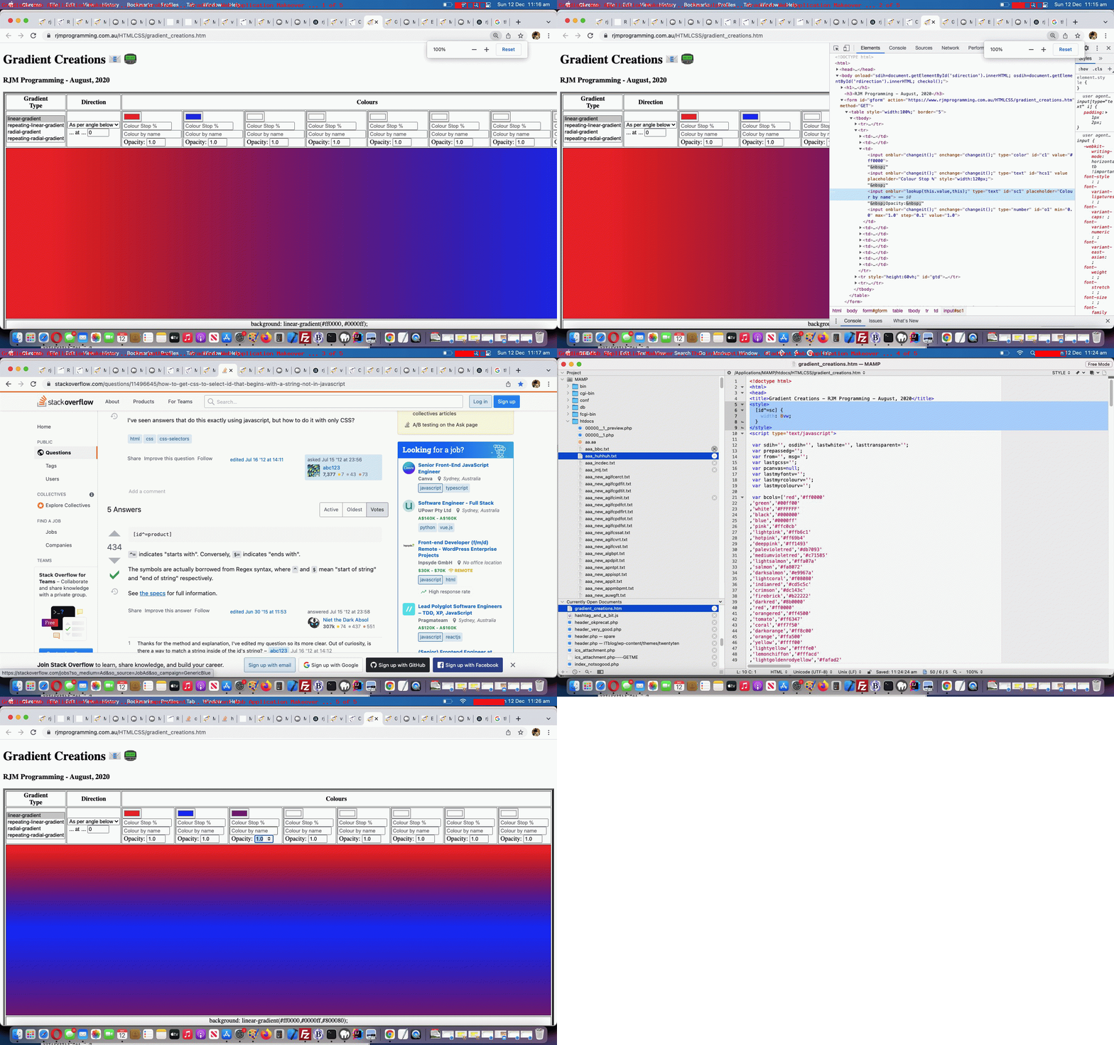
Maybe you can see from today’s tutorial animated GIF picture we categorized the slides into …
| Slide … | … with our commentary regarding our changed gradient_creations.htm “Gradient Creations” live run link |
|---|---|
| The problem … | At 100% zoom level with the Google Chrome browser pointing at the previous “Gradient Creations” web application incarnation we saw that it overshot the right hand border on the MacBook Air webpage screen. |
| The culprit … | Looking at the web page in Crome’s web inspector we identify the “Colour Name” textboxes (whose “id” starts with “sc” (as we mention later, to our advantage)) as being too wide and to lessen that width could improve the aesthetics. |
| The pathway … |
|
| The intervention … | Within the webpage’s <head> … </head> section we add … |
| The improvement … | The test shows improved aesthetics. Yay! |
By the way, further reading on this topic (and web application) is available with CSS Gradient Creations Sharing Tutorial below.
Previous relevant CSS Gradient Creations Sharing Tutorial is shown below.
Turning a web application like yesterday’s CSS Gradient Creations Tutorial “Gradient Creations” one into a web application where you can share your discoveries is an exercise in both …
- sharing and collaboration … as well as …
- accountability
… opening up something that used to be just for private use only, to being one that is open to the rest of the online wooooorrrrllllddd.
As well as this new email and SMS sharing capability we add another contenteditable=true incursion into the mix as another selling product for our web application. Just quietly, perhaps you can use it as a “digital card” creator, as we offer to augment …
- the table cell with a gradient background … with the idea that the user …
- can write their wording (of say, a card) in the foreground of that same table cell
… and then allow the user to append a space to their Javascript prompt window answering of the emailee address to indicate to the web application that the email should just be that table cell content. On the way a collaboration phase is possible by tweaking the HTML …
xform.append('body',(document.body.outerHTML.split('</form>')[0] + '</form></body>').replace(/NONE\;/g, 'inline-block;').replace('<div ','<input type=text style=width:50%; ').replace('>background:', ' value="').replace('</div>', '"></input>').replace('"></textarea>', '">' + document.getElementById('tdlook').innerHTML.replace(/\<br\>/g,String.fromCharCode(10)) + '</textarea>'));
… to work with a form method=GET way for the emailee to adjust the gradient CSS to send off a return email (or one to a third party) in response to that first email. No collaboration here, but we also allow for SMS communications too.
Also, along the way, we allow for a colour to be defined by its name, if it makes the web application’s colour array list.
You can try our our changed gradient_creations.htm live run link, to see what we mean.
Previous relevant CSS Gradient Creations Tutorial is shown below.
The great CSS background “gradient” functionalities can come in four forms, those being …
- linear gradient (and repeating linear gradient)
- radial gradient (and repeating radial gradient)
… as a means to add background interest, even to the point where the background can have some (different) transparency (level) compared to the foreground, as per example CSS like …
<style>

html::before {

 background: linear-gradient(rgba(255,255,255,0.8),rgba(255,255,255,0.8)),URL('//www.rjmprogramming.com.au/MyBusinessUnidad/Welcome_files/logo.jpg') repeat;

}

</style>
With tutorials like CSS Repeating Radial Gradients Primer Tutorial we allowed you to create some gradients, but we wanted a more detailed approach that was generic in its approach and left you with some CSS of use, which is often not the go with many other (albeit useful and inspiring) websites on the net.
There are a whole range of what you might call “directional” nuances you can apply to your gradients. There is opacity to allow for. There are “hard colour stops” you can apply. For linear gradients you can apply a variable angle. For radial gradients there are positional nuances that can be applied.
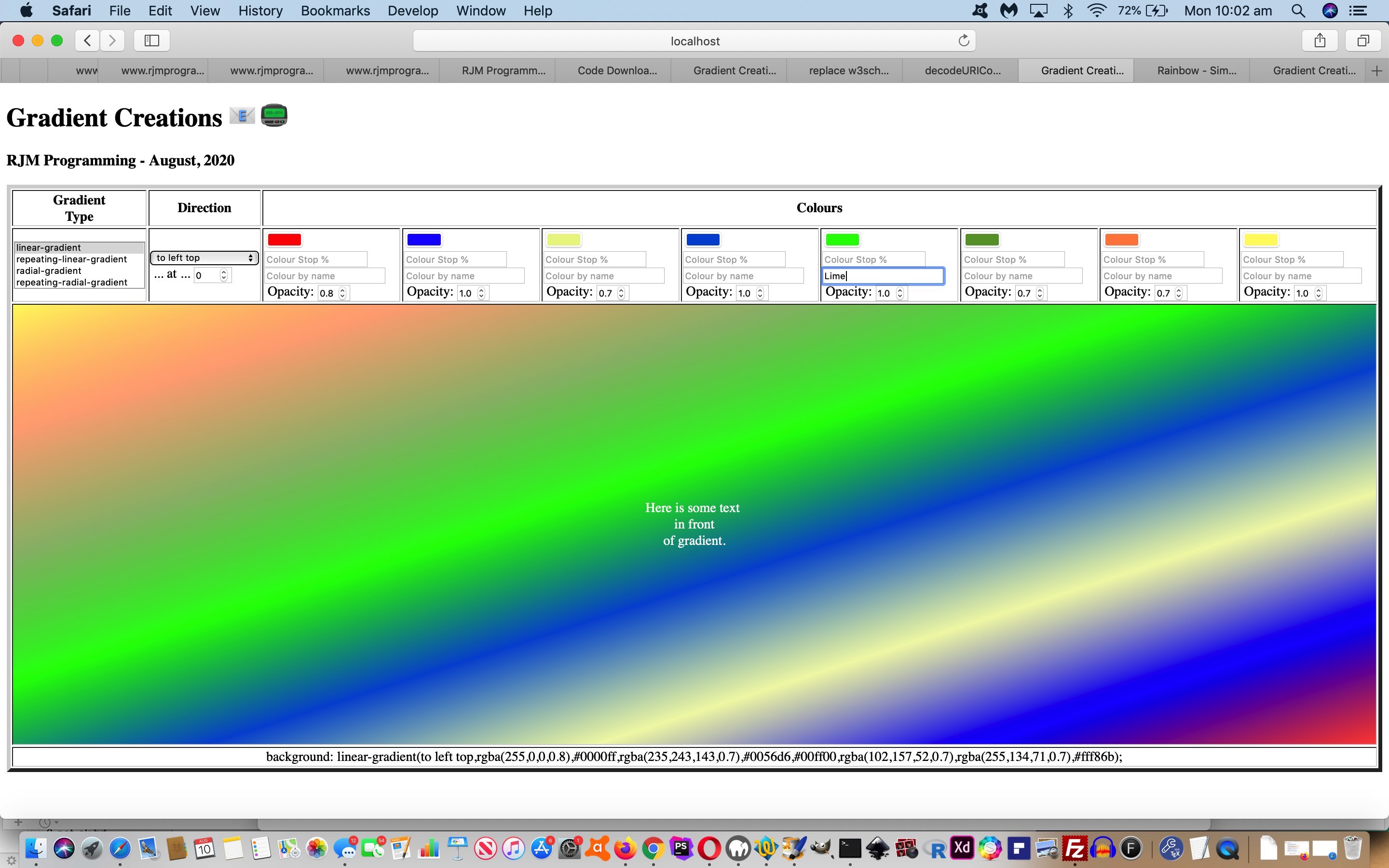
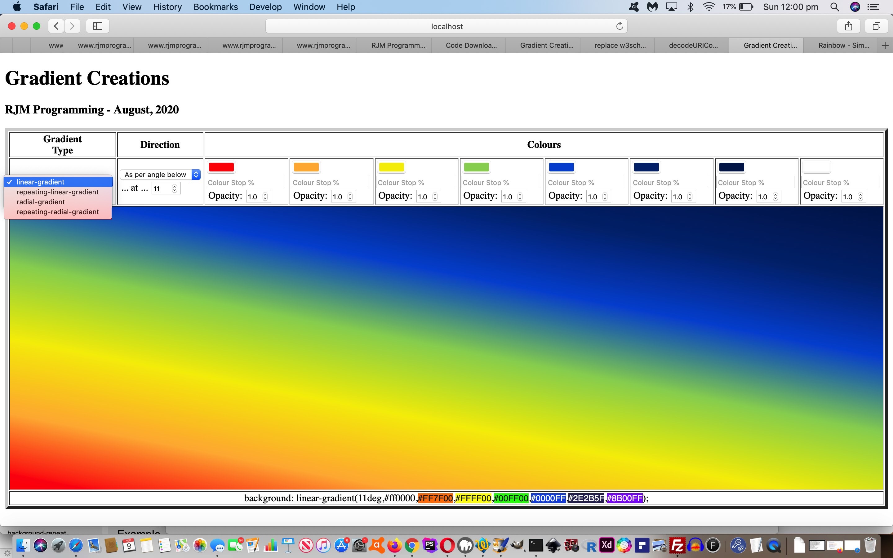
And then there are the colours. We are not sure of the limits, but we allow for up to eight colours. Enough to simulate the seven colours of the rainbow we go for with today’s tutorial picture arrangement whereby it tweaked with us that the HTML input type=color elements are all well and good but we needed to allow our CSS be editable by nesting into an HTML div contenteditable=true elements that can be tweaked for exact rgb or rgba colour definitions (thanks, Wikipedia), as we could look up for the purposes of displaying a rainbow coloured gradient background (we hope you like)!
Or see a repeating radial gradient example below …
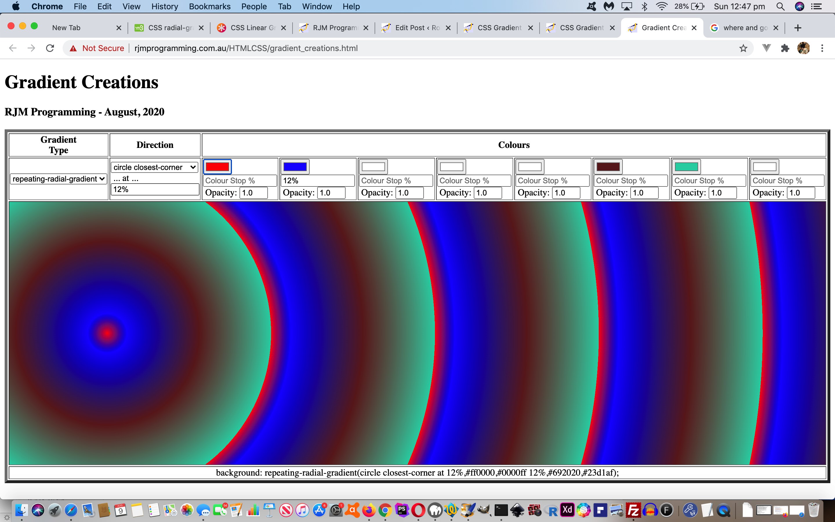
So feel free to try our gradient_creations.html live run link, to see what we mean.
Previous relevant “CSS Gradient Creations Tutorial is shown below.
Way back when with HTML/Javascript Canvas Rainbow Primer Tutorial we talked about CSS linear gradients and radial gradients in the one blog posting, but ever since then, it has so much more that linear gradients have been useful to us here at this blog.
Today, though, we turn a bit of attention to radial gradients, specifically repeated radial gradients.
We’ve got a simple web application to play around with them in terms of …
- ellipse versus circle
- coloured versus black and white
- extent keyword (closest-corner, closest-side, farthest-corner, farthest-side)
Below is one example of the CSS …
.circlefarthest-corner {

  background: repeating-radial-gradient(circle farthest-corner,

      red, black 5%, blue 5%, green 10%);

}
Feel free to play away at this live run that has this radial_gradients.html downloadable underlying HTML and CSS (and event logic Javascript that changes the HTML div element className property, to suit).
Previous relevant HTML/Javascript Canvas Rainbow Primer Tutorial is shown below.
The Canvas HTML element tag can be used as the container to draw graphics on the fly usually via the use of Javascript functions for rendering and event management.
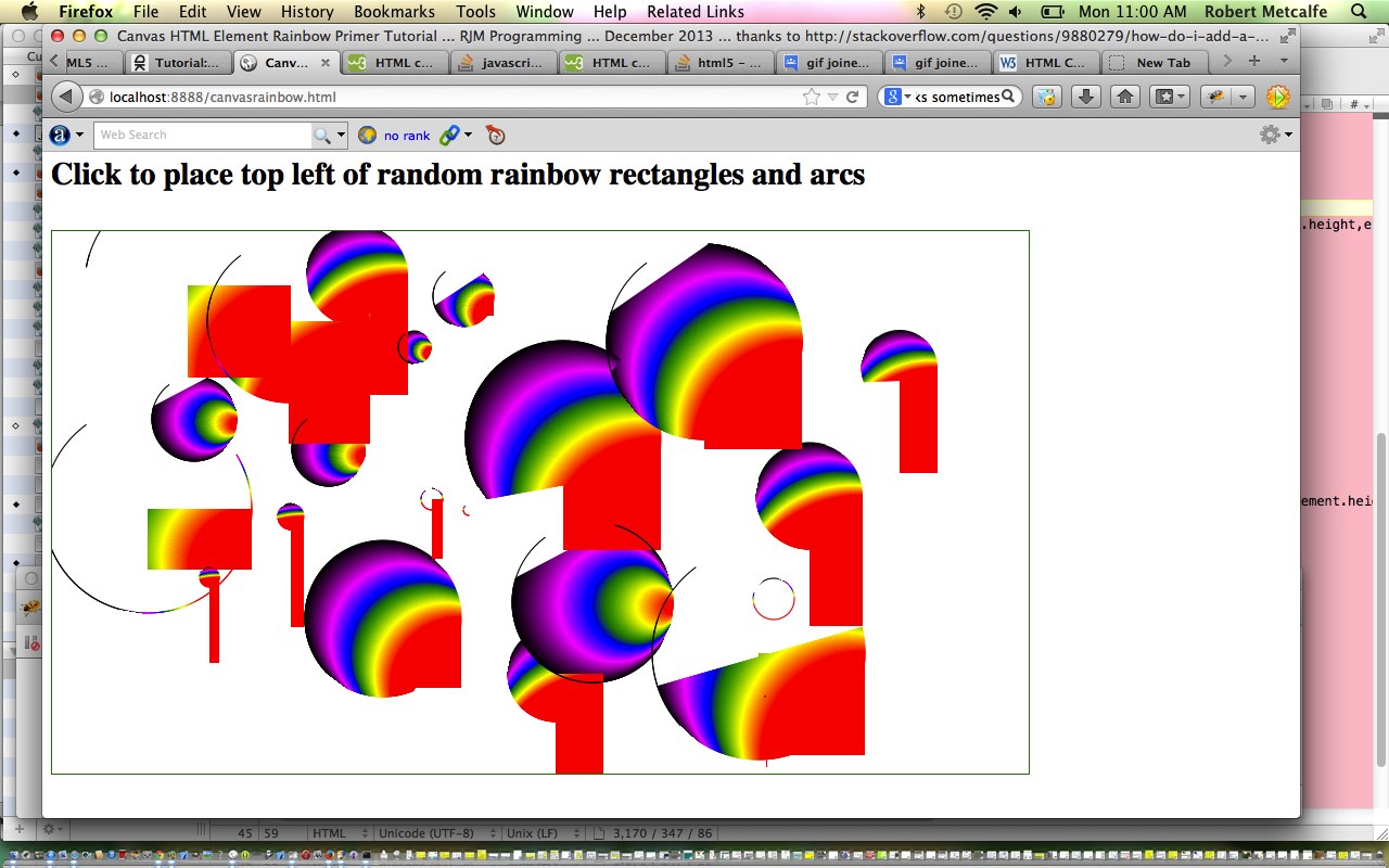
In today’s tutorial we touch on a couple of the two dimensional Javascript functions to draw a rectangle or arc, but in the two dimensional context, canvas HTML elements can be used to draw text, lines, boxes and circles as well. We also touch on two functions to create a linear or radial gradient to the fillStyle and/or strokeStyle of your HTML element placed onto the canvas.
You may want to read more at HTML Canvas Reference as a generic reference, or here, at the tutorial javascript – How do I add a simple onClick event handler to a canvas element? – Stack Overflow.
As you can imagine, this HTML canvas element, new to HTML5, can be very useful for some practical client-side web functionality.
Link to some downloadable HTML programming code … rename to canvasrainbow.html
Here is a new link to some downloadable HTML programming source code explaining changes made (from HTML/Javascript Canvas Primer Tutorial) here.
You’ll notice heavy use of the Javascript Math.random() function.
We hope you enjoy this tutorial as a rainbow coloured live run.
Yes … you’ve reached the end … have a top supportive rainbow coloured day!
If this was interesting you may be interested in this too.
If this was interesting you may be interested in this too.
If this was interesting you may be interested in this too.
If this was interesting you may be interested in this too.
If this was interesting you may be interested in this too.
If this was interesting you may be interested in this too.
