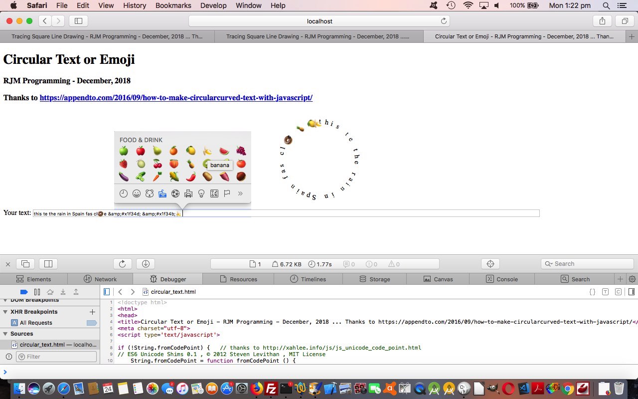
Revisiting the web application of Colour Wheel Canvas Analogue Clock Background Tutorial happened with the original idea to talk about …
- W3school’s How To Avatar Images webpage … and saw it was mainly a CSS border-radius:50%; way to show circular or elliptical (or oval) content, so moved on with this concept, thanks, and onto considering an “avatar” feel to our …
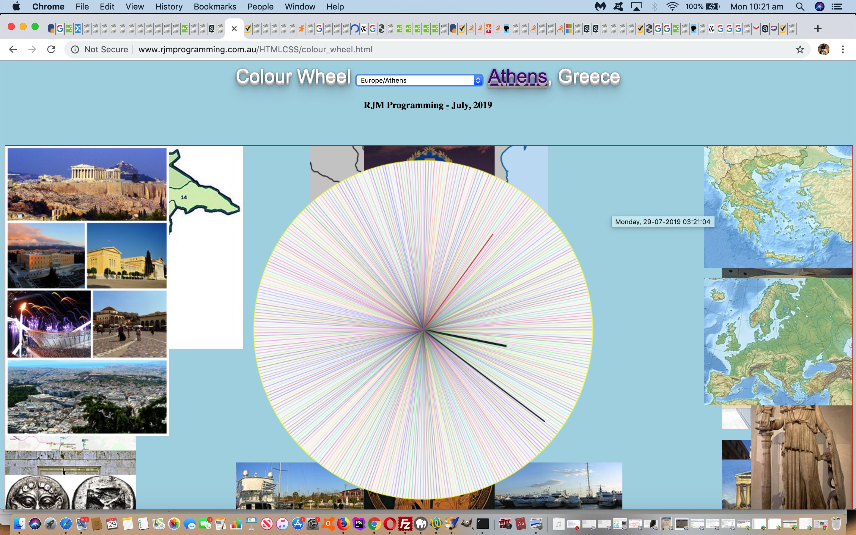
- Colour Wheel HTML and Javascript changed colour_wheel.html at this live run link, adding an “avatar” mode of elliptical analogue clock background, the images of which can now have, and show us, the use of the CSS background-blend-mode
And with this, we recommend you try this “play around” link as well, we interfaced the web application to user usage by …
- turn a hardcoded “,” into a glowing (see Flowchart and Venn Diagram Glow Tutorial) “a” link (with no “href” property, so not navigational) that a click on will set “avatar mode” … and then …
- that “a” element’s innerHTML content is turned into a chance for the user to set a CSS background-blend-mode for the background images defaulting to “multiply” in the list …
Value Description normal This is default. Sets the blending mode to normal multiply Sets the blending mode to multiply screen Sets the blending mode to screen overlay Sets the blending mode to overlay darken Sets the blending mode to darken lighten Sets the blending mode to lighten color-dodge Sets the blending mode to color-dodge saturation Sets the blending mode to saturation color Sets the blending mode to color luminosity Sets the blending mode to luminosity … that is turned into an HTML select (dropdown) element
This background-blend-mode looks to be a pretty useful CSS property.
Previous relevant Colour Wheel Canvas Analogue Clock Background Tutorial is shown below.
Time and place are very suitable concepts for web application work such as that of yesterday’s Colour Wheel Canvas Analogue Clock Resize Tutorial. Today’s work introduces into this “Colour Wheel” (so far analogue clock) TimeZone functionality, to us a great nexus of time to place, and able to be helped out by serverside PHP DateTimeZone class.
And what are the sources we use for this new “place” work?
- Wikipedia … and another “usual suspect” for us …
- Google Charts Map Chart has its internal menus that can get you to Google Maps maps
And how do we present this new “place” work? We start using the HTML5 canvas element “background” as the means to doing this, and we do this allowing for …
- multiple background images … eg. style=”background: URL([urlBackgroundImage1]), URL([urlBackgroundImage2]), URL([urlBackgroundImage3]);” … teamed with …
- background repeat … eg. style=”background-repeat: no-repeat;” … and positioning wise …
- background position … eg. rotational use of (the “float” feeling) left top,center top,right top,right center,right bottom,center bottom,left bottom,left center … leaving “center center” for your analogue clock (showing your TimeZone time)
And now that TimeZones are involved, a hover over the canvas element can flesh out the day of the week in its depiction of that TimeZone’s current time.
In and out of Wikipedia and/or using the PHP DateTimeZone class, geographical latitude and longitude becomes available to the programmer, and that is our conduit to interfacing to Google Charts Map Chart.
You can retry today’s HTML and Javascript changed colour_wheel.html at this live run link.
Previous relevant Colour Wheel Canvas Analogue Clock Resize Tutorial is shown below.
“To resize, or not to resize, that is (often) the question.” In “web application land” this question’s answer often revolves around whether a “web application” is a “production tool”, needing to work for lots of platforms, in as many situations as possible. Today, adding to yesterday’s Colour Wheel Canvas Analogue Clock Primer Tutorial we were motivated to improve the …
- resizing of the window scenario … as per …
<body align="center" style="background-color: lightblue;" onload=" onl();" onresize="if (document.URL.indexOf('&') != -1) { location.href=document.URL.replace('?x=','?xx=').split('#')[0].split('&x=')[0] + '&x=' + Math.floor(Math.random() * 12895643); } else if (document.URL.indexOf('?') != -1) { location.href=document.URL.split('#')[0].split('&')[0] + '&x=' + Math.floor(Math.random() * 12895643); } else { location.href=document.URL.split('#')[0].split('?')[0] + '?x=' + Math.floor(Math.random() * 12895643); }">
… lead to partly because yesterday’s web application incarnation was not good with … - embedding of the web application within an HTML (child) iframe element of a parent webpage … but canvas initialization code changes …
<script type='text/javascript'>

 var pw='', ph='';

 if (window.parent) {

   var fitinto=(location.search.split('fitinto=')[1] ? decodeURIComponent(location.search.split('fitinto=')[1].split('&')[0]) : '');

   if (fitinto != '') {

    if (parent.document.getElementById(fitinto)) {

     var rectis=parent.document.getElementById(fitinto).getBoundingClientRect();

     if (('' + rectis.width).replace('px','').replace(/0/g,'') != '' && ('' + rectis.height).replace('px','').replace(/0/g,'') != '') {

        pw=('' + rectis.width).replace('px','');

        ph=('' + rectis.height).replace('px','');

     }

    }

   }

 }

 if (pw != '' && ph != '') {

  document.write('<br><br><canvas title="" onclick="document.getElementById(' + "'" + 'dtop' + "'" + ').style.display=' + "'" + 'block' + "'" + ';" id=ourcanvas width=' + ('' + eval(-15 + eval(pw)) + 'px').replace('pxpx','').replace('px','') + ' height=' + eval(-15 + eval(ph)) + ' style="width:' + ('' + eval(-15 + eval(pw)) + 'px').replace('pxpx','px') + ';height:' + eval(-15 + eval(ph)) + 'px;border:1px solid red;background-color:' + bcol + ';"></canvas>');

 } else if (window.outerHeight == window.innerHeight && window.innerHeight == screen.height) { // thanks to https://stackoverflow.com/questions/16162639/difference-between-screen-and-window-property

  document.write('<br><br><canvas title="" onclick="document.getElementById(' + "'" + 'dtop' + "'" + ').style.display=' + "'" + 'block' + "'" + ';" id=ourcanvas width=' + ('' + eval(-15 + (window.orientation == 0 ? window.screen.height: window.screen.width)) + 'px').replace('pxpx','').replace('px','') + ' height=660 style="width:' + ('' + eval(-15 + (window.orientation == 0 ? window.screen.height: window.screen.width)) + 'px').replace('pxpx','px') + ';height:660px;border:1px solid red;background-color:' + bcol + ';"></canvas>');

 } else {

  document.write('<br><br><canvas title="" onclick="document.getElementById(' + "'" + 'dtop' + "'" + ').style.display=' + "'" + 'block' + "'" + ';" id=ourcanvas width=' + ('' + eval(-15 + (window.orientation == 0 ? window.innerHeight: window.innerWidth)) + 'px').replace('pxpx','').replace('px','') + ' height=660 style="width:' + ('' + eval(-15 + (window.orientation == 0 ? window.innerHeight: window.innerWidth)) + 'px').replace('pxpx','px') + ';height:660px;border:1px solid red;background-color:' + bcol + ';"></canvas>');

 }

</script>
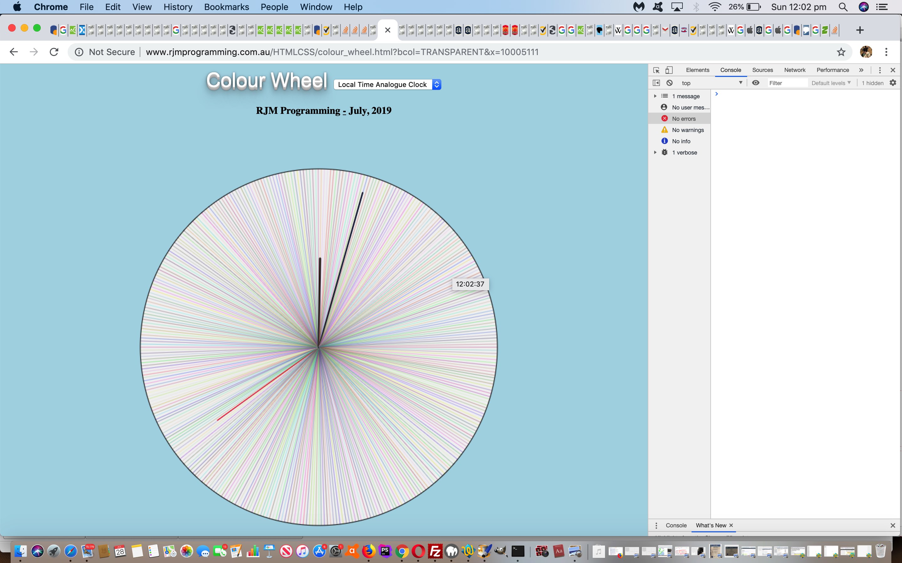
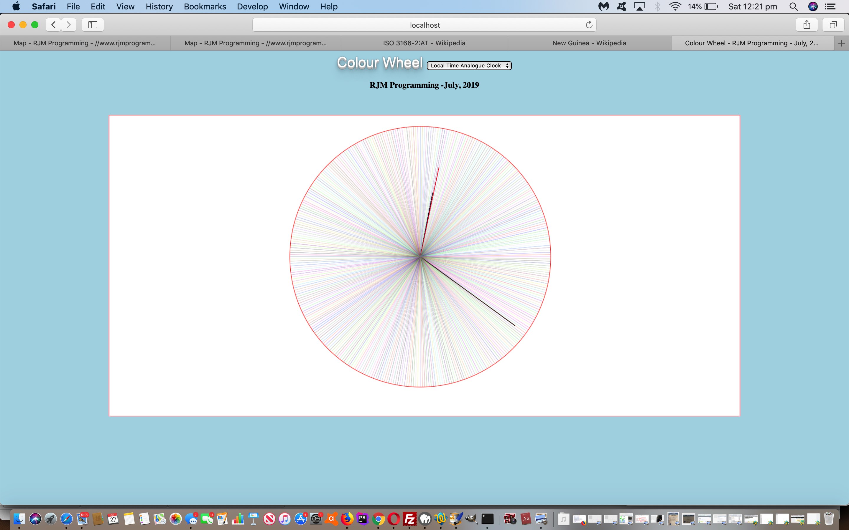
… and, as you can see below … this has improved … and along the way we improve the clarity of the canvas line drawing aesthetics by allowing for … - canvas line qualities (with default values to the right of “=” below) …
- [canvasElementContext].lineCap = “round”;
- [canvasElementContext].lineJoin = “round”;
- [canvasElementContext].lineWidth = 1; // is user-definable via ? and & web address argument
… and …
- the reveal or hiding of header elements (without resizing) via new onclick logics … can end up with the analogue clock, only, on the webpage (and click on canvas to get headings back) … and …
- background colour of canvas is user-definable via ? and & web address argument (that, if “transparent”, removes canvas border, and defaults to white)
And so, you can retry today’s HTML and Javascript changed colour_wheel.html at this live run link. We hope you give it a go!
Previous relevant Colour Wheel Canvas Analogue Clock Primer Tutorial is shown below.
Today’s new thread of web application ideas has “circle” ideas reminiscent of the recent Circular Text or Emoji Roulette Animation Tutorial but rather than “circular text”, today we are utilizing the very useful HTML5 canvas element, again.
“Colour wheel” idea one is … you guessed it … a Local Time Analogue Clock … do you remember those? We’ve done this in the past with the subtle weakness that it was to some degree digital regarding hour hand and minute hand movement (ie. they jumped “digitally”), but with today’s method we can let them move in a much smoother analogue way.
As with the recent HTML/Javascript Areas Canvas Tutorial the canvas element creation takes place just before </body> (ie. at the end of document.body.innerHTML) via …
<script type='text/javascript'>

  document.write('<br><br><canvas id=ourcanvas width=' + ('' + eval(-15 + (window.orientation == 0 ? window.screen.height: window.screen.width)) + 'px').replace('pxpx','').replace('px','') + ' height=680 style="width:' + ('' + eval(-15 + (window.orientation == 0 ? window.screen.height: window.screen.width)) + 'px').replace('pxpx','px') + ';height:680px;border:1px solid red;background-color:white;"></canvas>');

</script>
Global variable assignments are (almost) equally similar via … <body align=”center” style=”background-color: lightblue;” onload=” onl();“> …
var elem=null;

var context=null;

var cwidth=0;

var cheight=0;

var factor=1.0;

var hfactor=1.0, mfactor, sfactor=1.0;

var cf = "12px Verdana";

var path=null;

var paths=[];

var onedegree=eval(eval(1.0 / 180.0) * Math.PI);

var alldegree=eval(2 * Math.PI);

var letter=['1','2','3','4','5','6','7','8','9','a','b','c','d','e','f'];

var cone='f',ctwo='f', cthree='f';

var rnum=100;

var adate=new Date();

var hang=0, mang=0, sang=0;


function onl() {

  if (done == 0) {

   done = 1;

   elem=document.getElementById('ourcanvas');

   context=elem.getContext('2d');

   cwidth=eval(-70 + eval(('' + elem.width).replace('px','')));

   cheight=eval(-90 + eval(('' + elem.height).replace('px','')));

  }

  factor=getFactor(eval(rnum * 2), eval(rnum * 2));

  hfactor=eval(factor / 2.0);

  mfactor=eval(factor * 0.9);

  sfactor=eval(factor * 0.7);

  setTimeout(eachsecond, 1000);

}
… and each second we go …
function eachsecond() {

  setTimeout(eachsecond, 1000);

  context.clearRect(0,0,elem.width,elem.height);

  adate=new Date();

  var his=eval('' + adate.getHours());

  var mis=eval('' + adate.getMinutes());

  var sis=eval('' + adate.getSeconds());

  hang=eval(eval(270 + Math.round(eval(eval(his % 12) + eval(mis / 60) + eval(sis / 3600)) * 30)) % 360);

  mang=eval(eval(270 + Math.round(eval(mis + eval(sis / 60)) * 6)) % 360);

  sang=eval(eval(270 + Math.round(sis * 6)) % 360);


  for (var i=0; i<360; i++) { //360

 cone=letter[Math.floor(Math.random() * letter.length)];

 ctwo=letter[Math.floor(Math.random() * letter.length)];

 cthree=letter[Math.floor(Math.random() * letter.length)];

 if (i == hang || i == mang || i == sang) {

 if (i == mang) {

 context.beginPath();

 context.moveTo(Math.round(eval(25 + eval(cwidth / 2))), Math.round(eval(25 + eval(cheight / 2))));

 context.globalAlpha = 1.0;

 context.strokeStyle = "#000000"; //'#40FF20';

 context.lineTo(Math.round(eval(25 + eval(cwidth / 2)) + eval(eval(rnum * Math.abs(mfactor)) * (Math.cos(onedegree * i)))), Math.round(eval(25 + eval(cheight / 2)) + eval(eval(rnum * Math.abs(mfactor)) * (Math.sin(onedegree * i)))));

 }

 if (i == sang) {

 context.beginPath();

 context.moveTo(Math.round(eval(25 + eval(cwidth / 2))), Math.round(eval(25 + eval(cheight / 2))));

 context.globalAlpha = 1.0;

 context.strokeStyle = "#ff0000"; //'#40FF20';

 context.lineTo(Math.round(eval(25 + eval(cwidth / 2)) + eval(eval(rnum * Math.abs(sfactor)) * (Math.cos(onedegree * i)))), Math.round(eval(25 + eval(cheight / 2)) + eval(eval(rnum * Math.abs(sfactor)) * (Math.sin(onedegree * i)))));

 }

 if (i == hang) {

 context.beginPath();

 context.moveTo(Math.round(eval(25 + eval(cwidth / 2))), Math.round(eval(25 + eval(cheight / 2))));

 context.globalAlpha = 1.0;

 context.strokeStyle = "#000000"; //'#40FF20';

 context.lineTo(Math.round(eval(25 + eval(cwidth / 2)) + eval(eval(rnum * Math.abs(hfactor)) * (Math.cos(onedegree * i)))), Math.round(eval(25 + eval(cheight / 2)) + eval(eval(rnum * Math.abs(hfactor)) * (Math.sin(onedegree * i)))));

 }

 context.closePath();

 context.stroke();

 context.beginPath();

 context.moveTo(Math.round(eval(25 + eval(cwidth / 2))), Math.round(eval(25 + eval(cheight / 2))));

 context.lineTo(Math.round(eval(25 + eval(cwidth / 2)) + eval(eval(rnum * Math.abs(factor)) * (Math.cos(onedegree * i)))), Math.round(eval(25 + eval(cheight / 2)) + eval(eval(rnum * Math.abs(factor)) * (Math.sin(onedegree * i)))));

 context.closePath();

 context.globalAlpha = 0.2;

 context.strokeStyle = "#" + cone + "0" + ctwo + "0" + cthree + "0"; //'#40FF20';

 context.stroke();

 } else {

 context.beginPath();

 context.moveTo(Math.round(eval(25 + eval(cwidth / 2))), Math.round(eval(25 + eval(cheight / 2))));

 context.lineTo(Math.round(eval(25 + eval(cwidth / 2)) + eval(eval(rnum * Math.abs(factor)) * (Math.cos(onedegree * i)))), Math.round(eval(25 + eval(cheight / 2)) + eval(eval(rnum * Math.abs(factor)) * (Math.sin(onedegree * i)))));

 context.closePath();

 context.globalAlpha = 0.2;

 context.strokeStyle = "#" + cone + "0" + ctwo + "0" + cthree + "0"; //'#40FF20';

 context.stroke();

 }

  }

 context.globalAlpha = 1.0;

 context.beginPath();

 context.arc(Math.round(eval(25 + eval(cwidth / 2))), Math.round(eval(25 + eval(cheight / 2))), eval(rnum * Math.abs(factor)), 0, alldegree);

 if (his >= 12) {

 context.strokeStyle = "#000000"; //'#40FF20';

 } else {

 context.strokeStyle = "#ffff00"; //'#40FF20';

 }

 context.stroke();

}
You can try today’s HTML and Javascript colour_wheel.html at this live run link.
Previous relevant Circular Text or Emoji Roulette Animation Tutorial is shown below.
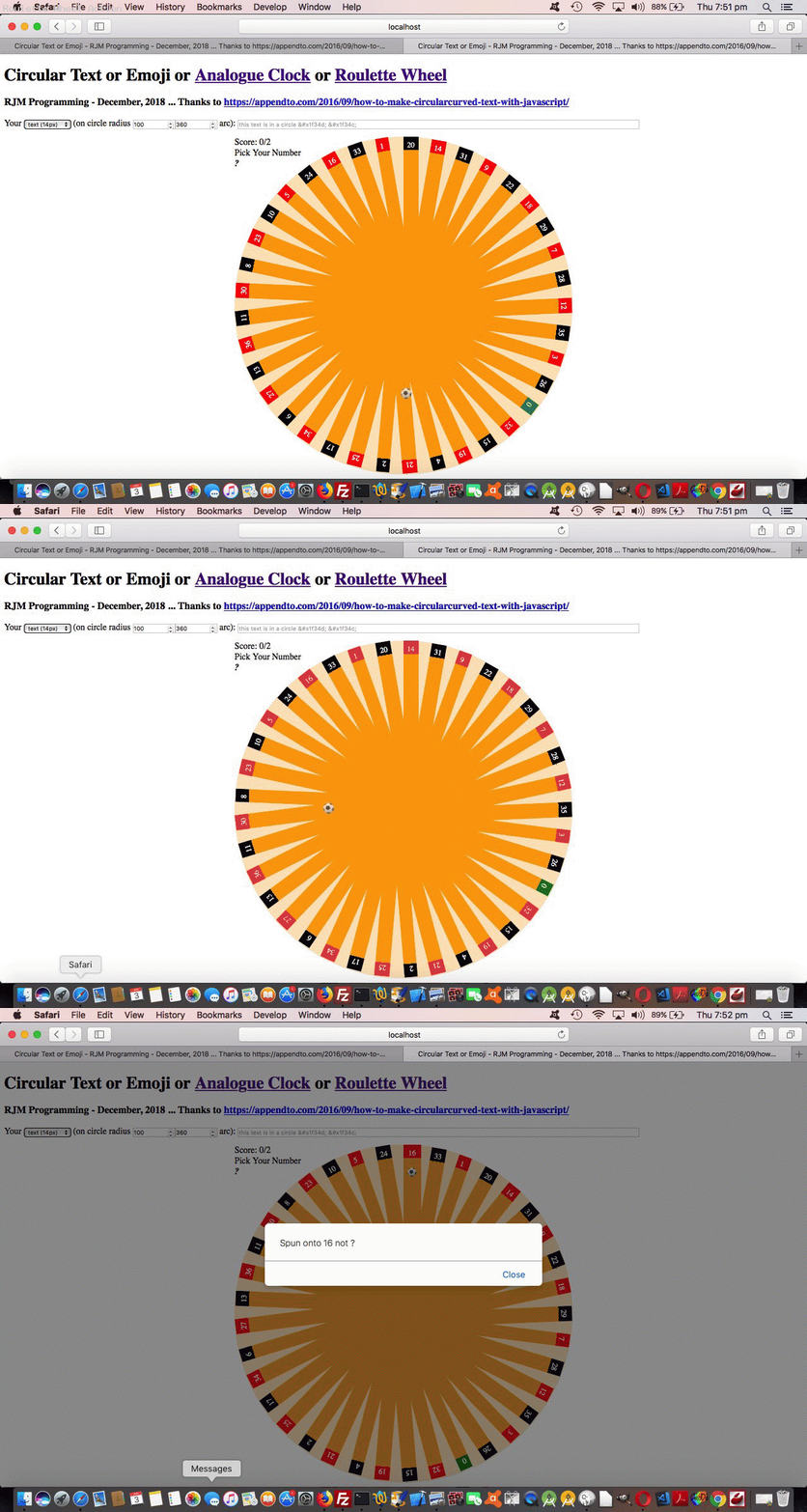
As we left off with the recent Circular Text or Emoji Roulette Game Tutorial we wanted to improve on the animation aspects to representing the roulette wheel ball, but still only involve …
- emoji (content) for HTML elements styled by …
- CSS @keyframes transition animations … in orbit
… and it was this in orbit bit that daunted us most. That is, until we …
- read the great advice of this link, thanks … and enjoyed the wonder of …
- how dynamic and easy dynamic CSS styling can be simply by adding <style> </style> encased styling to the end of document.body.innerHTML … via …
function animateonorbit(bid, ccl, cct, anrad, fhl) { // thanks to https://www.useragentman.com/blog/2013/03/03/animating-circular-paths-using-css3-transitions/

    var dba='<style> #' + bid + ' { display:block;  top:' + cct + 'px; ';

    dba+=' left:' + ccl + 'px; position:absolute; -moz-border-radius: 12px; border-radius: 12px;  ';

    dba+=' filter: alpha(opacity=80); -moz-opacity:0.8; -khtml-opacity: 0.8; opacity: 0.8; transform: rotate(45deg) translateX(' + anrad + 'px) rotate(-45deg); ';

    dba+=' animation:animateonorbit  ' + fhl + 's linear infinite; -webkit-animation:animateonorbit ' + fhl + 's linear infinite; z-index:79; } ';

    dba+=' @keyframes animateonorbit {  from   { 	transform: rotate(0deg) translateX(' + anrad + 'px) rotate(0deg);    } ';

    dba+='  to     { transform: rotate(360deg) translateX(' + anrad + 'px) rotate(-360deg);    } ';

    dba+=' @-webkit-keyframes animateonorbit {  from   { 	-webkit-transform: rotate(0deg) translateX(' + anrad + 'px) rotate(0deg);    } ';

    dba+='  to     { -webkit-transform: rotate(360deg) translateX(' + anrad + 'px) rotate(-360deg);    } </style> ';

    document.body.innerHTML+=dba;

    lasto=document.getElementById(bid);

    document.getElementById(bid).style.display='block';

}
Today’s changed HTML and CSS circular_text.html‘s live run link for you to try the Roulette Wheel (and its animated ball) part of the functionality yourself at a link up the top of the webpage.
Previous relevant Circular Text or Emoji Roulette Game Tutorial is shown below.
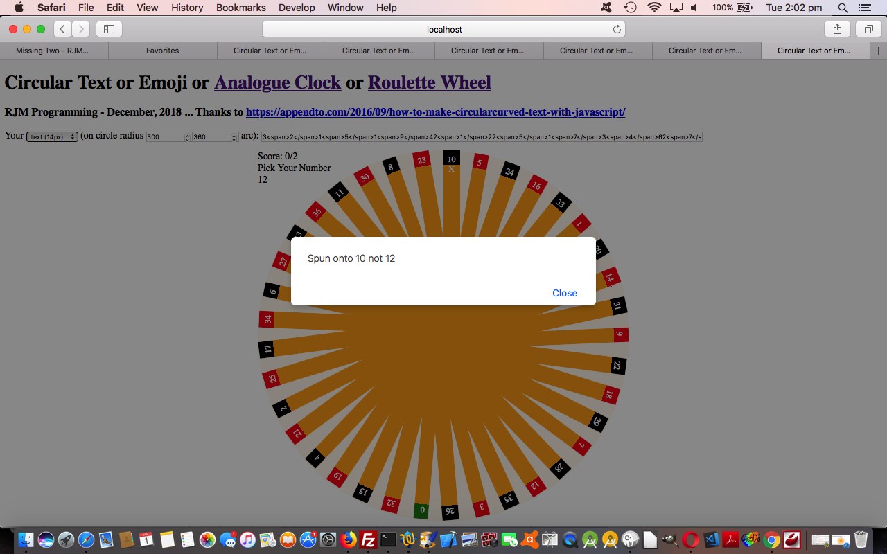
Extending the recent Circular Text or Emoji Onclick Tutorial circular text ideas, today we are starting out on a game that uses a Roulette Wheel as its basic web page component. To all those “graphically challenged” users, like me, we do not use any homegrown imagery of any sort, instead just use …
- HTML basis of design …
- CSS as …
- <head> </head> styling …
<style>

 .roulettered { color:white; background:linear-gradient(to top,orange 92%,red 8%);    }

 .rouletteblack { color:white; background:linear-gradient(to top,orange 92%,black 8%);    }

 .roulettegreen { color:white; background:linear-gradient(to top,orange 92%,green 8%);    }

</style>
- inline HTML styling
- <head> </head> styling …
- Javascript DOM dynamic styling and animation (the roulette wheel is sent spinning via setTimeout Javascript timer logic)
… involving our original …
- “circular text” as the numbers near the outer rim of the roulette wheel
- background border-radius parts in the middle (‘atend’ element) as the ribbing bits that form the rest of the roulette wheel
… and, so far, the one ball emoji at the end of a user turn. This last bit is where we feel we shall work at more improvement.
Today’s changed HTML circular_text.html‘s live run link for you to try the Roulette Wheel part of the functionality yourself at a link up the top of the webpage. You can guess a number or red or black or green colours, and odds based scoring is applied.
Previous relevant Circular Text or Emoji Onclick Tutorial is shown below.
In this increasingly connected online world, it can be surprising when an image looking part of a webpage cannot be linked to. The unusual thing about emojis is their way to …
- be part of the textual web armoury … yet …
- look like an image
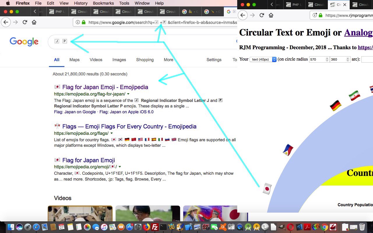
… and, as such, it would definitely not offend, maybe even “tickle pink” the user to have an emoji be linked to further information. In the case of the emojis featuring in yesterday’s Circular Text or Emojis Genericity Tutorial which are country flags (that are compound emojis) you can query the Google search engine with the contents of the Iemoji website webpages (such as Japan’s flag emoji one) with the right column data next to the “Decimal HTML Entity” left column. In fact, as we often urge our students, just copy this Decimal HTML Entity value straight up into the address bar, and your favourite search engine is likely to come up with a (in my case Google) search engine URL like …
https://www.google.com/search?client=firefox-b-ab&q=%26%23127471%3B+%26%23127477%3B
… getting you (emoji onclick event) links to some pretty pertinent information about Japan within seconds, let alone what you might find under the Images and/or Videos menu subsearches. Notice how integrated this is with the Google search engine webpages …
The Flag: Japan emoji is a sequence of the 🇯 Regional Indicator Symbol Letter J and 🇵 Regional Indicator Symbol Letter P emojis. These display as a single emoji on supported platforms.
… showing you how ISO 2-letter codes are linked to emoji country flag Decimal HTML Entity creation construction rules.
Today’s changed HTML circular_text.html‘s live run link for you to try yourself (or try the changed PHP circular_text.php‘s live run), then, features …
- changed emoji linking, the one thing left to say about this being, that the “missing link” between text and link HTML elements can be that elements that start as text can be made to act like linked elements (later) via (definitely the first, and sometimes, but not today, the second) CSS styling (via inline HTML CSS style=””) …
- cursor:pointer;
- text-decoration:underline;
… we make happen within the webpage’s Javascript (DOM) code
- functionality to be able to increase or decease the circular text’s font size (that being the way to control an emoji size as well, that reminds you that emojis are text, just not that very small part of the text world with ascii codes less than 256)
- a very subtle radial gradient background replaces the single colour background colour for the HTML ‘atend’ div element within the circular text as per …
if (document.getElementById('atend').innerHTML != '') { document.getElementById('atend').style.background='radial-gradient(circle,#c0d0f0,#c3d3f3)'; } //#c0d0f0'; } //'transparent';
Previous relevant Circular Text or Emojis Genericity Tutorial is shown below.
A major consideration in any “genericity” drive you have for your web applications is to allow for a large amount of user entered data, perhaps a surprising amount. If you offer a textbox to enter data, then a user may enter a hugely long, and perhaps valid, field. If we’d left it at the scenario of yesterday’s Circular Text or Emojis Analogue Clock Tutorial, though, we’d have been restricted to a textbox entry of about 800 characters for the rjmprogramming.com.au domain. In the first of the improvements below, then, we try to cater for this via …
- for textbox entries that are long we now populate an HTML form method=POST action=circular_text.php where we intervene at appropriate places with the large data items … and today we also …
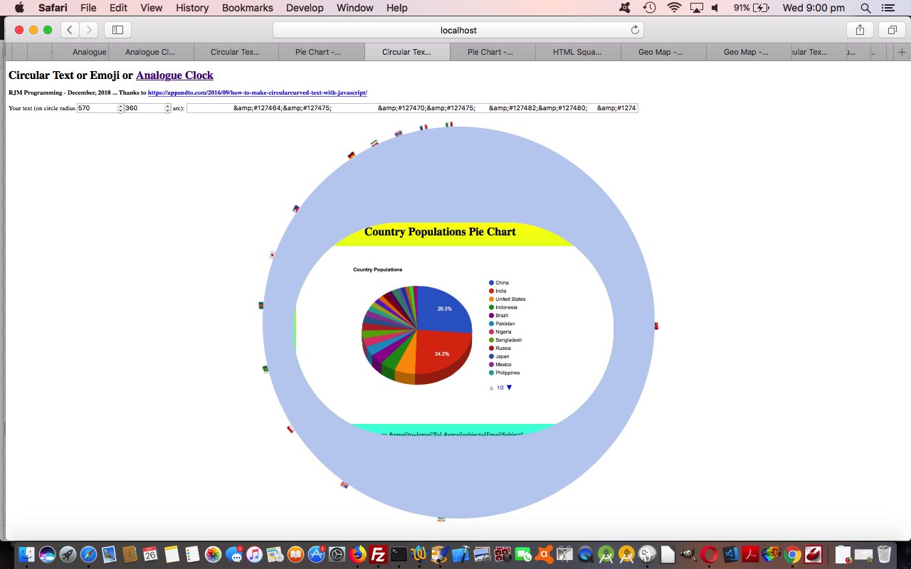
- make sure compound emojis like the country flags work (where the great Iemoji website webpages such as Japan’s flag emoji one, become so useful) … and we test that out with a …
- Google Chart Pie Chart content inside the circular text
… and an interesting thing happened with the “getting to work” of today’s textbox entry (for a radius value of 570) you can try …
🇨🇳 🇮🇳 🇺🇸 🇮🇩 🇧🇷 🇵🇰 🇳🇬 🇧🇩 🇷🇺 🇯🇵 🇲🇽 🇵🇭 🇻🇳 🇪🇹 🇩🇪 🇪🇬 🇮🇷 🇹🇷 🇹🇭 🇨🇩 🇫🇷 🇬🇧 🇮🇹<iframe frameborder=0 style=border-radius:600px;width:900px;height:600px;z-index:23;margin-left:87px;margin-top:270px; src=HTTPs://www.rjmprogramming.com.au/PHP/PieChart/pie_chart.php?title=%c2%a0%c2%a0%c2%a0%c2%a0%c2%a0%c2%a0%c2%a0%c2%a0%c2%a0%c2%a0%c2%a0%c2%a0%c2%a0%c2%a0%c2%a0%c2%a0%c2%a0%c2%a0%c2%a0%c2%a0%c2%a0%c2%a0%c2%a0%c2%a0Country%20Populations&onclick=y&task=Country&desc=Populations&data=,%20[~https;China,1347000000,India,1241000000,United%20States,312000000,Indonesia,238000000,Brazil,197000000,Pakistan,177000000,Nigeria,162000000,Bangladesh,151000000,Russia,143000000,Japan,128000000,Mexico,115000000,Philippines,96000000,Vietnam,88000000,Ethiopia,87000000,Germany,81800000,Egypt,82600000,Iran,78000000,Turkey,74000000,Thailand,69500000,Congo,67800000,France,63300000,United%20Kingdom,62700000,Italy,60800000~,100]#bitsatend></iframe>
… where the use of %c2%a0 creates whitespace but isn’t cleared by your normal trim functions, which is how we managed to get our Pie Chart title centralized enough not to be cut off by the HTML iframe border-radius applied to it. Cute, huh?!
Here is today’s changed circular_text.html‘s live run link for you to try yourself.
Previous relevant Circular Text or Emojis Analogue Clock Tutorial is shown below.
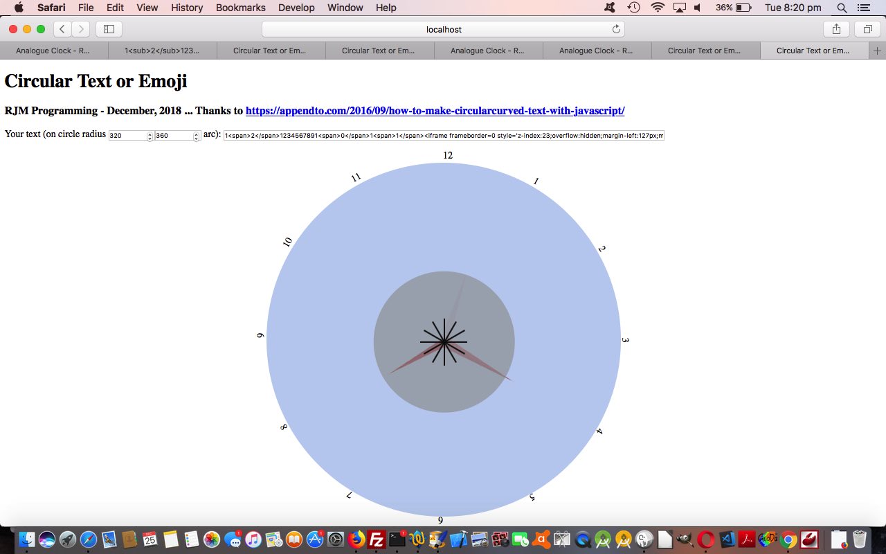
Often a good way to proceed to challenge genericity issues with a web application you think has potential to be more than it appears is to make it be the missing piece to another web application and interface to it. This is the scenario, today, putting together yesterday’s …
- Circular Text or Emojis Primer Tutorial … and adapt it to an older …
- Analogue Clock Timezone Tutorial web application, that eventually became so much more than its top left analogue clock missing the hour numbers quite useful for mere mortal sanity purposes
This interfacing match is great, as it fills in a gap, but there are a couple of things to overcome, those being …
- allow for a circular text component consist of more than one character, and here we allow the user to put …
1<span>2</span>
… to show “12” for example - allow for an element like the HTML iframe “child” element be the contents within a newly introduced HTML div element for today’s changed circular_text.html‘s live run placed into the … anyone, anyone? … yes, Franklin D. Roosevelt, that would be in the circle the circular text goes around, and we do that stylewise via (on the fly Javascript) code making use of the centrally justified circular text element (curiously causing rect.width and rect.height below to be zero) …
  var rect=document.getElementById('test').getBoundingClientRect();

  document.getElementById('atend').style.position='absolute';

  document.getElementById('atend').style.left=eval(-rad + 20 + rect.left) + 'px';

  document.getElementById('atend').style.top=eval(38 + rect.top) + 'px';

  document.getElementById('atend').style.width=eval(2 * rad - 38) + 'px';

  document.getElementById('atend').style.height=eval(2 * rad - 38) + 'px';

  document.getElementById('atend').style.borderRadius=eval(2 * rad - 28) + 'px';

  if (document.getElementById('atend').innerHTML != '') { document.getElementById('atend').style.backgroundColor='#c0d0f0'; } //'transparent';
… and ahead of this our user entered data needed for the Analogue Clock has an HTML (child) iframe element part …
1<span>2</span>1234567891<span>0</span>1<span>1</span><iframe scrolling=no frameborder=0 style='z-index:23;margin-left:127px;margin-top:130px;height:400px;' src=analogue_clock.htm#xbody></iframe>
… that we figure, because it is HTML containing spaces in its non-innerHTML parts, is meant as content for that new ‘atend’ HTML div element located in the middle of the circular text, and created via the codeline reached in this scenario …
function justinnertextish(intx, within) {

  var sone=1, tagis='', iit=0, less=false, ioffset=0;

  outx=intx;

  it=[];

  if (intx.indexOf('</') != -1) {

    outx="";

    for (iit=0; iit<intx.length; iit+=sone) {

      if (intx.substring(iit, eval(1 + iit)) == '<') {

        tagis=intx.substring(iit).substring(1).split('>')[0];

        less=false;

        if (tagis.indexOf(' ') != -1 || within) {

        less=true;

        document.getElementById('atend').innerHTML='<' + tagis + '>' + intx.substring(eval(iit + 2 + tagis.length)).split('>')[0] + '>';
// etcetera etcetera etcetera
Previous relevant Circular Text or Emojis Primer Tutorial is shown below.
We’ve got a “proof of concept” tutorial for you today, because we got put onto an idea for something by How to Make Circular/Curved Text with JavaScript, thanks. We wanted to extend the logic of that …
- ascii codes (of characters) less than 256, text handling … to, now, be able to handle …
- emoji data (or that’s what we like to “nickname” it … sorry if this annoys, but it really concerns UTF-8 characters really
We resisted the Sushi Train Circuit Game Tutorial ideas, because it isn’t lunchtime, and opted to allow the user to enter their own text (including any emojis (available via Command-Control-Space menu here at Mac OS X) or via &#[CodePoint]; HTML Entity (decimal or hexidecimal (CodePoint)) entries (where we’d like you to put & rather than just & if you are going to do this, and if you want to do this, but need tips on how you might approach this, please consult our previous Karaoke via YouTube API in Iframe Emoji Tutorial where we often start at good ol’ emojipedia).
Maybe there will be some sequels, but for the meantime you can examine the HTML and Javascript circular_text.html code (including more thank you links), that you can try for yourself at this live run link.
With that in mind, take a look at us creeping through the text characters you enter, and notice how an emoji will have two bytes in a row with ascii code greater than 255 …
var etxt=intxt.replace(/\&\;/g,'&').replace(/\;\&\#/g,',').split('&#'); // intxt is your text
var txt=[], zero=0; // changed elsewhere as well
var one=1;
for (kk=zero; kk<etxt[k].length; kk+=one) {
if (etxt[k].substring(kk, eval(1 + kk)).charCodeAt(0) > 255) { // emoji found
txt.push(String.fromCodePoint(eval('' + etxt[k].substring(kk).charCodeAt(0)),eval('' + etxt[k].substring(kk).substring(1).charCodeAt(0)) ));
one=2;
} else { // normal ascii text
txt.push(etxt[k].substring(kk, eval(1 + kk)));
one=1;
}
}
}
one=1;
zero=0;
You can also see this play out at WordPress 4.1.1’s Circular Text or Emojis Primer Tutorial.
If this was interesting you may be interested in this too.
If this was interesting you may be interested in this too.
If this was interesting you may be interested in this too.
If this was interesting you may be interested in this too.
If this was interesting you may be interested in this too.
If this was interesting you may be interested in this too.
If this was interesting you may be interested in this too.
If this was interesting you may be interested in this too.
If this was interesting you may be interested in this too.
If this was interesting you may be interested in this too.
